| Image |
Comment |
| 04/11/2006 08:32:53 PM |
Komodo Dragonby HawkeyeComment: Picture too fuzzy. Would have been ok if at least the head was in sharper focus. |
 Photographer found comment helpful. Photographer found comment helpful. |
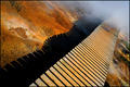
| 04/11/2006 08:30:15 PM |
Into the Mistby StructorComment: I think you have gone too far on the tilt... looks like the brige will topple over. |
| Photographer found comment helpful. |
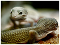
| 04/11/2006 08:25:58 PM |
"Wha-chu lukin at?!"by RikkiComment: Strange how the head of the lizard seems to sudently pop out of the fog. Transition seems too abrupt to be the result of shallow dof. I don't know the reasons, but it is too distracting in my opinion; when looking at the photograph, I can't get over the head appearing from nowhere. Makes it hard trying to appreciate the whole photograph. Message edited by author 2006-04-14 09:19:10. |
| Photographer found comment helpful. |
| 04/11/2006 08:20:35 PM |
|
| Photographer found comment helpful. |
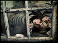
| 04/11/2006 08:18:17 PM |
Grungeby Joey LawrenceComment: That a nice composition. Nice "framing". Very artistic. Bumping up. |
| Photographer found comment helpful. |
| 04/11/2006 08:15:20 PM |
Fuzzyby pointandshootComment: Cool backlight effect. Nice colors.
I could be wrong, but I sense oversharpening in here. The noise pattern in the out of focus area looks exagerated by the sharpening. Sharpening should be used in moderation in my opinion.
I think it's a side offect of DPC where super sharp photos wins more ofthen than soft photos. So it's hard to resist when comes time to apply sharpening to our photos. I understand that. |
| Photographer found comment helpful. |
| 04/11/2006 08:04:49 PM |
wavesby ZemmComment: Cool pattern. Looks like the wave pattern on the backside of Omega's Seamaster. |
| Photographer found comment helpful. |
| 04/10/2006 08:17:41 PM |
Beauty Dyingby dustinwilsonComment: Composition is not too exciting. A bit too much dead space above the rose. And you camera really needs some cleaning; you got dust bunny all over the place. You should have clone them out in post processing. There are a bit too obvious in this plain background. |
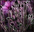
| 04/10/2006 08:02:41 PM |
Buds and Mossby Faye PekasComment: Returning for comment. At first, I gave this photo a low score since background has a weird feel to it. But looking at it again, I realized I was too hard. The background has a little something hard to tell. A bit distracting though. bumping to 6. |
| Photographer found comment helpful. |
| 04/08/2006 01:13:19 PM |
Liberty Place Sunsetby banmornComment: Wow. The mirror image of the building within itself is mesmerazing. The symetry is perfect. Great shot. Message edited by author 2006-04-08 13:14:22. |
| Photographer found comment helpful. |
Home -
Challenges -
Community -
League -
Photos -
Cameras -
Lenses -
Learn -
Help -
Terms of Use -
Privacy -
Top ^
DPChallenge, and website content and design, Copyright © 2001-2025 Challenging Technologies, LLC.
All digital photo copyrights belong to the photographers and may not be used without permission.
Current Server Time: 08/13/2025 10:49:03 PM EDT.