| Image |
Comment |
| 08/08/2002 07:28:00 AM |
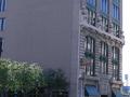
Seventh Street Grilleby mcrochipComment: Really needed to be framed to show the grille better - or the sign better. There's a lot of blank wall here. Good choice of subject though. |
| 08/08/2002 06:54:00 AM |
2nd/3rd century ADby stephanComment: Lovely lighting showing the depth of this picture. It's a bit of a shame that the majority of the light isn't on the face though. Still a great shot. |
 Photographer found comment helpful. Photographer found comment helpful. |
| 08/08/2002 07:42:00 PM |
|
| 08/08/2002 06:58:00 AM |
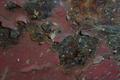
EncRustby willsy66Comment: Sneaky pun-title. The picture subject is good but really needed much more light. Light from the sides would have shown the texture of the surface and brought out those lovely colours. Nice DoF. |
| 08/08/2002 07:20:00 AM |
Weatheredby sohrComment: Almost convincing as a genuinely old photo. Only the sharpness of the focus gives it away. |
| 08/08/2002 07:03:00 AM |
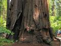
Old Man of the Forestby bobgaitherComment: I'm SO glad you got some people in this shot. It gives it 110% more impact. Lovely colours and a good amount of detail even in the shadows. Choice of angle really tells us everything about the sheer size of this thing! Love the picture. This is a sequoia right? |
| 08/06/2002 09:03:00 AM |
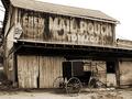
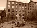
We don't get many visitors anymore...by mscott821Comment: Good subject but in your effort to keep the foreground debris in the shot you've had to crop too close to the top of the building. This spoils the framing in my opinion. Sepia didnt work too well here, perhaps because it's a little too red and a little too dark over all. |
| 08/08/2002 06:36:00 AM |
KEEPER OF DREAMSby karolComment: Is this wonderful old box sitting on a very wet tabletop? I hope it wasnt damaged! Otherwise - great to be able to see so much detail. I think my only criticism is the small amount of red at the bottom which needn't have been there and which makes the picture look like it slopes to the left. |
| 08/07/2002 05:22:00 AM |
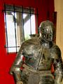
I'm a little rustyby arippsComment: Good subject but I think you should have moved around the subject to avoid the bright white light of the window which has shown up chromatic aberrations in your lens (the blue fringes). Good use of flash. Good focus, colour and contrast. |
| 08/08/2002 07:15:00 AM |
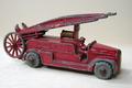
Lesney Toy Truckby LanSnakeComment: Good shot but DoF is too narrow. Front and rear of the toy are both slightly out of focus. Good light and subject. |
| Photographer found comment helpful. |
Home -
Challenges -
Community -
League -
Photos -
Cameras -
Lenses -
Learn -
Help -
Terms of Use -
Privacy -
Top ^
DPChallenge, and website content and design, Copyright © 2001-2025 Challenging Technologies, LLC.
All digital photo copyrights belong to the photographers and may not be used without permission.
Current Server Time: 08/28/2025 08:44:58 AM EDT.