| Author | Thread |
Comments Made During the Challenge  |
|
|
08/11/2002 02:00:00 PM |
|
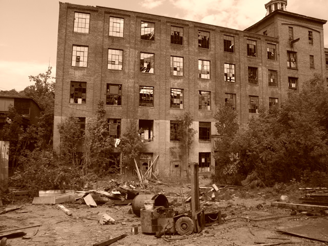
this is a great subject for the challenge, and a well done photograph as well. the sepia toning was a great idea. The only way I could think of to make this photo better would be to wait for the lighting to improve. |
|
|
|
08/10/2002 01:49:00 PM |
|
Nice though lose some at the left and gain a little at the top right where the roof tower is chopped off. |
|
|
|
08/09/2002 02:29:00 PM |
|
Good subject. Sepia tone is unneccessary, as the subject is quite evocative of feelings of oldness by itself. I would have shot this one in a similar fashion. |
|
|
|
08/08/2002 10:53:00 AM |
|
this is good when everything in thr frame is old -- both the backdrop and the foreground. heck even the bushes look untended for years. the broken windows look great, and the non-broken ones reflect enough to give the illusion that this is just one standing wall left. great shot |
|
|
|
08/08/2002 08:33:00 AM |
|
nice view :) The clutter in the foreground adds a lot to this one... the darker sepia toning also adds a nice effect ... - jmsetzler |
|
|
|
08/07/2002 12:07:00 PM |
|
good angle shot and use of sepia |
|
|
|
08/06/2002 09:08:00 PM |
|
don't agree with the toning - but the building is sure a find for this challenge. |
|
|
|
08/06/2002 03:48:00 PM |
|
Sepia effect worked nicely for you, the framing could use a bit of work -- take off the dead space on the left, and give a pinch more to the top and right. |
|
|
|
08/06/2002 03:22:00 PM |
|
|
|
08/06/2002 11:20:00 AM |
|
wouldve been good for fear challenge but the sepia hurts it here I think |
|
|
|
08/06/2002 09:03:00 AM |
|
Good subject but in your effort to keep the foreground debris in the shot you've had to crop too close to the top of the building. This spoils the framing in my opinion. Sepia didnt work too well here, perhaps because it's a little too red and a little too dark over all. |
|
|
|
08/05/2002 10:26:00 PM |
|
|
|
08/05/2002 07:49:00 PM |
|
This would have been great in the Corporate World thing. Good here too. The junk kind of overpowers the old for me though. A closer shot of the building would have been more powerful. Autool |
|
|
|
08/05/2002 06:18:00 PM |
|
|
|
08/05/2002 04:14:00 PM |
|
Nice shot, and I really like the sepia - it suits the subject you chose, and works for me. lhall |
|
|
|
08/05/2002 02:40:00 PM |
|
Nice! I would like to see this either B/W or in full color, though. |
|
|
|
08/05/2002 02:37:00 AM |
Captures the age well, kinda depressing tho but I suppose that should be a plus in this case.
|
|
Home -
Challenges -
Community -
League -
Photos -
Cameras -
Lenses -
Learn -
Help -
Terms of Use -
Privacy -
Top ^
DPChallenge, and website content and design, Copyright © 2001-2026 Challenging Technologies, LLC.
All digital photo copyrights belong to the photographers and may not be used without permission.
Current Server Time: 06/28/2026 05:06:12 AM EDT.