| Author | Thread |
Comments Made During the Challenge  |
|
|
08/11/2002 07:04:00 PM |
|
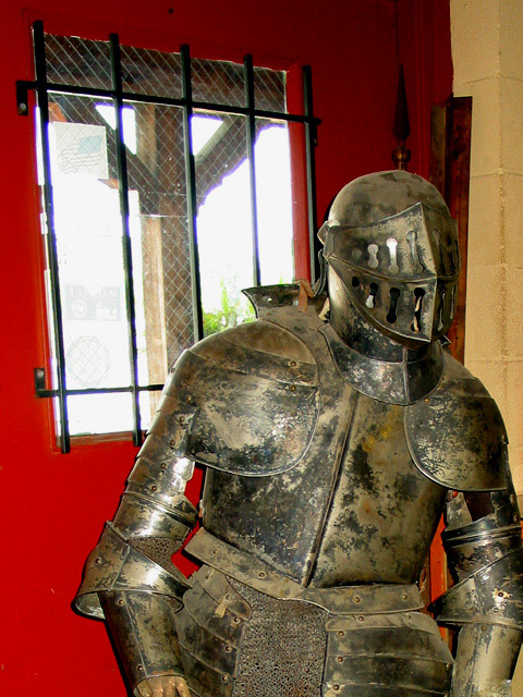
I like the idea... don't like the backgorund... would prefer if the armor were standing in a more appropriate place. 4 sjgleah |
|
|
|
08/11/2002 02:10:00 PM |
|
good subject, good composition, and good colors. the only problem you need to correct is the overexposure of the sky. it looks like you already tried to fix that with your flash. I guess there's not much else you could do if it's in a museum. maybe you could have a buddy cover up the window fromthe outside? what might be best is to wait until it's not so bright outside (though by then the museum or whatever could be closed. I don't know) |
|
|
|
08/10/2002 07:44:00 PM |
|
Great subject matter but the red wall is a little distracting. Perhaps if you had made this black and white the armor would be more of a focal point? Also, it is a bit off-centered. Perhaps if it were zoomed-in a bit more also and focused in on a specific part of the armor like the helmet? |
|
|
|
08/10/2002 01:28:00 PM |
|
nasty flash, taken old very literally |
|
|
|
08/09/2002 07:51:00 PM |
|
Too bad the window is right there! That's a rust armor! I kinda question the cropping, esp. the left elbow and hands, I can live without the legs/feet. 7 Swash |
|
|
|
08/09/2002 02:49:00 PM |
|
Flash is too obvious in this one. Might be better as a tripod mounted medium exposure. |
|
|
|
08/08/2002 04:20:00 PM |
|
That is a bright red, there. I think if you had moved jsut a touch to the left, then the yellowish color could play in the picture a little more. It kinda looks like he just walked in the door. karmat |
|
|
|
08/08/2002 12:08:00 PM |
|
this is definitely a nice subject for the 'old' challenge... the background, however, does not contribute much to that concept. Maybe it woud have been possible to move to a better area, maybe not :) - jmsetzler |
|
|
|
08/08/2002 03:25:00 AM |
|
white window distracts -- as does red background. ignoring that, I think the title was very appropriate, and if the figure were talking to something other than the edge of the picture, it would be quite cute. |
|
|
|
08/07/2002 04:33:00 PM |
|
Nice subject matter but I am not keen on what's included in the frame and what's missing (rest of him). |
|
|
|
08/07/2002 11:16:00 AM |
|
The armour looks like it's trying to hear something – the title 'Pardon me, only I'm a little deaf' would have been amusing :) Technically and challenge wise it's a great picture. |
|
|
|
08/07/2002 05:22:00 AM |
|
Good subject but I think you should have moved around the subject to avoid the bright white light of the window which has shown up chromatic aberrations in your lens (the blue fringes). Good use of flash. Good focus, colour and contrast. |
|
|
|
08/05/2002 05:42:00 PM |
|
This is a little disorienting to me; the armor is leaning one way and the window the other! |
|
|
|
08/05/2002 01:10:00 PM |
|
Bright light of the window is distracting... |
|
Home -
Challenges -
Community -
League -
Photos -
Cameras -
Lenses -
Learn -
Help -
Terms of Use -
Privacy -
Top ^
DPChallenge, and website content and design, Copyright © 2001-2026 Challenging Technologies, LLC.
All digital photo copyrights belong to the photographers and may not be used without permission.
Current Server Time: 06/28/2026 05:26:32 AM EDT.