| Image |
Comment |
| 10/08/2008 05:55:58 AM |
Kissesby BarbBComment: Nice shot of the snake. If there was anyway to get more focus on his eyes, the snake would have come more alive. Snake's eyes add so much more to their beauty.
I'm pretty sure by looking at the snakes coloring that the handler isn't in any danger, so there is no suspense for me seeing them so close. So, I think the handler's face is pointless for this shot. If you had more of the handler's face, especially his eyes, he might be more relevant. It just kind of looks like they're about to kiss. (unless that was what you were going for :P )
Hmm... I guess its all about the eyes for me.
|
 Photographer found comment helpful. Photographer found comment helpful. |
| 10/08/2008 05:47:16 AM |
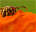
Hornet in Hidingby bspurgeonComment: That score does seem a bit low.
I think it would have been better to have more of his face (head) in focus. As it is you have one eye and part of the antennas. I think that is a waste of your focus plane, which is already limited by shooting in macro.
Perhaps you were trying to show the hornet as hiding before it attacks, but the huge flower at the bottom half of the picture is unnecessary. If you can get a closer crop, I would crop more of the flower.
I don't have much success with macros myself, so take my opinion with a grain of salt. |
| Photographer found comment helpful. |
| 10/06/2008 04:34:58 AM |
spiteby aplomb76Comment: Thanks for the comment kenna718. I'm a little disappointed it didn't score over 6, but that is how things go. I didn't do much preparation for the shot. I was just fooling around and this is what I got. I'll be a little more careful when shooting this sort of subject next time, and hopefully I'll do better. :) |
| 10/05/2008 12:12:27 PM |
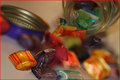
Who took the lollies from the lol lollie jar?by GregoryBComment: I think this was a great idea and you did it very well. It looks pretty tricky to get the lighting to match well, but I think you pulled that off.
Once I got over my initial impression I felt that the candy in focus in the foreground stands out quite a bit more than the blurred candy behind it. If you can make the candy in the foreground come into focus in the same way that the candy in the background goes out of focus I think the composition would have been better.
I think the red border is a mistake though. The red seems to harsh and distracting. I would go with something more subtle.
Overall, this looks a bit tricky, and I think you did a great job. |
| Photographer found comment helpful. |
| 10/02/2008 12:35:04 PM |
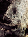
macro_8462.jpgby HeiSchComment: I do enjoy that moment of contemplation before it finally dawns on me as to what it is. I think the photo is well done, but the subject isn't so visually appealing on close up to me. I think more can be done with this to make it a little more interesting, but like I said it is well done. |
| Photographer found comment helpful. |
| 10/02/2008 12:31:22 PM |
macro_8465.jpgby HeiSchComment: It is gorgeous. colors, texture, composition, border - it is very enjoyable to look at. |
| Photographer found comment helpful. |
| 10/01/2008 11:04:39 AM |
Lovebirdsby GermaineComment: I can't complain about the blown out wall. It somehow appeals to me. But the curb looks oversaturated. Is that how it already looked? I would have probably toned the curb down a little. |
| Photographer found comment helpful. |
| 09/29/2008 07:52:43 AM |
|
| Photographer found comment helpful. |
| 09/29/2008 07:51:06 AM |
|
| Photographer found comment helpful. |
| 09/29/2008 07:48:03 AM |
|
| Photographer found comment helpful. |
Home -
Challenges -
Community -
League -
Photos -
Cameras -
Lenses -
Learn -
Help -
Terms of Use -
Privacy -
Top ^
DPChallenge, and website content and design, Copyright © 2001-2025 Challenging Technologies, LLC.
All digital photo copyrights belong to the photographers and may not be used without permission.
Current Server Time: 08/28/2025 09:33:28 AM EDT.