| Image |
Comment |
| 07/22/2002 12:49:00 AM |
Damn Reflection...by chuckComment: very groovy shot. i like the color especially. ~mcmurma Aesthetics...8 Meets Challenge...8 Overall....8 |
| 07/22/2002 12:53:00 PM |
|
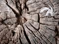
| 07/22/2002 01:01:00 PM |
curves, lines and contrastby olyaComment: i like this photo, but i wish it had been submitted in B&W. it would have made a stronger image, i think. ~mcmurma Aesthetics...7 Meets Challenge...8 Overall....8 |
| 07/25/2002 12:39:00 PM |
vittlesby queen 91Comment: nice photo, but the lighting, to me, seems rather flat and uninteresting. also, it appears to be a bit soft overall, this could be your equipment and/or an intentional effect. if it is intentional, it doesn't work for me, i would like to see more sharpness, color, and contrast. (all of which can be achieved, with minimal effort, through a photo editing program like paintshop.) ~mcmurma Aesthetics...5 Meets Challenge...5 Overall...5 |
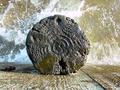
| 07/24/2002 11:48:00 AM |
Wheel of Textureby KathycComment: this is one interesting wheel. the many properties of its construction (and subsequent weathering) look really cool. ~mcmurma Aesthetics...8 Meets Challenge...8 Overall...8 |
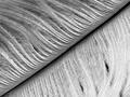
| 07/24/2002 11:36:00 AM |
Featheredby FranziskaLangComment: strong image, i like it very much and it looks great in b&w. ~mcmurma Aesthetics...8 Meets Challenge...8 Overall...8 |
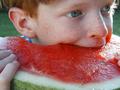
| 07/22/2002 01:24:00 AM |
Summer Smileby crisa58Comment: nice photo, looks like mighty good eatin'. i am hard pressed to feel the texture, though. (7/25...bumped score up to an 8 after eating some melon ' - ) ~mcmurma Aesthetics...8 Meets Challenge...8 Overall....8 |
| 07/22/2002 01:44:00 AM |
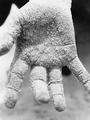
Mr. Handby akebonoComment: i really like this. the white light/thingy on the left of the thumb is distracting, as is the black spot, but overall the composition is strong. good texture. ~mcmurma Aesthetics...7 Meets Challenge...8 Overall....8 |
| 07/25/2002 11:43:00 AM |
rebozoby karolComment: this photo would look so much nicer to me if the main swatch of fabric on the left were in focus, and not the one on the left. the colors are vibrant and the texture is appealing. ~mcmurma Aesthetics...5 Meets Challenge...7 Overall...6 |
| 07/24/2002 12:51:00 PM |
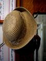
hatby arippsComment: the hat has nice texture, but the photo is busy. too many elements present in my opinion. also, the black void beneath the hat is distracting. a photo of just the texture of the hat (or part of it) with only the wood-grain in the background would have worked better for me. ~mcmurma Aesthetics...4 Meets Challenge...4 Overall...4 |
Home -
Challenges -
Community -
League -
Photos -
Cameras -
Lenses -
Learn -
Help -
Terms of Use -
Privacy -
Top ^
DPChallenge, and website content and design, Copyright © 2001-2025 Challenging Technologies, LLC.
All digital photo copyrights belong to the photographers and may not be used without permission.
Current Server Time: 08/02/2025 06:17:05 AM EDT.