| Author | Thread |
Comments Made During the Challenge  |
|
|
07/28/2002 12:53:00 AM |
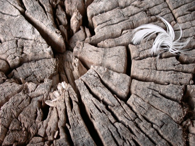
Very nice photography. The feather gives it a little something extra. I like that it is not completely centered. Good lighting too. 9
Ruthann |
|
|
|
07/27/2002 11:07:00 AM |
|
A bit soft on the tree, I wish it had a sharper focus on it. I like feather as well, nice layout and idea. 7 |
|
|
|
07/26/2002 11:36:00 PM |
|
The feather on the stump adds a nice touch :) It offers a nice bit of contrast and brightness to the somewhat 'cold' image of the old wood. I think you did an excellent job of composing this shot... good work :) = 7 - jmsetzler |
|
|
|
07/26/2002 02:08:00 PM |
|
An absolutely stunning texture!!! The dry, almost petrified looking wood really contrasts with the delicate feather. Focus is sharp except for the very top edge of the frame, and the exposure is right on. *8* -balynch |
|
|
|
07/25/2002 11:13:00 PM |
|
I like your picture very much, but i find it's not as sharp as it should be. |
|
|
|
07/25/2002 01:51:00 PM |
|
great shot, i dont know if you relally need the feather there though, there is more than enough texture in the wood alone |
|
|
|
07/24/2002 08:48:00 PM |
|
I love this shot, it is one of my top 3 for this challenge. I personally do not like the feather. I have a bird, so most feathers in my office are un-welcome. |
|
|
|
07/24/2002 03:41:00 PM |
|
I really like the way the deep lines work in the layout of the photo. The lighting is strong, but not overpowering, but the feather was a stroke of genius. I assume you placed it? It's texture is such a contrast, the juxtaposition so sublime. Truly a marvelous shot. 10 crisa58 |
|
|
|
07/24/2002 02:33:00 PM |
|
I think the feather adds a nice touch, but in my opinion, it needs to be to the left, just a touch to feel a little more balanced. karmat |
|
|
|
07/24/2002 10:35:00 AM |
|
|
|
07/24/2002 09:06:00 AM |
Composition6
Originality7
Technical Aspects5
Meets Challenge8
Total Score7
For those that are just learning, like me.
Composition: Scoring in this area is based on basic composition of a picture and includes the rule of thirds, balance, cropping, and curved and diagonal lines. Subject matter that does not lend itself to the picture or otherwise unwanted is also considered here.
Originality: Scoring in this area is based on pictures or concepts that I have seen, as well as how much effort you have invested in the picture. Usually a little something that sets it aside from a snapshot. Does it make me want to come back for another look? You know things like that.
Technical Aspects: Focus, exposure, lighting, and other special effects (done by the camera), and post processing are all considered in this category.
Meets Challenge: This is based on my interpretation of if you, have/have not, met the challenge. This is fairly simple but quite important for this site.
There are many sites that can give you assistance in achieving better skills in photography, but I think the best way to learn is to take pictures and show them to other people. Believe me when it is a good one you will know it.
Good luck!
Autool
|
|
|
|
07/23/2002 10:57:00 PM |
|
Great composition and subjects! |
|
|
|
07/23/2002 08:57:00 PM |
|
Composition and texture is excellent, but I think the colors are a bit dull... |
|
|
|
07/23/2002 06:49:00 AM |
|
Needs to be shaper, use a smaller aperture. |
|
|
|
07/23/2002 01:55:00 AM |
|
I like the contrast of the feather on the third line, nice addition. Good example of making a shot vs. taking a shot. |
|
|
|
07/23/2002 12:57:00 AM |
|
Good idea... a little bit closer would work |
|
|
|
07/23/2002 12:47:00 AM |
|
the feather puts a nice touch to the picture. nice! |
|
|
|
07/22/2002 09:32:00 PM |
|
Focus seems to be off a little. Makes it difficult for me to appreciate this fully. |
|
|
|
07/22/2002 09:14:00 PM |
|
very nice shot. says alot without yelling it out |
|
|
|
07/22/2002 06:23:00 PM |
|
Soft focus. Like the feather. |
|
|
|
07/22/2002 05:36:00 PM |
|
The feature is a nice touch. Good job on composition and exposure. I do however think it might benifit from just a bit of unsharp mask. |
|
|
|
07/22/2002 03:57:00 PM |
|
great use of contrasting colors and texture |
|
|
|
07/22/2002 03:23:00 PM |
|
Nice composition.....I like it........just could of been more crisp. Kee |
|
|
|
07/22/2002 02:48:00 PM |
|
Super pic. The feather looks too intentional. |
|
|
|
07/22/2002 01:41:00 PM |
|
i like it....good focus and texture. |
|
|
|
07/22/2002 01:01:00 PM |
i like this photo, but i wish it had been submitted in B&W. it would have made a stronger image, i think. ~mcmurma
Aesthetics...7
Meets Challenge...8
Overall....8
|
|
|
|
07/22/2002 12:40:00 PM |
|
This is really nice contrast. The light curved feather, and the dark hard lines of the wood. Very good. |
|
|
|
07/22/2002 06:19:00 AM |
|
|
|
07/22/2002 01:26:00 AM |
|
Very nice texture and detail:) Shiiizzzam |
|
Home -
Challenges -
Community -
League -
Photos -
Cameras -
Lenses -
Learn -
Help -
Terms of Use -
Privacy -
Top ^
DPChallenge, and website content and design, Copyright © 2001-2026 Challenging Technologies, LLC.
All digital photo copyrights belong to the photographers and may not be used without permission.
Current Server Time: 06/29/2026 02:32:24 AM EDT.