| Image |
Comment |
| 05/27/2003 01:55:01 AM |
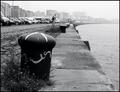
Inkyby marcoComment: I like the lines in this shot. They flow so nicely around. |
 Photographer found comment helpful. Photographer found comment helpful. |
| 05/27/2003 01:28:22 AM |
I'm Ready For My Close Upby CreativeFlyPhotoComment: Nice shot. I wish there had been a touch more DOF. The critical area of focus needs to contain his snout, I think, and on through the eye line. The textures in his skin and the tone you have achieved are just wonderful. |
| Photographer found comment helpful. |
| 05/27/2003 01:23:44 AM |
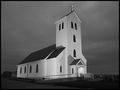
Midnight Churchby tyrkinnComment: Lovely church, it looks like it should be sitting on a hilltop somewhere! The lighting is very nice, and I like the angle and composition. Well done. |
| Photographer found comment helpful. |
| 05/27/2003 01:13:51 AM |
Welcome Homeby tragicharpyComment: Nice shot, good composition and it has a very nostalgic feel. The tone seems to be missing a true black, though, and this causes the shot to lose a lot of snap. |
| 05/27/2003 01:10:56 AM |
"Duo"...toneby tfarrell23Comment: Interesting shot with lots of neat things going on. The tone seems to be missing a true black, though. And this causes the shot to lose a lot of snap. |
| Photographer found comment helpful. |
| 05/27/2003 01:06:17 AM |
The Loneliest Oneby BigSmilesComment: I like the grainy, chilling quality presented here. It looks so much like ice. (though I suspect it was done through IR) Either way, it's well presented and the tone compliments it nicely. |
| Photographer found comment helpful. |
| 05/27/2003 12:00:55 AM |
Past it's Primeby ArtifactsComment: I really like the texture and composition of this shot, but I'm afraid I don't like the tone. It's either too strong, or just the wrong tone altogether, I can't decide which. Either way, it is a nice shot, but it's just not working for me. |
| Photographer found comment helpful. |
| 05/26/2003 11:53:05 PM |
Black & White in Sepiaby AnachroniteComment: I really like the composition and subject of this shot... But I dont care for the tone. It's too much. I feel this would have been much stronger with a more subtle tone, or even straight black and white. |
| 05/26/2003 11:50:12 PM |
The Light Insideby xertionComment: This is a perplexing shot. Mainly because I can't for the life of me figure out what I'm looking at! It is a cool prespective, though, and the strong tone works with the composition. Nicely done. |
| Photographer found comment helpful. |
| 05/26/2003 11:48:07 PM |
Days Gone Byby sherComment: Nice tone, but the composition is not working for me. Everything is too orderly. I realize that this may well be how the scene presented itself, but it just has too much balance. Sharpness is good, though, and it is an interesting scene with lots of texture and nostalgia. Good work. |
| Photographer found comment helpful. |
Home -
Challenges -
Community -
League -
Photos -
Cameras -
Lenses -
Learn -
Help -
Terms of Use -
Privacy -
Top ^
DPChallenge, and website content and design, Copyright © 2001-2025 Challenging Technologies, LLC.
All digital photo copyrights belong to the photographers and may not be used without permission.
Current Server Time: 08/06/2025 02:43:13 AM EDT.