| Image |
Comment |
| 08/19/2002 01:56:00 PM |
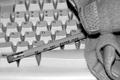
Back to The Basicsby evilbunneeComment: I understandthe juxtaposition of the keyboard and the pencil but don't understand the towel, if that's what is is. I cannot find this image particularly original as I have seen lots of keyboard images by now. Nice job on the duotoning. 5 Journey |
| 08/19/2002 02:16:00 PM |
Time to Reflectby GraciousComment: The association of the pencils with the meditative scene is rather lost on me. You used pencils because that's what the challenge said but a book, poem, music score would have made a better association. It doesn't matter (and won't reflect my score), just an observation. This is a very nice image, nice composition, lovely color scheme,mood invoking. I find the diagonal of the open tray and the pencils a little too harsh and jarring with the mood/tone of the rest of the composition which seems to call for soft lines and soft curves. Not sure I'm conveying my thoughts well here. 6 for now will revisit this later. Journey |
| 08/20/2002 12:23:00 AM |
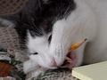
I love pencils>by cathysappComment: I get a little tired of the cat shots but this one has a very interesting angle and composition and far superior to the average cute cat picture. Great definition of the yellowing of the teeth, the whiskers and the fur. Nice toowith that corner of note pad. My only nitpick is that the background rug (?) is distracting. Will revisit this lateron this week. 7 for now. Journey |
| 08/20/2002 02:28:00 AM |
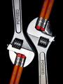
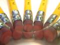
Mechanical Pencilsby jmsetzlerComment: This is a beautiful image. Good composition; great clarity. Also like the originality and the subtle humor. Normally I'm not all that much of an admirer of total symmetry but it works well here. My only nitpick: seems a little soft at the top left edges (near the Forged area). 8 Journey |
| 08/25/2002 02:20:00 PM |
|
 Photographer found comment helpful. Photographer found comment helpful. |
| 08/19/2002 02:10:00 PM |
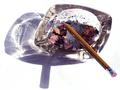
Inflectionby taylorbehneComment: Nice effect. You must have used glass or something to achieve it. Yet, I can't say that this grabs me. 5 Journey |
| 08/19/2002 11:31:00 PM |
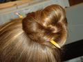
Red and White by RemieComment: I like this. Strong, stark design, strong colors. Visually very pleasing. Good composition. Love how the white of the pencil seamlessly blends into the background. Although I'm sure you'll be getting comments of people who just hate that feature! My only nitpick is that the red point and tip don't seem all that sharp and have jaggedness and artifacts. Oversharpening perhaps? Good job.7 Journey PS: you might wish to consider some spot editing to clean up the red point (not possible for the challenge I know); it will greatly help this image. |
| 08/19/2002 02:10:00 AM |
Virgin On The Obsceneby MartinComment: Did you really mean "virgin" or "verging....."? I can see the technical merits of this picture, however, it doesn't do much for me. I understand some aspects, others not; all in all I find it contrived. Journey |
| 08/19/2002 02:28:00 PM |
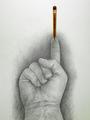
Balance by timj351Comment: Beautifully drawn and very nice sense of humor and context. Good composition. My mind and eyes are entertained. Thanks. Will revisit this later this week. 8 for now Journey |
| 08/20/2002 10:50:00 PM |
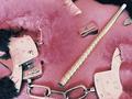
Hair Paraphernaliaby daniellitaComment: Even though the assignment is the humble pencil, I still would like to look at an image that is visually pleasing. This picture has poor composition, all the surrounding clutter turn the image into a snapshot because no attention was paid to details. 4 Journey |
Home -
Challenges -
Community -
League -
Photos -
Cameras -
Lenses -
Learn -
Help -
Terms of Use -
Privacy -
Top ^
DPChallenge, and website content and design, Copyright © 2001-2025 Challenging Technologies, LLC.
All digital photo copyrights belong to the photographers and may not be used without permission.
Current Server Time: 08/24/2025 01:12:07 AM EDT.