| Image |
Comment |
| 08/25/2004 09:49:50 AM |
Tiny Dancersby DarkRiderComment: Just as I suspected, folks wanted your drops in focus.Well, I've already posted my views on that. You deserved better. I really think the voting was way off on this challenge. This photo should have scored a lot higher. This shot is way better than a bunch of yellow sails and a yoga sign as far as I'm concerned. |
 Photographer found comment helpful. Photographer found comment helpful. |
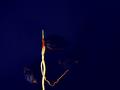
| 08/25/2004 09:45:43 AM |
DIY Neonby digistouneComment: Well I gave you a 10. I'm surprised this wasn't in the top 5 at least. Really felt the voting was way off. If I could score the scoring for the Neon challenge - I'd give a 4. I cannot believe some of the photos that made the top 20!
I found your photo well composed,well organized, unique, and an original entry for the theme and I liked the colours used. |
| Photographer found comment helpful. |
| 08/25/2004 09:32:26 AM |
|
| Photographer found comment helpful. |
| 08/25/2004 09:30:36 AM |
|
| Photographer found comment helpful. |
| 08/24/2004 09:06:16 AM |
Bright Highlighter Pensby SammieComment: This is a nice shot. I wonder what it would have been like if you had used a different coloured container. |
| Photographer found comment helpful. |
| 08/23/2004 08:35:56 AM |
|
| Photographer found comment helpful. |
| 08/19/2004 12:16:00 PM |
|
| Photographer found comment helpful. |
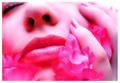
| 08/19/2004 12:13:29 PM |
Pink Passion by ScantyNebulaComment: Anyone that would give this a low mark is an idiot or is. . .I don't know worried about their own photo. . . blind. . .This obviously a well composed, professional looking shot and I hate you for it ;-) just kidding - I am neon green with envy. The only thing I can say negatively - and I'm reaching here - is the angle tends to maybe accentuate the nose holes just a tad. Maybe if her head had been slightly turned (to our left)so the eye would still be included or tilted down slightly . . .just a thought. It's still a 10 damn it anyway ;-) |
| Photographer found comment helpful. |
| 08/19/2004 12:03:40 PM |
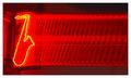
All That Jazzby 'PongComment: I think it would have been cooler if the background from after the boxy thing with the word music on it was black. |
| Photographer found comment helpful. |
| 08/19/2004 12:01:02 PM |
sure i'll drink......you firstby mrsamsaComment: I would have liked to have seen the objects a little larger in the frame. Maybe you were worried about cutting off the reflection? I wonder what this shot would have been like if taken vertically. I don't really mind that it isn't sharp as a tack, but I think in this case it might have added to the shot. |
| Photographer found comment helpful. |
Home -
Challenges -
Community -
League -
Photos -
Cameras -
Lenses -
Learn -
Help -
Terms of Use -
Privacy -
Top ^
DPChallenge, and website content and design, Copyright © 2001-2025 Challenging Technologies, LLC.
All digital photo copyrights belong to the photographers and may not be used without permission.
Current Server Time: 08/20/2025 12:31:20 PM EDT.