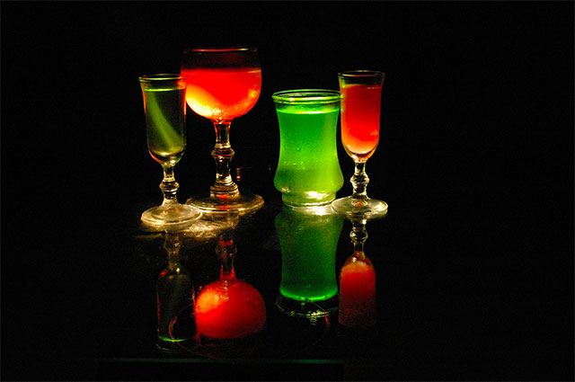
What a good idea for the challenge. I would like to see how you did the lighting. The picture looks a bit tilted even though I don't think it is as the table edge on the bottom is straight. Perhaps if you had rotated it a bit to the right and then cropped so the table edge wasn't visible it wouldn't look slightly out of kilter. The reflection is nice. The picture is a bit noisy, thing some noise reduction might have really make it stunning.
I would have liked to have seen the objects a little larger in the frame. Maybe you were worried about cutting off the reflection? I wonder what this shot would have been like if taken vertically. I don't really mind that it isn't sharp as a tack, but I think in this case it might have added to the shot.
too much negative space.... I don't feel like its adding anything to this image... the interest is in the color and shape rather than the emptiness....




 Add photograph to your favorites
 Add photographer to your favorites


 Photographer found comment helpful.


