| Image |
Comment |
| 09/06/2002 12:56:00 AM |
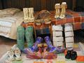
Could you walk a mile in his shoes?by NitenComment: I didn't get through all the pictures last week for voting - so I am just finding this one now. A very touching photo - I wore a brace just like the one in the middle for about 2 years between 5-6 grade for perthes disease in my hip, so I know a little bit about one of the "shoes" shown here. As far as the picture goes I like the child's quilt that is on the floor in this shot - I think it brings a very personal feeling in contrast to the cold braces. I am sure this is a very emotional shot for you - thanks for submitting it. It does show another side to childhood that is not often portrayed. |
 Photographer found comment helpful. Photographer found comment helpful. |
| 08/23/2002 02:08:00 PM |
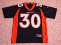
Find the Pencilby #1 Bronco FanComment: This picture is a little too flat for me and having the shirt centered in the middle of the picture doesn't do much for me. I think it would have appealed more if the shirt was in a different position instead of flat on the carpet (maybe laying the grass with footballs around it?). I also would have liked a bigger challenge to find the pencil - perhaps if it was set along a seam of the shirt instead of across the collar. Good lighting and focus and meets the challenge = 5 |
| Photographer found comment helpful. |
| 08/23/2002 02:11:00 PM |
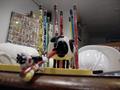
Poo Mooby MagsCoyoteComment: creative but a bit too busy of a shot to appeal to me. I wish the focus was more on Salvestor and Tweedy in the front with more of the background blurred. I think that would have made a clearer picture. Or, if there was a backdrop(even just a wall) right behind the pencils so I was not so distracted by some of the other objects. meets the challenge in a creative way = 5 |
| 08/22/2002 07:27:00 PM |
My true Loveby BaldurComment: I really love this shot!. I think the lighting and color are perfect. I like how the written words are just in focus enough to read them. The glare on the drop of ink and the side/ tip of the pen are a tiny distraction - unfortunately I don't have any advice on how to fix that. But the dilema of the score - I am sure you are hearing it a lot. I want badly to give it a ten - but the challenge is pencil - not pen/ink so I am left in an odd situation. This is my favorite shot of the week - but I don't feel it meets the challenge - do I give it 10 or a 1? The rules say I should keep the highest consideration of the challenge in mind when voting??? hmmm not much help there. ok - I will go with an 8. I really do think the shot is great. |
| 08/23/2002 02:14:00 PM |
Reflectionby BukiosComment: I like the idea here - creative and pretty well done - however I am too distracted by the reflection of you in the spoon. Could you try the shot moving a step or two to the right or left and shooting at an angle? I am not sure if you would still get the relection that way - but it might work. Good focus in the spoon and pretty good lighting = 5 |
| 08/23/2002 02:17:00 PM |
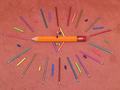
Puuurdy Pencilsby evmariedogsComment: I appreciate the time taken to make this design - but the picture ends up being very flat when taken from above the pencils. If you could have made the design so the pencils were standing up (or maybe if they were all leaning against the big pencil in the middle? - and then taken the picture at an even level with them I think it would be more appealing. The lighting is good and your focus is good too = 5 |
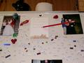
| 08/23/2002 02:01:00 PM |
Honey Do Listby YomiComment: I like the idea here - it is a comfortable photo to me because of the familiy pictures, magnets and magnetic poetry/words. The part that bothers me is the composition of the shot. I would have prefered if the upper part of the picture(above the fridge) was not in the shot. Another little thing that bugged me was that the pencil covered the head of the girl in the photo on the left. If the picture was composed better I would have rated it higher - for now I give it a 5. |
| 08/09/2002 04:43:00 PM |
|
| 07/24/2002 02:37:00 PM |
A Crystalline Wonderlandby dequinixComment: sugar? There is nice color here but I feel a bit lost in it. perhaps a view from a bit further above might have helped it. = 4 |
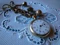
| 07/24/2002 03:03:00 PM |
watch on linenby camelotnorthComment: I like the linen but I dont' think the watch adds much to the shot. I would have scored higher without it. = 4 |
Home -
Challenges -
Community -
League -
Photos -
Cameras -
Lenses -
Learn -
Help -
Terms of Use -
Privacy -
Top ^
DPChallenge, and website content and design, Copyright © 2001-2025 Challenging Technologies, LLC.
All digital photo copyrights belong to the photographers and may not be used without permission.
Current Server Time: 08/20/2025 06:50:52 AM EDT.