| Image |
Comment |
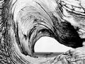
| 12/09/2002 10:18:45 PM |
Driftwoodby GraciousComment: I like how the swirl in the wood frames this shot. The colors or lack of color emphasize the age and helps bring out the detail. I am left wondering what is in the middle part though and that area is what draws my attention most. I wish there was a bit more depth because of that. = 7 |
 Photographer found comment helpful. Photographer found comment helpful. |
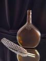
| 12/09/2002 09:51:58 PM |
Turkey Feather Still Lifeby KazComment: Good focus, good lighting, very clear. Overall this is a nice shot - but it doesn't seem to have much inspiration, or rather it doesn't inspire me much. I can't think of anything to offer for improvement so eliminating my personal preference = 8 |
| 12/09/2002 09:48:47 PM |
Last Year's Resolutionby myqylComment: The white object leaning against the wall doesn't add anything to the shot. I think it would have been better taken out. I like how the framing makes this feel pushed into the corner. Good lighting to capture the dust and bring a dreary feeling. = 6 |
| Photographer found comment helpful. |
| 12/09/2002 09:45:52 PM |
Neon Twigby kandyjComment: I would have prefered this moved up in the frame just a bit. I like the idea but the colors don't do much for me. =6 |
| Photographer found comment helpful. |
| 12/09/2002 09:43:58 PM |
Yuleby KimblyComment: I love the red light around the back that can be seen under the arm. The only drawback for me is that the skintone and background are too similar in tone and almost blend - although you may have intended that so I won't take away for it. The shadow on the shoulder is a bit distracting. Interesting shot = 7 |
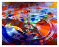
| 12/09/2002 09:40:29 PM |
A Splash of Color by RackatComment: Very cool! Is this different color oils on the water to create the effect? Or something under the water? Either way this shot = 10 |
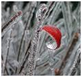
| 12/09/2002 09:39:03 PM |
Hanging On by welcherComment: wow - this is beautiful. I love how vibrant the red leaf is. Great framing, wonderful focus = 10 |
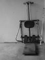
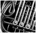
| 12/09/2002 05:56:09 PM |
Corne by muckpondComment: Good clarity. Good lighting. Not too much glare on the metal. The one distraction is the overly white section in the lower left corner that doesn't seem to fit with the rest of the shot. |
| 12/09/2002 05:52:53 PM |
|
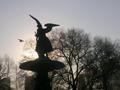
| 12/09/2002 05:48:31 PM |
Angel's flightby catpixelComment: Nice framing - great catch with the bird flying by. I wish there were a bit more lighting on the statue - or perhaps just taken from a different angle to catch more of the details. Perhaps shot from directly in front or on the side? That might have introduced unwanted features in the background for you though. Overall I like the idea but the shot is just a bit too dark for my taste. = 6 |
| Photographer found comment helpful. |
Home -
Challenges -
Community -
League -
Photos -
Cameras -
Lenses -
Learn -
Help -
Terms of Use -
Privacy -
Top ^
DPChallenge, and website content and design, Copyright © 2001-2025 Challenging Technologies, LLC.
All digital photo copyrights belong to the photographers and may not be used without permission.
Current Server Time: 08/20/2025 06:52:44 AM EDT.