| Image |
Comment |
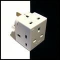
| 12/11/2002 04:27:41 PM |
Power Cubedby ManicComment: The only recommendation I would have is to see if you could adjust the lighting to eliminate the shadow from the white side. Otherwise I really like the contrasts in this picture. = 8 |
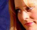
| 12/11/2002 04:24:01 PM |
Chasityby connieComment: I like the position of this portrait. The only distraction for me is the tiny glare over the right eyebrow. I like the soft look of this without the focus being too soft. Overall nice lighting. = 7 |
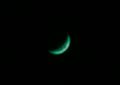
| 12/11/2002 04:01:43 PM |
Green Cheeseby ChaszmyrComment: I think having a different position of the moon within your photo would have helped here. Perhaps changing to a vertical shot with the moon high in the frame? = 5 |
| 12/11/2002 02:50:50 PM |
Merry Kissmas!by karmatComment: Is it possible the background here is too white? It actually hurts me eyes to look at it a long time lol. I think this is a nice shot - the detail on the foil is very good. Cute idea = 7 |
 Photographer found comment helpful. Photographer found comment helpful. |
| 12/11/2002 02:49:19 PM |
Marina in Decemberby MorganComment: It is interesting to see all the patterns and lines here. I like the branches show in the upper right and left of the shot. The only thing that bothers me is the rail on the left side being slightly blurred. The other parts of the shot look good though and the detail is nice. = 7 |
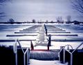
| 12/11/2002 02:47:13 PM |
Birds Eye Viewby spidermanComment: I like the patterns created by the stucture. The picture looks as though there is a lot of noise in it and the details are not very strong. I get this kind of look when I use the digital telephoto on my camera. The background is a bit too stark for my taste - perhaps an adjustment of the brightness/contrast to make it a bit softer would help. = 5 |
| 12/11/2002 02:42:57 PM |
Dixie in Decemberby rll07Comment: That is just so cute. The only thing that would make it better would be if that was a blue bow around the next instead of the collar. Great detail and use of the border to really accent this shot. = 8 |
| 12/11/2002 02:41:46 PM |
Portrait of a Beautyby byetkoComment: Nice colors on this. The lighting on the nose is too bad - looks a bit harsh. I like the shadows around the eye from the hair and how the details are shown so well. = 7 |
| 12/11/2002 02:38:03 PM |
Up in the Cloudsby jab119Comment: I like the framing of the structure on the left and the perspective it gives to the photo. The The sun spot makes what is otherwise a very soft picture rather harsh though. = 6 |
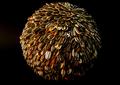
| 12/11/2002 02:34:36 PM |
Tons of Seedsby RfariasComment: Did you do all that yourself? This shot is just a bit too dark for my tastes but the focus and detail are great. I like the different patterns on the seeds and the overall pattern created by the rows. Nice = 7 |
Home -
Challenges -
Community -
League -
Photos -
Cameras -
Lenses -
Learn -
Help -
Terms of Use -
Privacy -
Top ^
DPChallenge, and website content and design, Copyright © 2001-2025 Challenging Technologies, LLC.
All digital photo copyrights belong to the photographers and may not be used without permission.
Current Server Time: 08/24/2025 11:48:23 AM EDT.