| Image |
Comment |
| 08/21/2002 12:40:00 PM |
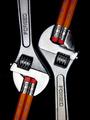
Mechanical Pencilsby jmsetzlerComment: I can see that this image took a lot of visualization. Very thought out. I like the composition very much - very creative idea. You must have a lot of patience - getting everything lined up just right (I had troubles with my pencils with one idea- glue was one prob and patience to keep turning them so they were just right!). Very symetric and great utilization of space. My one tiny pik is that the wrench on the right is slightly brighter than the other - but could be to bring attention to that one-the more i look - the pencils are also a little darker at the top as well as the wrench has a shadow that fades into the black - perhaps that is the intention - to make you THINK that is exact, but when in fact it is not. Either way - I love this - Great Work! 10 Ruthann |
| 08/20/2002 02:52:00 PM |
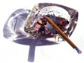
Total Addiction.by BigSmilesComment: Really Nice work - made me chuckle. Good use of lighting/exposure - good focus - the photo screams of addiction. On my screen, I see a little bit of grey near the pencil and the shadow-just noting-not judging. I like this very much 9 Ruthann |
 Photographer found comment helpful. Photographer found comment helpful. |
| 08/21/2002 08:43:00 PM |
Self-Portrait w/Pencilby chariotComment: A little strange, but nicely done. Good use of light and shadow - tones. Nicely achieved white background (sometimes difficult for me). At first, marked as a 7, now an 8. Something about this that is keeping my attention. Almost as if you can see thru the pencil and looking out from the screen (sort of xray vision thing). I think maybe it's the shadow of the eyelashes. GREAT work! Ruthann |
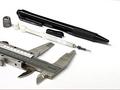
| 08/20/2002 02:24:00 PM |
Mechanicalby jeremyaComment: Very simple and elegantly done. Nice contrast, composition and interesting idea. Great use of different tones. 9 Ruthann |
| 08/19/2002 10:53:00 AM |
Red and White by RemieComment: TRULY AWESOME!!! I absolutely love it. great work - perfect. My fav so far. (ok, one tiny itty bitty thing, I wish the light didn't reflect so much in the grain on the red pencil) great composition - lighting is great - the exposure is perfect. 10!! Ruthann |
| 08/19/2002 07:25:00 PM |
Pencil Pandemoniumby kindonComment: Excellent! I love the colors. Very clean and sharp. Also like the composition. 10! Ruthann |
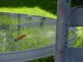
| 08/20/2002 02:56:00 PM |
Forgottenby HillWalkComment: GREAT Job with this - brings out sadness. I like how the sun light is just barely highlighting the tip of the pencil. Really nice. 9 Ruthann |
| 08/23/2002 09:59:00 PM |
untitledby BeeGeeComment: REALLY GREAT - I can see the time and effort put into this one. It's simple - but not. I definately like the composition - the usage of lines. The choice of dof is also really great - it makes the primary subject REALLY stand out (isn't that the point of dof?). Great achievement of black background. At first, the extra contrast (if that's what it is) stood out as a negative, but as I really look at it, I think it adds more the photo. GREAT WORK 9 Ruthann |
| 08/23/2002 10:23:00 PM |
End of the Roadby rdesaiComment: Great work (Running out of steam for commenting - so being brief) Detail, composition, b/w (if it is b/w), idea - creative; time and effort; lighting - all great and effective for this image. 9 Ruthann |
| 08/21/2002 08:52:00 PM |
odd man outby snsComment: Nice idea. I'm being straight out - NOT to offend. I see a few things that I would adjust. For something like this, I would make sure that the subject was level - or if intended to be tilted, then more tilt - this looks as if that part wasn't carefully considered. The light source appears to be a flash - not effective for this. Personally, I use regular household lights - no money for expensive stuff. I would also try to balance the light evenly trying to avoid the shadows - better yet, with a lamp or something, place the light souce lower and to the side. The background is too grey, that is, assuming it was supposed to be white. I would adjust the white balance on the camera, if possible. I appreciate the time and effort put into this. I am in no way an expert. I am still in the learning process myself. 5 Ruthann |
Home -
Challenges -
Community -
League -
Photos -
Cameras -
Lenses -
Learn -
Help -
Terms of Use -
Privacy -
Top ^
DPChallenge, and website content and design, Copyright © 2001-2025 Challenging Technologies, LLC.
All digital photo copyrights belong to the photographers and may not be used without permission.
Current Server Time: 08/20/2025 08:10:22 PM EDT.