| Author | Thread |
Comments Made During the Challenge  |
|
|
08/24/2002 05:02:00 PM |
|
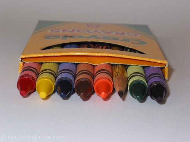
Nice! I would like to see the crayon box squared-up to the edge of the picture frame. |
|
|
|
08/23/2002 03:10:00 PM |
|
I probably shouldn't comment on this one. I might be bias towards head on shots of crayons coming out of the box. LOL. (in case you hadn't seen it, I did a very similar shot in the something new challenge called "out of the box") It was so hard for me to photograph the crayons to look clear and in focus because of 1. the shiny-ness, and 2. the wrappers on crayola crayons are textured to begin with and take on a grainy, oof look. the lighting for this is perfect, and the background makes the crayons stand out. definately has a pencil in it. The only complaint I might have would be the tilt of the box. I think I would have liked to see this level with the top and bottom of the photo. Otherwise, very nice shot. Good luck in the challenge. |
|
|
|
08/21/2002 09:31:00 PM |
|
Nice idea, but I find the composition rather uninteresting. I would have preferred to see the box at an angle, rather than parallel to the borders. |
|
|
|
08/21/2002 08:52:00 PM |
Nice idea. I'm being straight out - NOT to offend. I see a few things that I would adjust. For something like this, I would make sure that the subject was level - or if intended to be tilted, then more tilt - this looks as if that part wasn't carefully considered. The light source appears to be a flash - not effective for this. Personally, I use regular household lights - no money for expensive stuff. I would also try to balance the light evenly trying to avoid the shadows - better yet, with a lamp or something, place the light souce lower and to the side. The background is too grey, that is, assuming it was supposed to be white. I would adjust the white balance on the camera, if possible. I appreciate the time and effort put into this. I am in no way an expert. I am still in the learning process myself. 5
Ruthann |
|
|
|
08/21/2002 03:09:00 PM |
|
I like the perspective and focus here. Was the slight tilt on purpose? karmat |
|
|
|
08/21/2002 10:42:00 AM |
|
Good idea. Simplistic and out of the box. (or in) not sure. Feel like a pencil and crayon world myself sometimes. |
|
|
|
08/21/2002 10:33:00 AM |
|
I think if the encil were pulled out a little it would have fit the title better..nice idea though. |
|
|
|
08/21/2002 02:46:00 AM |
|
I think I recognize these crayons......A little fuzzy and maybe a bit dark but is a nice composition. I think the slight tilt is more of an attraction than a distraction. I will be watching to see what other people more experienced than I will comment about that. =5 syamjonimi ;'-D |
|
|
|
08/21/2002 01:04:00 AM |
|
Nice idea, but very WRONG angle (sorry). Nice idea though, and the focus, DOF is interesting. |
|
|
|
08/20/2002 07:25:00 PM |
Composition: Subject Placement, Cropping, Background6,
Technical: Focus, Exposure, Lighting, Processing5,
Challenge: Does your entry meet it?10,
Appeal: Is it Interesting, Motivating, Etc.? 5,
Total Averaged Rating7. Autool
|
|
|
|
08/20/2002 05:50:00 PM |
Nice, says a lot more than just a pencil in a crayon box to me. Talks of round pegs in square holes and whether or not one should try and fit into a mould and peer pressure and lots of things. Don't even know if that's what was intended or it is just a pencil in a crayon box. Would score higher if was horizontal within frame.
6, Kavey |
|
|
|
08/20/2002 07:33:00 AM |
|
Great idea! Not sure this was the most interesting angle you could have taken the photo from. Nice clean background though. I would suggest cropping in closer but I see that your camera's resolution would start giving you problems if you did. |
|
|
|
08/20/2002 12:37:00 AM |
|
The centering and angle of this picture don't really do anything for me. A few degrees to the left or right might help a bit. 5. |
|
|
|
08/19/2002 06:17:00 PM |
|
|
|
08/19/2002 05:14:00 PM |
|
perhaps a more interesting angle would've made this photo seem more appealing, good idea though |
|
|
|
08/19/2002 02:22:00 PM |
|
It's a bit dark, I think the lighting could have been a bit better. Overall not bad. |
|
|
|
08/19/2002 01:29:00 AM |
|
I think the framing would have been more interesting is the box were rotated on a slight diagonal and the crayons were lots all lined up precisely. 5 |
|
Home -
Challenges -
Community -
League -
Photos -
Cameras -
Lenses -
Learn -
Help -
Terms of Use -
Privacy -
Top ^
DPChallenge, and website content and design, Copyright © 2001-2026 Challenging Technologies, LLC.
All digital photo copyrights belong to the photographers and may not be used without permission.
Current Server Time: 06/28/2026 02:25:00 PM EDT.