| Image |
Comment |
| 09/21/2002 12:04:00 AM |
|
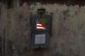
| 09/18/2002 12:26:00 PM |
Graffitiby vestanpanceComment: I may be missing something, but I don't really see what the neg space adds to this photo. Also, it is not level. |
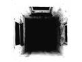
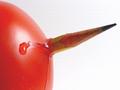
| 09/23/2002 03:30:00 PM |
Shaftby millerComment: Thank you for your comments everyone. I appreciate it. -Leigh |
| 08/20/2002 12:46:00 PM |
|
| 08/20/2002 02:44:00 PM |
Hanaby muckpondComment: This is certainly a nice shot, but something doesn't seem right to me. It may be that the lack of contrast between the subject and the background makes it seem kind of flat. |
| 08/22/2002 08:08:00 PM |
Pencil Holderby normwComment: Nice simple shot. I had a similar idea, but with the pencil looking like it's coming out of my arm instead. Never tried it though. |
| 08/20/2002 02:41:00 PM |
The Circle of PenciLifeby lennierComment: Nice idea. One thing I think would be nice is if the pencil shavings were blowing away. I'm not sure how it would look in practice, but it's an idea to consider. Also you might want to try to get the background closer to true white. |
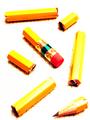
| 08/23/2002 05:59:00 PM |
The Pencil That Wasby fas-ligandComment: Nice shot. A little more curve in the cut up pencil might be nice. I'd also like to see just a bit more DOF so the eraser was in focus. |
 Photographer found comment helpful. Photographer found comment helpful. |
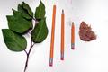
| 08/26/2002 09:01:00 AM |
Lunchby millerComment: Thank you everyone for your great comments. Yes, I know about the highlights on the right side of the sandwich, but there wasn't much I could do about it and get the light the way I wanted it (well, at least not with my setup). I used a white board to try to get some more light on the pencils, but as you can see it didn't work so well. The shadow is there on purpose, to make the sandwich stand out more, but I can see why some people don't like it. |
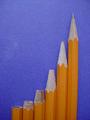
| 08/19/2002 01:43:00 PM |
Evolutionby MarkRobComment: Nice idea, but I think you could have done some things better. A little more light on the pencils would help them stand out more. Also, you might want to set them up a few feet in front of the background to give some depth. The tip of the pencils at the far right and far left are out of focus. This could use a little counter-clockwise rotation and you should save at the best quality that gives you a file less than 150k. There are some jpeg artifacts. |
| Photographer found comment helpful. |
Home -
Challenges -
Community -
League -
Photos -
Cameras -
Lenses -
Learn -
Help -
Terms of Use -
Privacy -
Top ^
DPChallenge, and website content and design, Copyright © 2001-2025 Challenging Technologies, LLC.
All digital photo copyrights belong to the photographers and may not be used without permission.
Current Server Time: 08/23/2025 11:14:22 PM EDT.