| Author | Thread |
Comments Made During the Challenge  |
|
|
09/22/2002 09:54:00 PM |
|
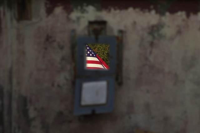
I can't tell for sure what I'm looking at. The flag is nice and clear though. Good luck in the challenge! Grayce aka Gracious |
|
|
|
09/22/2002 06:48:00 PM |
|
Cool effect, somehow it looks like the wall in front is moving. |
|
|
|
09/21/2002 12:04:00 AM |
|
Nice job keeping only the flag in focus. |
|
|
|
09/20/2002 12:35:00 PM |
|
Sorry, I do not see any negative space. |
|
|
|
09/20/2002 03:23:00 AM |
|
What are you looking through? This is kinda cool. I like how the foreground is out of focus. 10 |
|
|
|
09/19/2002 06:19:00 PM |
|
I like this! I'd have liked to see more of the flag, but I like the feel and tone of this image. I espically like the brightness of the flag contrasting with the dullness of the wall. 6 -lennier (more flag might have been a 7 or even an 8) |
|
|
|
09/19/2002 06:17:00 PM |
|
|
|
09/19/2002 03:36:00 PM |
Great photo. Would look good with almost any flag, too! Yes, Neg Space greatly impacts this photo. Nice work (i'm only making quick comments for scores 8+, sorry) 9
Ruthann |
|
|
|
09/19/2002 03:49:00 AM |
|
the flag is a bright spot for me too |
|
|
|
09/18/2002 08:36:00 PM |
oh beautiful for patriot dream that sees beyond the years
thine alabaster cities gleam undimmed by human tears |
|
|
|
09/18/2002 07:18:00 PM |
|
|
|
09/18/2002 08:36:00 AM |
|
Very well done. Focus and lighting are good. Meets the challenge. 8 |
|
|
|
09/18/2002 02:58:00 AM |
|
|
|
09/17/2002 03:27:00 PM |
|
It took a few seconds to figure out what I was seeing here. I really like it. Not sure what I am looking thru to see the flag, however. Good execution of negative space. |
|
|
|
09/17/2002 05:51:00 AM |
Composition: 5 Lighting: good 5,
Appeal: 5, Total Rating 5 Sulamk
|
|
|
|
09/17/2002 05:05:00 AM |
|
I put it one down just because this is the USA flag. This is the most boring subject in my mind ,sorry but thou it is a cool pic |
|
|
|
09/17/2002 05:00:00 AM |
|
Great shot. Hope you're not getting too many comments on too blurry...don't worry, it's not! |
|
|
|
09/17/2002 12:15:00 AM |
|
Nice contrast in colours and focus, I fail to see the negative space though. |
|
|
|
09/16/2002 11:59:00 PM |
|
amazing idea. really nice. must have been difficult to execute. cmcvety. |
|
|
|
09/16/2002 08:04:00 PM |
|
this is nice but i think u should've gone closer... no? |
|
|
|
09/16/2002 07:20:00 PM |
|
|
|
09/16/2002 04:53:00 PM |
|
Nice light.....nice nice. Good luck. Score 6 Justine |
|
|
|
09/16/2002 04:48:00 PM |
|
Do you think the very same image with a japanese flag in it would be of the same value? not to be rude.... |
|
|
|
09/16/2002 02:15:00 PM |
|
great idea and effect 8 sgtpepper6344 |
|
|
|
09/16/2002 12:58:00 PM |
|
Good DOF usage. Great idea. |
|
|
|
09/16/2002 12:54:00 PM |
|
wow.. this is a BEAUTIFUL study in depth of field. The colors of this flag really stand out nicely and grab my attention well. I would score this even higher if the flag was not centered in the frame... good shot! = 8 - jmsetzler |
|
|
|
09/16/2002 03:55:00 AM |
|
Home -
Challenges -
Community -
League -
Photos -
Cameras -
Lenses -
Learn -
Help -
Terms of Use -
Privacy -
Top ^
DPChallenge, and website content and design, Copyright © 2001-2026 Challenging Technologies, LLC.
All digital photo copyrights belong to the photographers and may not be used without permission.
Current Server Time: 06/27/2026 07:08:44 PM EDT.