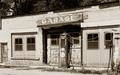
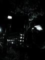
DPChallenge: A Digital Photography Contest You are not logged in. (log in or register
 
Browse Settings
Currently viewing:
Memberawpollard

Show comments:

Per page:

Order:

Comments:


Comments Made by awpollard
Pages:   ... ... [52]
Showing 271 - 280 of ~520
Image Comment
Shearing Dante The Alpaca
02/25/2006 11:29:40 AM
Shearing Dante The Alpaca
by train

Comment:
Greeting from the Critique Club...

Nice approach to providing the viewer with one of the necessities in life that we don't always see. I believe you are using Dante as the subject and not the shearers due to the crop that you have presented us.

Given the situation that you mentioned in your description the lighting and detail is quite nice. The story you are telling doesn't appear to bad a sad one as Dante does not appear to be fussing about.

In general I would have liked to see just a little (just a tad) more of the hands on right and a lot less of the gentlemen on the left. The amount of white from the gentlemans tee-shirt adds an uneven balance to the natural colors that otherwise fill the frame.

As always, when doing a critique, I will download the shot and while perserving what the shooter originally intended, try different things that I might have done and/or to back my observations.

To ease out some of the white on the left of the frame, I tried a 6x4 crop starting just below the stain on the gentleman's sleeve. For me this accomplished several things, the most obvious being a lot less of the white tee shirt, the stain on the sleeve a small but evidant distraction, the dark area (gentleman's black pants) all but removed from the frame and finally places the subjects eye on the bottom left third of the frame.

The only other thing that I might have done, would be to do a tad bit of Dodging of the eye and just below the nose to bring out Dante's expression a bit.

As to sharpness I will always say a bit more sharpness but realize that softness comes a lot of the time from resizing the image. When submit to challenges my last step after the resize is to sharpen one final time.

A very nice shot, highly fitting of the challenge. Great job.

Andy

ED: to note a strange coincidence... Today (after critiquing this in the morning) I went down to Old Town San Diego to shoot the Mormon Infantry celebration... Long story short they had an Alpaca there that was trimmed up nicely as the one you have in this shot. Not to common a a sight in San Diego...

Message edited by author 2006-02-25 20:35:50.
Photographer found comment helpful.
Waiting for Spring
02/25/2006 12:44:56 AM
Waiting for Spring
by brens29

Comment:
Greetings from the Critique Club.

You have presented us with a wonderful minimalist shot here. At first glance one perceives a cold lonely, abandoned feeling of the piece of farm equipment. Very fitting of the Challenge.

Studying the shot in depth, the time of day that this was shot casts a nice shadow that adds to the effect nicely. The angle and placement of the subject are such that it leads us through the frame which makes this simple shot appealing.

If there is a distraction in this shot, for me it would be the footprints in the snow in the upper right corner. Personally, I would rather see no sign of (recent) life in a shot of this nature. As I'm drawn to the subject, my eye picks up those footprints in the corner and wants to bring them to focus taking us past the subject. The snow covered trails add texture/flow but do not draw attention and are integral to the shot.

Finally I would like to see a little more sharpness on this shot. Not only would it add a little pop to the cold steel equipment but I think it would add a little more life to the snow.

Very nice shot and a tough one (snow) to shot... Congrats on a wonderful shoot.

Andy

Ed: Typo

Message edited by author 2006-02-25 00:53:36.
Photographer found comment helpful.
DEATH & The LOVERS
09/11/2005 11:36:55 AM
DEATH & The LOVERS
by mesmeraj

Comment:
Greetings from the critique club.

All the elements and the angle in which the shot was taken make this an excellent composition. There are a few secondary subjects in the shot but the many colors of the Tarot card draw us to those as the main subject. The shot comes across with a less is more feel about it.

The crop provides a well laid out story, I don't believe that I would have done it any differently. The negative space near the top center works wonderfully to force the viewer to sneak a glance at the fortune tellers face every so often.

Many commenters eluded to the light of this shot and you, yourself, pointed out monitor calibration.

When working with dark shots on DPC you really have a small window to work for those who do not calibrate their monitors regularly. I do calibrate mine frequently as I myself have been bitten by the too dark/too light voters.

That being said I think the shot here has very nice lighting that sets the mood that you are trying to convey. However I think that I may have worked the highs/mids just a tad (and I mean tiny bit) to bring up the young lady's face and lighten the white garment to bring the necklace out a bit. At the same time being careful to not lighten the negative space that adds tremendously to the shot.

As I critique these shots I bring them down to my PC and study and adjust without taking away from what I believe the photog intended. In the case of your shot here, the only thing that I might have done differently is to adjust to adjust the highs/mids with the slightest of glow to give it even more mood.

If you have the Virtual Photographer Plug-in for your editor apply the Radiant Filter using the defaults to this and you will can see how a little more softness/light makes the story unfold without sharpening the elements of the shot. The old 50% Transparent Layer + increase the Saturation + Gaussian Blur to that layer trick would also work with shot as well to give us a more somber feeling.

Excellent Composition and Story telling as is...Great Work.

Andy
Photographer found comment helpful.
25 cents a gallon
07/12/2005 12:42:06 AM
25 cents a gallon
by pearlseyes

Comment:
A Friendly opinion from the critique club:

Very nice nostalgic shot. Nice Tones and very sharp/clear throughout.

First I like to look at shots from the DPC world (Challenge/DPC voter Trends) and then look at it from an artistic real world pov...and they are a different in many ways.

Firstly a 5.9 for a first challenge is a great accomplishment, congrats.

IMO two things most likely kept this shot from obtaining a 6.5 or better: Contrast and sub-subjects (all the things to look at besides the pump).

Sometimes less is better depending on the audience that you are trying reach, at DPC less is better and for this particular shot, I think it would hold true from an artistic story telling point of view. There is a lot going on in the shot as it is here; Pump (subject), Sign, Windows, Doors, a wire and the dark trees above the Garage.

The Crop
Perhaps I would have done an 8x10 (landscape) crop starting just to the rigth of the small door on the left all the way over to the center of the Window (on building) to the rigth of the pump.

Cropping in this manner removes a lot of secondary subjects that the eyes pick up and wander towards. The door on the left, half pump (far right), window behind it would be the notable distractions that we don't want the viewer to wander off to, we also make the wire less a distraction and the window to the right of the gas pump is no longer a major object.

This same crop would cut down the amount of dark area above the garage. The Sign and the Pump are no longer centered, which gives the viewer the shot was taken from an angle even though it was not. We also don't allow the viewer's periphrial vision to kick in and wander. When we have a long landscape shot with a subject in the center; the eyes only focus on it for a short while, and then we try to take in everything else is the shot.

The Sign, Pump and Shadow above the Garage door are now the Darkest areas...We have effectively forced the viewer to that area, no wandering...they have to focus on what we have presented them. The two windows on the left balance the shot but are eyes are drawn back to the darker more interesting Pump and Sign.

The Lighting
The tones are a nice add to the shot over a standard b/w, however in the buildings case they tend to be a tad bit monotinous (washed in together) in a basic challenge this would be tough to find that delicate balance between brightening the Shadows (so we could pull just a little more detail at the top of the garage door) and darkening the mids to bring out the bricks and paneling around the windows.

Outside of the Challenge one could Dodge the shadows around the garage door just a teenie tiny bit to bring out detail and burn random areas around the bricks to add dimension to the shot.

One thing that really stands out for me is that there is no white in the shot, doesn't always have to be there but it will help with the feel of a shot like this.

Wow I better go now, I'm starting to mumble...remember these are just my thoughts...

Take care, keep up the great work...

Andy

Window to the outside world.
07/10/2005 06:27:28 PM
Window to the outside world.
by docpjv

Comment:
A Friendly opinion from the Critque Club.

The Candy Coating
As a Virgo, being both Logical and Analytical, I tend to place a lot of emphasis on verticals and horizontals. Here you have met that challenge perfectly. The slightest tilt/lean could throw off the balance of the shot, but your alignment is near perfect. This is a pleasent shot to study and becomes deeper the more one looks at.

Hypnotizing and calculated all at the same time. The lines lead us inward to a door that is nicely situated in the shot.

The Reds and Greens contradict each other nicely, especially being seperated by the hypnotizing detailed artwork on the beams as one gets drawn farther into the shot.

The lighting and tonal qualities appear to be spot on as to what you saw when looking down this corridor. I can only imaging others who have stood in the same spot could not have enjoyed it visually as much as the 3-Dimensional reality that you have captured here.

My Nit Picks:
I like the foundations of the pilars and the almost white cement is fine, but I do tend to be stalled as I am drawn into the shot by the two shadows on the floor where it appears that the cement is missing or broken. Perhaps dodging or ligthening those shadows to a light gray might take some of the abruptness off those shadows, rendering them less a distraction.

From about the middle to the top between the left front pilar and the second pilar I am picking up a hint of the same detailed artwork that is garnishing the beams. It is peeking through and appears as spots to the viewer. I might darken that area to a point that they are no longer a distraction.

My final nit pick and in all reality would be taken care of once the shot is matted, are the green verticals near the very top of the shot. Actually the whole space above the first beam seems to be out of place in my mind. Again a Mounting and Matting this shot should come right down to the top edge of the first beam covering that little distraction. The green verticals between the first and second beams are fine as they seem to blend into the illusion.

Superb shot and one to be very proud of. What would be fun is to print this a 16x20 and put it at the end of a hallway of a drab office space, one for the colors but moreso to give the illusion that the hallway keeps going on.

Andy
Photographer found comment helpful.
Fairy of the Forest
07/08/2005 01:05:07 AM
Fairy of the Forest
by jenesis

Comment:
They can say oh my gosh Brad. No really the first thing that came to mind was Wow when I saw. And just as Brad said the tones and lighting are superb! I really like the lack of color in the shot, couple with the highlights on the faerie this really is a dream.
Photographer found comment helpful.
Slide Rule
07/07/2005 03:02:59 AM
Slide Rule
by janruss

Comment:
A good shot of a great subject for the challenge. What I believe hindered your score on this shot and I don't see mentioned by commentors is the fall off of your DOF. It is a minimalistic shot with complex details (there isn't such a thing I just made that up) plenty of detail from all the lines on the rule.

Beings how the rule nearly fills the frame the slide becomes the major subject and the eye is drawn to the slide, I immediatly notice all the tack sharp lines beneath and around that area. As I study it more my periphial vision quicky spots the softness of the lines at both ends of the rule.

As close as you are to the subject this is a tough shot to pull off with Sharpness throughout. It appears that you have plenty of light, stopping down the aperture possibly as much as f/11 might have prevented the fall off the DOF.

And then the other approach might be to take the shot from an angle to deliberatly have a shallow dof on one end of the rule or other.

Message edited by author 2005-07-07 03:08:19.
Photographer found comment helpful.
Dead Pointe Shoes
07/07/2005 02:32:51 AM
Dead Pointe Shoes
by pidge

Comment:
Excellent concept and a nice composition. IMO there are several things that may have brought your score up.

The first noticable (and I have been bitten by this before I started calibrating my monitor regularly) is the background. I believe it to be black velvet but it has been lightened to an almost dark gray. The negative space is fine but it really needed to be a lot darker to insure that there was nothing but the shoes to look at in the shot. The dull gray along with (another thing I have been bitten by which is lint/specks/cat hair) white specks on the backdrop tend to pop out when one really studies the shot. Both could be remedied by adjusting Luminosity upwards (darker) on the Histogram just to the point where the specks disappear. The other thing I learned is to have a lint brush handy as I have cats and they love black velvet.

The other thing that I would have done and this is even nit pickier...is that if the shoes are to appear dangling (and they do), I would have straightened the shot so that the shoes hung straight down...whether or not was straight as you took it, the human eye sees what it perceives to be right and in this case the shoes seem to be hanging to the left as I view it. Sometimes we need to adjust for the way eyes perceive things.

Subject matter is great and worked well here. The artsy side of me says this would have done exceptional with the same composition but done in a contrasty b/w to add even more age to the shoes.

Just my thoughts.

Message edited by author 2005-07-07 02:44:33.
Photographer found comment helpful.
Darkness is Addiction
06/16/2005 02:00:42 AM
Darkness is Addiction
by Parker

Comment:
This is very cool... The negative color space works well here, kind of like an old bogart movie. This gives the viewer not only darkness but coldness feeling as well. Great job.
Treacherous Path
06/16/2005 01:57:13 AM
Treacherous Path
by LevT

Comment:
I like it a lot...gives one the feeling they are about to decend into the bowels of the earth. Great crop/composition. Excellent Shot. One of my picks.
Photographer found comment helpful.
Pages:   ... ... [52]
Showing 271 - 280 of ~520


Home - Challenges - Community - League - Photos - Cameras - Lenses - Learn - Help - Terms of Use - Privacy - Top ^
DPChallenge, and website content and design, Copyright © 2001-2025 Challenging Technologies, LLC.
All digital photo copyrights belong to the photographers and may not be used without permission.
Current Server Time: 08/06/2025 05:35:39 PM EDT.