| Author | Thread |
|
|
07/12/2005 12:42:06 AM |
A Friendly opinion from the critique club:
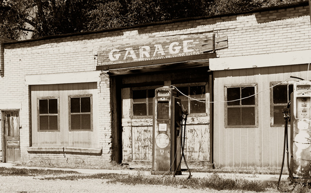
Very nice nostalgic shot. Nice Tones and very sharp/clear throughout.
First I like to look at shots from the DPC world (Challenge/DPC voter Trends) and then look at it from an artistic real world pov...and they are a different in many ways.
Firstly a 5.9 for a first challenge is a great accomplishment, congrats.
IMO two things most likely kept this shot from obtaining a 6.5 or better: Contrast and sub-subjects (all the things to look at besides the pump).
Sometimes less is better depending on the audience that you are trying reach, at DPC less is better and for this particular shot, I think it would hold true from an artistic story telling point of view. There is a lot going on in the shot as it is here; Pump (subject), Sign, Windows, Doors, a wire and the dark trees above the Garage.
The Crop
Perhaps I would have done an 8x10 (landscape) crop starting just to the rigth of the small door on the left all the way over to the center of the Window (on building) to the rigth of the pump.
Cropping in this manner removes a lot of secondary subjects that the eyes pick up and wander towards. The door on the left, half pump (far right), window behind it would be the notable distractions that we don't want the viewer to wander off to, we also make the wire less a distraction and the window to the right of the gas pump is no longer a major object.
This same crop would cut down the amount of dark area above the garage. The Sign and the Pump are no longer centered, which gives the viewer the shot was taken from an angle even though it was not. We also don't allow the viewer's periphrial vision to kick in and wander. When we have a long landscape shot with a subject in the center; the eyes only focus on it for a short while, and then we try to take in everything else is the shot.
The Sign, Pump and Shadow above the Garage door are now the Darkest areas...We have effectively forced the viewer to that area, no wandering...they have to focus on what we have presented them. The two windows on the left balance the shot but are eyes are drawn back to the darker more interesting Pump and Sign.
The Lighting
The tones are a nice add to the shot over a standard b/w, however in the buildings case they tend to be a tad bit monotinous (washed in together) in a basic challenge this would be tough to find that delicate balance between brightening the Shadows (so we could pull just a little more detail at the top of the garage door) and darkening the mids to bring out the bricks and paneling around the windows.
Outside of the Challenge one could Dodge the shadows around the garage door just a teenie tiny bit to bring out detail and burn random areas around the bricks to add dimension to the shot.
One thing that really stands out for me is that there is no white in the shot, doesn't always have to be there but it will help with the feel of a shot like this.
Wow I better go now, I'm starting to mumble...remember these are just my thoughts...
Take care, keep up the great work...
Andy
|
|
|
|
07/06/2005 03:20:04 AM |
Thank you for the comment you were kind enough to leave on my obsolete entry.
It looks as though I need to come to you for help if this is the standard you are starting from. Well done with your first entry. |
|
Comments Made During the Challenge  |
|
|
07/05/2005 07:42:17 PM |
|
This is truly obsolete because the mechanism has been replaced with solid state,so while the pump is basically the same these units are obsolete. Noce nostalgic image. 7 |
|
 Photographer found comment helpful. Photographer found comment helpful. |
|
|
07/05/2005 06:42:51 PM |
The sepia gives this shot an old fashioned, nostalgic feel, but it also causes the subject to blend into the background. I also think the centering of the main gas pump between the garage doors isn't helping the photo either.
Not a lousy photo by any means, however. 6. |
|
| Photographer found comment helpful. |
|
|
07/04/2005 07:16:33 PM |
|
The sepia treatment is a very good choice, and it's a super choice of locations. There's something about the rhythm of the gas pumps against the rhythm of the face of the garage that does not work for me; don't quite know why. I wonder whether the shot would be better if the left door were cropped off and the double doors were between the pumps? |
|
| Photographer found comment helpful. |
|
|
07/04/2005 05:25:34 PM |
|
nice shot but, too washed out for my personal taste. Very nice composition though |
|
| Photographer found comment helpful. |
|
|
07/02/2005 02:05:35 AM |
|
OK....where'd you find this one? I love it. I'd love to play with this one a bit. I'd probably give it a little more contrast in the midtones and I might play with the crop a little. You could crop at the first window on the right and land the pump in a stronger visual position using the grass as leadlines from the corner.. Beautiful composition. This is my kind of picture. |
|
| Photographer found comment helpful. |
|
|
07/01/2005 02:37:58 PM |
|
I like your presentation of the old pump. |
|
| Photographer found comment helpful. |
|
|
07/01/2005 01:04:11 AM |
25 cents? FILL 'ER UP! :)
Great job on the subject and the composition. Lighting could be darker. Nice job overall! |
|
| Photographer found comment helpful. |
|
|
06/29/2005 09:38:49 PM |
|
wonderful! nostalgic! great...! 9 |
|
| Photographer found comment helpful. |
|
|
06/29/2005 04:52:10 PM |
|
Oh, the good 'ol days. Very fitting for the challenge. I'm not sure, though, that I like the angle and the crop. Perhaps getting a little closer and getting more detail of the old gas pump would have been better. The sepia tone is fitting here. Good luck 8 |
|
| Photographer found comment helpful. |
|
|
06/29/2005 04:25:53 PM |
|
nice rustic shot. Garage sign and pump are too centered however. would've been more effective if left side was cropped about 1 1/2 inches. |
|
| Photographer found comment helpful. |
|
|
06/29/2005 08:03:40 AM |
|
seems a little over exposed, washed out. Like the image though. |
|
| Photographer found comment helpful. |
|
|
06/29/2005 07:11:51 AM |
|
| Photographer found comment helpful. |
Home -
Challenges -
Community -
League -
Photos -
Cameras -
Lenses -
Learn -
Help -
Terms of Use -
Privacy -
Top ^
DPChallenge, and website content and design, Copyright © 2001-2026 Challenging Technologies, LLC.
All digital photo copyrights belong to the photographers and may not be used without permission.
Current Server Time: 06/28/2026 06:08:21 AM EDT.