| Image |
Comment |
| 05/03/2005 07:00:40 PM |
Running spiderby SpirievComment: The photo has a late night "surprise!" feel to it. The colors and detail are muddy and the lighting too dim yet harsh. But your composition is solid if those oher elements were fixed - I like how blocky the frame is laid out. |
| 05/03/2005 06:59:24 PM |
Camouflageby mb27Comment: I think the composition is a bit too muddled with all the different types of lines going through (the branches and sticks). If it were the same tree and same type of lines, I think it would help the minimalism (reducing the elements). The photo looks oversharpened. |
 Photographer found comment helpful. Photographer found comment helpful. |
| 05/03/2005 06:57:51 PM |
Floatby sailracer_98Comment: I really wanted to like this photo more. I like the idea of it, but the colors just aren't compelling enough to draw me in. The fluorescent floater just doesn't pop for me. I like that you caught such a glassy reflection. |
| Photographer found comment helpful. |
| 05/03/2005 06:55:41 PM |
Did that guy just take my picture?by kelstertxComment: The backlight seems blown out and makes the squirrel appear fuzzy. The composition isn't really minimalist, but I do appreciate the squirrel's casual pose with his paw up on the tree. |
| 05/03/2005 06:54:03 PM |
Sneaking a Peakby Nikolai1024Comment: It's an interesting idea - the composition is well done, the door and frame seem to disappear as the viewer focuses completely on what they can see through the crack in the door. There seems to be a bit of noise in teh photo, especially in the expanses of gray. The red towel is a nice plus. |
| Photographer found comment helpful. |
| 05/03/2005 06:52:39 PM |
Guardian Angelby eyjoComment: The saturation of color is really fun. The composition is a little off to my eye, the steeple needs to be in or out a bit more to be balanced. |
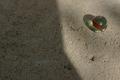
| 05/03/2005 06:51:25 PM |
Crystal, stone and lightby rbennyComment: I thought about marbles on concrete as a subject and was happy to see you chose it as a subject. It's a nice marble and the strip of red in it is a great flash of color for this otherwise monotone picture. I'd like to see it a little more saturated. I'm not sure the dark and light helps the composition in this photo. |
| Photographer found comment helpful. |
| 05/03/2005 06:49:42 PM |
Cool and Refreshing....by singsunshineComment: A very interesting take on this challenge, I like how the bottle has changed color and shape to play upon our expectations of what a coke bottle should look like. |
| Photographer found comment helpful. |
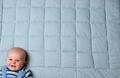
| 05/03/2005 06:48:45 PM |
Big Blue Blanketby -crtComment: I like the idea of an off centered composition with the kid on a blanket. I'm not sure about the gingham though, it seems to demand too much attention. Did you try having the baby in the frame a bit more, or less background? |
| 05/03/2005 06:47:43 PM |
Stay Awayby lebowskiComment: I like the contrast of the stark background and the spiky thorns. I think I'd like to see more of the subject in the frame, they're just a little too cut off for a pleasing composition for my taste. |
Home -
Challenges -
Community -
League -
Photos -
Cameras -
Lenses -
Learn -
Help -
Terms of Use -
Privacy -
Top ^
DPChallenge, and website content and design, Copyright © 2001-2025 Challenging Technologies, LLC.
All digital photo copyrights belong to the photographers and may not be used without permission.
Current Server Time: 08/04/2025 12:32:30 PM EDT.