| Author | Thread |
Comments Made During the Challenge  |
|
|
05/03/2005 11:00:10 PM |
|
like the subject. I keep wanting to se emore light on the foreground, but the white gives it a wintery look, so maybe more light would change the mood. |
|
|
|
05/03/2005 06:47:43 PM |
|
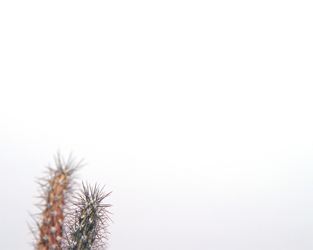
I like the contrast of the stark background and the spiky thorns. I think I'd like to see more of the subject in the frame, they're just a little too cut off for a pleasing composition for my taste. |
|
|
|
05/01/2005 10:26:28 PM |
|
|
|
05/01/2005 03:02:17 PM |
|
|
|
04/30/2005 07:46:19 PM |
|
Cactus on white. You are concentrating on the composition on the photo it seems. The subject is uninteresting. |
|
|
|
04/30/2005 12:44:08 PM |
|
maybe using a bigger aperature value would make both pricklies stand out, and in focus, interesting though, 5 |
|
|
|
04/30/2005 03:42:18 AM |
|
Nice framing for the challenge |
|
|
|
04/29/2005 05:06:45 PM |
Groovy
Wouldn't want to touch that, I think your image has done its job :-) |
|
|
|
04/29/2005 02:48:09 AM |
|
Excellent...it would be nice if both pieces of cactus were in focus. |
|
|
|
04/29/2005 02:06:14 AM |
|
yes, there is something I quite like about this one, composition perhaps :) |
|
|
|
04/29/2005 12:45:28 AM |
|
These shots seem forced, now - perhaps just a function of seeing so many so quickly. It doesn't ... well, tell me anything ... just doesn't seem apt to the subject; it feels like taking an image and then putting it in an expanse of white(ish). Obviously technically adept stuff; I just can't see it as an organic image. |
|
|
|
04/28/2005 05:26:28 PM |
|
|
|
04/28/2005 12:51:05 AM |
|
I really like the idea, I think it might have been a little better if both of the cacti (cactuses? hehe) were in focus... nice picture all the same |
|
|
|
04/27/2005 03:36:01 PM |
|
I like it!!! The more faded cactus gives a nice, unique look to this. Definitely minimal, but very appealing -- and I don't even like cactus. But I like this a lot :) |
|
|
|
04/27/2005 01:39:00 PM |
|
I dont see any relationship with the negative space. Add a finger or something in the upper right to connect them |
|
|
|
04/27/2005 10:43:35 AM |
|
second cacti is distracting...might have been better if both were in focus or used only one |
|
|
|
04/27/2005 08:05:26 AM |
|
Home -
Challenges -
Community -
League -
Photos -
Cameras -
Lenses -
Learn -
Help -
Terms of Use -
Privacy -
Top ^
DPChallenge, and website content and design, Copyright © 2001-2026 Challenging Technologies, LLC.
All digital photo copyrights belong to the photographers and may not be used without permission.
Current Server Time: 06/28/2026 08:37:20 AM EDT.