| Author | Thread |
Comments Made During the Challenge  |
|
|
05/03/2005 11:15:11 PM |
|
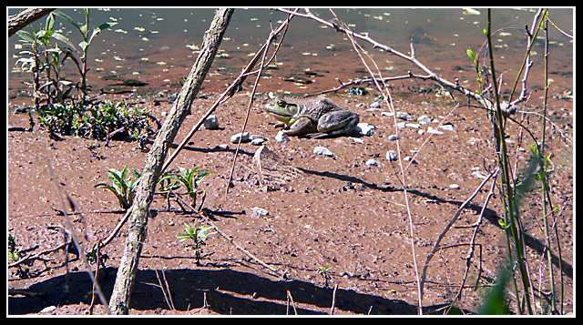
The shot seems too 'busy' for a minimalist theme. 4 |
|
|
|
05/03/2005 06:59:24 PM |
|
I think the composition is a bit too muddled with all the different types of lines going through (the branches and sticks). If it were the same tree and same type of lines, I think it would help the minimalism (reducing the elements). The photo looks oversharpened. |
|
 Photographer found comment helpful. Photographer found comment helpful. |
|
|
04/29/2005 10:23:45 PM |
|
looks a bit too bright, but a good capture. |
|
| Photographer found comment helpful. |
|
|
04/29/2005 07:30:06 PM |
This is too crowded picture to be minimalism, the picture isn't clear enough either, but I have to admit that I would like to be there, in my country there are no frogs:-(
The trees out of the way and the frog low to the right on the picture would have made it much better. Best wishes for continuing photograpy! |
|
| Photographer found comment helpful. |
|
|
04/29/2005 11:41:03 AM |
|
The frog is good,the foreground is a bit too busy for my taste. |
|
| Photographer found comment helpful. |
|
|
04/28/2005 10:23:52 PM |
|
Nice shot, seems a little over sharpened. |
|
| Photographer found comment helpful. |
|
|
04/28/2005 01:49:14 PM |
|
looks a little over exposed |
|
|
|
04/28/2005 12:20:37 PM |
|
the sticks looks like a bit blurry and the and the grass in the right hand corner is blurry |
|
|
|
04/28/2005 10:25:07 AM |
|
Great pic of the frog (toad?), but the image is a little too busy for me. Would have worked better for me without the sticks/brush in the foreground, but I know that sometimes that's the only way to get one of these shots. |
|
| Photographer found comment helpful. |
|
|
04/27/2005 10:21:44 PM |
|
Sorry, but this looks way over-processed and unnatural. Also, it would benefit to move the subject off from dead center. |
|
|
|
04/27/2005 09:34:32 PM |
|
It looks like too much contrast. Just a bit too busy with the branches for minimalism. |
|
|
|
04/27/2005 05:07:43 PM |
|
took me a second to find it, well done. |
|
| Photographer found comment helpful. |
|
|
04/27/2005 04:36:51 PM |
|
Nice shot. I like how the branches frame the subject. This would feel cluttered if that were not the case. |
|
| Photographer found comment helpful. |
|
|
04/27/2005 04:17:00 PM |
|
A little on the bright side, could benefit with some curve work in an editing program. Also, the border doesn't really suit it well |
|
|
|
04/27/2005 04:58:29 AM |
|
The color selection on this is really awful, and the result conceals the subject and hurts the eyes. |
|
Home -
Challenges -
Community -
League -
Photos -
Cameras -
Lenses -
Learn -
Help -
Terms of Use -
Privacy -
Top ^
DPChallenge, and website content and design, Copyright © 2001-2026 Challenging Technologies, LLC.
All digital photo copyrights belong to the photographers and may not be used without permission.
Current Server Time: 06/30/2026 02:22:02 PM EDT.