| Image |
Comment |
| 10/25/2006 01:09:38 PM |
Portraitby steveh552Comment: The expression on this boys face is awkward...as if it were caught at the wrong moment. I like the almost sepia toning...but it doesn't really go far enough for me, rather it leaves his skin looking oddly toned. Still puzzling over why the fireplace is not plumb.... |
 Photographer found comment helpful. Photographer found comment helpful. |
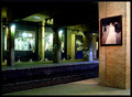
| 10/25/2006 10:10:32 AM |
Aloneby anotherdayComment: Every time I look at this image (and so far that's at least 5) I like it more! the image of the lonely woman in a stark station just works. The color blocking throughout proves pleasing in composition. Nice mood and sense of place! |
| Photographer found comment helpful. |
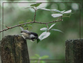
| 10/25/2006 07:38:57 AM |
A little snackby derekmartinigComment: I love the pose on the chickadee! Unfortunately there's much here that detracts from my enjoyment of the image. The border comes too far into the image robbing the power from the line of the rose branch. The feathers on the chickadee are unsharp and the highlights on the leaves steal undo attention. I really want this image to work for me because the pose is so wonderful... |
| 10/25/2006 07:33:45 AM |
|
| Photographer found comment helpful. |
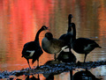
| 10/25/2006 07:30:44 AM |
On Golden Pondby NoellaSueComment: Seems underexposed...I think you needed to go one way or the other with the geese, make them into a silhouette or bring up the exposure so the details in the shadows aren't lost. Wonder what those refections really looked like...seems that there was some interest to be had there. |
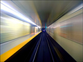
| 10/24/2006 06:23:15 PM |
Train in Vainby Rae-AnnComment: Lovely! You've taken the viewer to an unusual place! While this type of image often leaves me feeling dizzy this one doesn't...the graphic lines have a wonderful power. |
| Photographer found comment helpful. |
| 10/24/2006 06:21:08 PM |
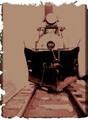
FADED MEMORIESby shutterbug8Comment: I love the artistic treatment of this image! Perfectly 19th century! Well, almost perfect...wondering why you chose not to carry the edge effect onto the right side of the frame... Nonetheless one of my highest votes goes to you. |
| Photographer found comment helpful. |
| 10/24/2006 06:00:54 PM |
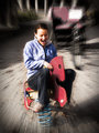
Me and My Boy!by scarbrdComment: Cute pic! Tell me, though, why are you two the only ones having a good time at the air show? |
| Photographer found comment helpful. |
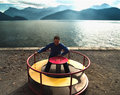
| 10/24/2006 01:46:30 PM |
Lake of Luzern Fun 2by Noel_ZHComment: Removing halo effect helps...I'd still burn the heck out of those columns in the background and the square white card on the bike...but that's just me. |
| Photographer found comment helpful. |
| 10/24/2006 01:42:26 PM |
Lake of Luzern Fun 1by Noel_ZHComment: Originally posted by Noel_ZH:
KaDi, thanks for the comments, very good point. I've now lasso'd the face, duplicated, set to overlay 30%, and I'm quite satisfied with that (definitely looks a lot better!). Not sure what you're asking in relation to how I'm doing it, let me know what specifically and I'll try my best to explain :) Thanks again!
ps: reuploaded up the image with the new one. |
You've already explained...in this case you made a selection (face) and set the layer to overlay....different from the method I describe but that's fine with me. I've noticed that there are many different approaches to dodge and burn...I'm just curious how other people go about it.
ps: look better...not overdone at all |
| Photographer found comment helpful. |
Home -
Challenges -
Community -
League -
Photos -
Cameras -
Lenses -
Learn -
Help -
Terms of Use -
Privacy -
Top ^
DPChallenge, and website content and design, Copyright © 2001-2025 Challenging Technologies, LLC.
All digital photo copyrights belong to the photographers and may not be used without permission.
Current Server Time: 08/26/2025 09:53:47 PM EDT.