| Image |
Comment |
| 11/27/2006 12:28:38 PM |
|
 Photographer found comment helpful. Photographer found comment helpful. |
| 11/27/2006 12:27:31 PM |
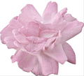
Pretty In Pinkby TheresaAComment: I think the composition is what hurts this most. Centering the subject creates a stagnant composition in this case especially because the subject itself has no point of interest in itself. The lighting feels flat. And the merging with the edges of the frame makes this feel uncomfortably squeezed. |
| Photographer found comment helpful. |
| 11/27/2006 12:24:04 PM |
Blue on Whiteby xianartComment: The tones in the skin are unappealing to me. The dark wisp of hair at the edge of the face is a distraction...a slightly different angle could have eliminated that and also might have provided a more interesting curve to the side of the face. |
| Photographer found comment helpful. |
| 11/27/2006 12:22:24 PM |
Ice Blueby JutildaComment: What keeps this from being successful, in my opinion, is the loss of detail in the brightest parts of the cat (forehead and one side of the face) as well as the lack of crispness in the eyes. Would be more appealing with a less stunned expression and some connection between subject and viewer rather than gazing out of the frame. |
| 11/27/2006 12:20:02 PM |
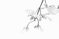
Delicateby pidgeComment: The orchid merges with the background and so loses its form. I don't like the way it merges with the frame on the right and wonder why you chose to compose it so. |
| Photographer found comment helpful. |
| 11/27/2006 12:18:59 PM |
A light mealby beafliesComment: I like the idea and the composition. I think I'd like it more if there were a bit more fill lighting as the shadows seem a bit heavy without reason. |
| 11/27/2006 12:18:56 PM |
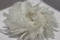
Hurricaneby nards656Comment: Other than a wreath of feathers, I'm not sure what this is or why I should be interested in it. |
| Photographer found comment helpful. |
| 11/27/2006 12:18:11 PM |
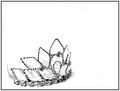
Simplicityby xXxscarletxXxComment: The shadows compete with the form of the tiara. It also seems that this could have been more carefully composed so that the object could be enjoyed more. Not sure what all that white space does for it. |
| Photographer found comment helpful. |
| 11/27/2006 12:18:09 PM |
|
| Photographer found comment helpful. |
| 11/27/2006 12:18:04 PM |
Angelby rkligmanComment: With the harsh shadows on the inside of each wing it appears you've blurred out the shadows cast by the object on the background. The thing itself is an interesting piece of art but I faill to see what you've brought to its interpretation. |
| Photographer found comment helpful. |
Home -
Challenges -
Community -
League -
Photos -
Cameras -
Lenses -
Learn -
Help -
Terms of Use -
Privacy -
Top ^
DPChallenge, and website content and design, Copyright © 2001-2025 Challenging Technologies, LLC.
All digital photo copyrights belong to the photographers and may not be used without permission.
Current Server Time: 08/26/2025 12:27:01 PM EDT.