| Author | Thread |
|
|
12/08/2006 07:51:44 AM |
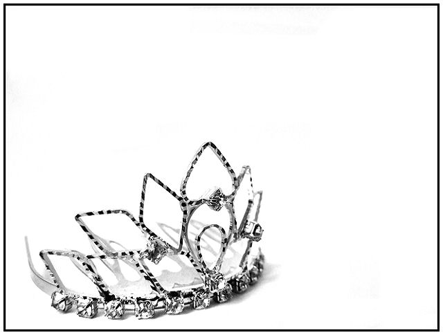
IMHO, <--i must add this because Im an idiot. LOL. People like photos that they can relate too, or at least that they can imagine to relate to. This tells no story at all, hence is completely unrelatable to most.
How come I got this feeling, you knew all of this upon entering.
|
|
 Photographer found comment helpful. Photographer found comment helpful. |
|
|
12/04/2006 05:34:45 AM |
even if those were shadows, I'd still like their inclusion. shadows are good....they add depth...no idea why so many people, including a couple I really respect, think they detract, because without that additional form this shot would be fantastically 2-dimensional.
of course, that's just my opinion and I've been told many times I don't have a clue what I'm talking about. *shrug* |
|
| Photographer found comment helpful. |
Comments Made During the Challenge  |
|
|
11/30/2006 11:39:34 PM |
|
Good idea, nicely put together. The shadows are somewhat distracting from the whole "simplicity" concept. ~7 |
|
| Photographer found comment helpful. |
|
|
11/30/2006 01:47:51 PM |
|
Really like this shot, the sharpness and clarity of the picture really make it work. Nice job... |
|
| Photographer found comment helpful. |
|
|
11/30/2006 09:25:06 AM |
|
Simple is good. :D I don't know if it's the subject itself that makes it appear to be a little soft, but the leading edge of the tiara (sp?) isn't as sharp as I thought it would be (leading edge meaning the part where the large bottom jewels meet the material they are resting on). The high center point seems to be where this photo is the sharpest, but my eye is drawn to the lower left first. Anyway, sorry for the long ramble. I still like this entry for it's simplicity. Good luck in the challenge. |
|
| Photographer found comment helpful. |
|
|
11/28/2006 12:17:22 PM |
|
I like this, but I think I would have liked it better without the shadow. I think a light from the other side would have taken care of that? |
|
| Photographer found comment helpful. |
|
|
11/28/2006 05:19:02 AM |
|
i like the bold lighting on this |
|
| Photographer found comment helpful. |
|
|
11/27/2006 12:18:11 PM |
|
The shadows compete with the form of the tiara. It also seems that this could have been more carefully composed so that the object could be enjoyed more. Not sure what all that white space does for it. |
|
| Photographer found comment helpful. |
|
|
11/27/2006 03:27:23 AM |
|
The shadows spoils this, the angle & crop are nice though |
|
| Photographer found comment helpful. |
Home -
Challenges -
Community -
League -
Photos -
Cameras -
Lenses -
Learn -
Help -
Terms of Use -
Privacy -
Top ^
DPChallenge, and website content and design, Copyright © 2001-2026 Challenging Technologies, LLC.
All digital photo copyrights belong to the photographers and may not be used without permission.
Current Server Time: 07/16/2026 12:30:57 AM EDT.