| Image |
Comment |
| 10/21/2013 08:04:50 PM |
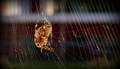
Charlotte's Webby DanaSComment: I'm afraid it's a little too literal for me. A good try on a hard one though.5. |
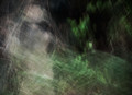
| 10/21/2013 08:03:25 PM |
"A River Runs Through It" by Norman Maclean by rjksteschComment: For someone who doesn't like over saturation, this one has my attention, even if it leans to the left ;) It's a great composition and quite a vibrant and wild scene, what I imagine the novel is like (with my little knowledge of it).6. |
 Photographer found comment helpful. Photographer found comment helpful. |
| 10/21/2013 07:53:04 PM |
|
| Photographer found comment helpful. |
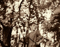
| 10/21/2013 07:36:44 PM |
The Bell Jarby grahamgatorComment: Sylvia's roman à clef, quite a beautiful scene of fragility and captivity. As an inspiration of the novel it is quite good if not literal. Technically mostly pleasing, while composition off centre is preferred the space on the left is empty and feels that way. Nicely done otherwise.5. |
| Photographer found comment helpful. |
| 10/20/2013 09:27:09 PM |
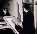
The Picture of Dorian Gray by mrchhasComment: A great interpretation, this selection really does benefit from a real model in the shot. Props are great, the use of mono very supportive of the novel theme. I would have cropped the right a lot closer to the model but that's only a minor issue. Good work.8. |
| Photographer found comment helpful. |
| 10/20/2013 09:25:01 PM |
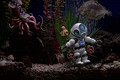
War of The Worldsby MondComment: Does have a great sci fi look, I imagine you toned it , so that helps as well. Good use of lateral presentation to support your interpretation. More about the technology than the invasion.6. |
| 10/20/2013 09:22:08 PM |
Lord of the Fliesby posthumousComment: Great location and bokeh, maybe if you had the boy's shirt off and some tribal marking it would have added to the atmosphere. Toning is great, like the composition and his look supports the story. 7. |
| Photographer found comment helpful. |
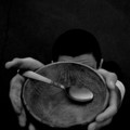
| 10/20/2013 09:19:11 PM |
Oliver Twistby GeneralEComment: I like the grungy feel, maybe a wooden spoon would have been better. Has potential though. The fringing is a little distracting, as is the white dot up top, and the blotchy finger is strange ;) I like the film effect you've produced, looks like a 60's Life magazine shot.6. |
| Photographer found comment helpful. |
| 10/20/2013 09:15:08 PM |
Don Quixote (de la mancha) by HarlequinComment: Probably need a bit more in the composition to push it into a larger interpretation of the novel. I like the mono, but it is a little flat in the lighting. It has an old world feel and I like the angle you have chosen.5. |
| Photographer found comment helpful. |
| 10/20/2013 09:13:16 PM |
|
| Photographer found comment helpful. |
Home -
Challenges -
Community -
League -
Photos -
Cameras -
Lenses -
Learn -
Help -
Terms of Use -
Privacy -
Top ^
DPChallenge, and website content and design, Copyright © 2001-2025 Challenging Technologies, LLC.
All digital photo copyrights belong to the photographers and may not be used without permission.
Current Server Time: 08/16/2025 06:15:27 PM EDT.