| Author | Thread |
Comments Made During the Challenge  |
|
|
10/22/2013 10:44:53 AM |
cannot vote on this due to TPL rules.
I hope this scores well for you |
|
|
|
10/21/2013 06:46:51 PM |
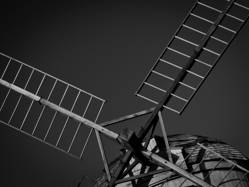
Initial Reaction: Windmill...
Suitability for Challenge Topic: Tilting at windmills.. Hmm... Figurative, but directly related to the text.
Aesthetic: A little bit low contrast, and a touch soft. Tilted composition works here, and not just because of "tilting at windmills"..
Needs Work: Exposure/contrast
Final Thoughts: While this doesn't really tell me a story, it is at least applicable.
Score: 6 |
|
|
|
10/21/2013 03:01:27 PM |
|
3...I get it, the windmill. The 3 is for that flat and lifeless B&W conversion and a meh composition. There is no energy here. |
|
|
|
10/21/2013 11:05:54 AM |
Windmills? Check! Tilting? Check! Of course, when they talk about Don Q "tilting at windmills" they are describing him attacking with a lance, as in "jousting", but what the heck. I'm amused.
Photographically, sort of "meh" but still intriguing in a matter-of-fact way.
You get a 6 from me... |
|
|
|
10/20/2013 09:15:08 PM |
|
Probably need a bit more in the composition to push it into a larger interpretation of the novel. I like the mono, but it is a little flat in the lighting. It has an old world feel and I like the angle you have chosen.5. |
|
 Photographer found comment helpful. Photographer found comment helpful. |
|
|
10/19/2013 08:24:29 PM |
|
a nice tilt. a thick darkness, spare graphics, a bit bleak, almost dull, which is not bad in itself but missing the twist. 4 |
|
| Photographer found comment helpful. |
|
|
10/19/2013 01:17:59 PM |
|
Windmills in his mind. I like the point of view here as seen by the knight - a target for his lance. Technically, it's a little dull - some processing to bring out contrast and details would help. I give it a 7 for content, a 6 for composition and a 5 for technique. Result: 6 |
|
| Photographer found comment helpful. |
|
|
10/18/2013 09:44:11 PM |
|
I have not read the book, but I've seen enough pictures to know the windmill is a tie in. Image wise, I like the framing of this shot and the staggered greys. Well composed. 7 |
|
| Photographer found comment helpful. |
|
|
10/18/2013 07:30:23 PM |
I like the lighting and the composition.
Gave it an 8 |
|
| Photographer found comment helpful. |
|
|
10/18/2013 12:26:51 AM |
|
| Photographer found comment helpful. |
|
|
10/17/2013 04:34:46 PM |
|
The connection between Don Quixote and windmills is obvious, so you can be neither punished nor rewarded for it. The composition is close-up with the paddles going out of frame, which is good, but I'm not a fan of the orb in lower right... I don't think anything is counterbalancing it. It "grounds" your image too much. 4 |
|
| Photographer found comment helpful. |
|
|
10/17/2013 11:41:37 AM |
|
It does depict the windmill but it lacks the fight. It also appears to be a replica and looses authenticity. The composition is fine but the whites are to dim hence lacking contrast. 4 |
|
| Photographer found comment helpful. |
|
|
10/17/2013 10:22:52 AM |
|
The tilted angle of the top of the windmill(?) is a little odd... I would have liked to had seen a more "straightened" shot... and it's a lot of "grays" rather than black and white. But theres good clarity. I gave it a 4 |
|
| Photographer found comment helpful. |
|
|
10/17/2013 06:57:03 AM |
|
Works ok, but the crops weird and it looks underexposed.4. |
|
| Photographer found comment helpful. |
|
|
10/17/2013 05:53:51 AM |
|
| Photographer found comment helpful. |
|
|
10/16/2013 09:45:44 PM |
|
Interesting composition and perspective! It works, I like it. Lighting seems a little flat though, wish there was more dynamic range though...some more prominent highlights as it's coming off a little flat for me. |
|
| Photographer found comment helpful. |
|
|
10/16/2013 07:46:13 PM |
Tilting at windmills!
Wonderfully done! Love the composition, the processing, the angle and all
9 (for now) |
|
| Photographer found comment helpful. |
Home -
Challenges -
Community -
League -
Photos -
Cameras -
Lenses -
Learn -
Help -
Terms of Use -
Privacy -
Top ^
DPChallenge, and website content and design, Copyright © 2001-2026 Challenging Technologies, LLC.
All digital photo copyrights belong to the photographers and may not be used without permission.
Current Server Time: 06/30/2026 09:53:06 PM EDT.