| Image |
Comment |
| 09/03/2006 08:46:31 PM |
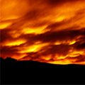
Fire Skyby beetleimagesComment: it is small. sorry for all the comments you are getting on it. I know I'd be really bummed if something like this happened to me. |
| 09/03/2006 08:44:28 PM |
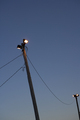
light.by rethsComment: didn't see the movie, not scoring on that. Yes it is a light but is it interesting? You might want to think about the next questions.
Is there a reason I would want to look at this instead of looking out my own door and seeing a real light?
What can you do to make it so it's not something I see many times everyday?
How can you make it new to me?
|
| 09/03/2006 08:31:13 PM |
|
| 09/03/2006 08:26:17 PM |
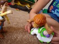
I'd like you to meet Brusier Woods (Legally Blonde)by WildpurpleComment: didn't see the movie, not scoring on that. The full frontal on-camera flash is not your friend. Look at his poor eyes. Look at the huge shadow behind him. These are things we try to avoid by not using the on-camera flash. No good ever comes from relying on that as your single light source.
If you have time, go read Cindy's thread on studio lighting.
He's a cute pup. |
 Photographer found comment helpful. Photographer found comment helpful. |
| 09/03/2006 08:11:26 PM |
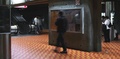
The Jackal - Is that Richard Gere?by lambie83Comment: The centered composition makes the picture static. It might have had some drama if it was composed so that only the koisk and person was in the frame. The other people do not add anything to the story. If the person was running and the other people were looking at him in shock, then they would add to the story. |
| Photographer found comment helpful. |
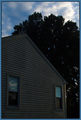
| 09/03/2006 07:59:01 PM |
Monster Houseby sfarrell23Comment: I didn't see this movie so I'm not voting on that part of the challenge. The picture is dark which is ok to set the mood for monsters but the blue sky contrasts too much to make the house look scary. Instead I find I am just looking at a house that looks like any house in my neighborhood. |
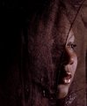
| 09/03/2006 07:54:08 PM |
Boundby gjumiComment: I didn't see the movie so I didn't score you on that part. Picture wise, the dof throws me off. The blurry forground isn't attractive. Maybe if the dof were reversed it would give more dimension to the shot. I like the colors and high contrast processing but the grainyness detracts because it looks like a small crop was done from a larger picture. Not saying it was, just what it looks like to me. |
| Photographer found comment helpful. |
| 09/03/2006 04:08:12 PM |
Veiledby brizmamaComment: I hope you don't take this down anytime soon. It is beautiful. I can see this hanging some place as a huge print. Billboard size. It's not just a portrait, it's fine art. |
| Photographer found comment helpful. |
| 09/02/2006 09:52:39 PM |
untitledby Bear_MusicComment: commenting, not voting. I love the graphic way this looks. More like a block print. I don't know if it was created in camera or pp. It is nice though. |
| Photographer found comment helpful. |
| 09/02/2006 09:48:25 PM |
Meltingby LjonComment: just commenting, not voting. This is lovely. love the color and composition. If I remember after the challenge ends, I will choose as a favorite. Can't do that on this page. |
| Photographer found comment helpful. |
Home -
Challenges -
Community -
League -
Photos -
Cameras -
Lenses -
Learn -
Help -
Terms of Use -
Privacy -
Top ^
DPChallenge, and website content and design, Copyright © 2001-2025 Challenging Technologies, LLC.
All digital photo copyrights belong to the photographers and may not be used without permission.
Current Server Time: 08/26/2025 04:55:01 PM EDT.