| Image |
Comment |
| 11/27/2003 07:27:45 PM |
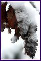
Smell-lessby kinksComment: The leaves look splotchy. I might have tried to focus on the tip of the front leaves and had a little more dof. Not trying to mean or anything. |
 Photographer found comment helpful. Photographer found comment helpful. |
| 11/27/2003 07:08:59 PM |
Love it or hate itby jonpinkComment: Lighting and composition great. I think I would like to see more dof, but it's your picture, so I guess you liked it that way. |
| 11/27/2003 07:05:33 PM |
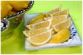
Lemon-fresh Scentby HRoxasComment: The colors and composition are very pleasing. Yes. My saliva glands are now open! Good job. The green background adds a nice touch. |
| Photographer found comment helpful. |
| 11/27/2003 06:36:24 PM |
|
| Photographer found comment helpful. |
| 11/27/2003 06:34:31 PM |
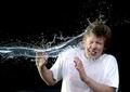
Splash! by arnitComment: Let me join the masses. How could this not win! 10
I do feel that he should have changed tees after every attempt! Seeing that his shirt is wet, but the water is just barely hitting him sorta destroys the illusion. But that isn't trying to take anything away from the shot. It's perfectly excellent. |
| Photographer found comment helpful. |
| 11/27/2003 06:16:11 PM |
It's not always what you expectby Bela45Comment: Nice set up. The only thing I don't like about it, is the oversharpening. Way too much. The white lines almost destroy all the hard work you did to set up the shot. 7 |
| Photographer found comment helpful. |
| 11/27/2003 06:10:17 PM |
Daaaad!!by cbellerComment: Funny. I like it and can hear the kid saying that! That's a pretty mean thing to do to a defenseless kid with his peepee hanging out! But it worked.lol |
| Photographer found comment helpful. |
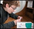
| 11/27/2003 06:06:43 PM |
Unexpected Birthday Surpriseby ColeyComment: You are on the right path. Not that I'm good at set ups, but concerning this picture, here is what I would change to make it more "real". The test box is placed to square in the composition. The Happy birthday sign is too big and obvious. Buy, make or use an old card and place it somewhere within the scene where it looks casual. The lighting is good and I like the expression as the model looks at the results. Use some more props such as pens, papers, electronics, so the scene doesn't look to sterile(pun not intended) and unused. It looks oversharpened also. |
| Photographer found comment helpful. |
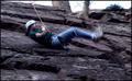
| 11/27/2003 05:44:48 PM |
This Wasn't Supposed to Happen!by DiamondPeteComment: I don't mind that the climber is in motion, but the whole picture has has motion blur. If you were trying to do a panning shot, the climber should be in focus and the rocks more blurred. |
| Photographer found comment helpful. |
| 11/26/2003 07:56:36 PM |
BRAND NAMES ONLY!!!by NeuferlandComment: Pretty creative. You really went outside on this. I like the pastel colors and how it looks like it's under glass. Maybe if your daughter was a little more visible? It does look like pop art though. |
| Photographer found comment helpful. |
Home -
Challenges -
Community -
League -
Photos -
Cameras -
Lenses -
Learn -
Help -
Terms of Use -
Privacy -
Top ^
DPChallenge, and website content and design, Copyright © 2001-2025 Challenging Technologies, LLC.
All digital photo copyrights belong to the photographers and may not be used without permission.
Current Server Time: 08/28/2025 08:08:01 AM EDT.