| Image |
Comment |
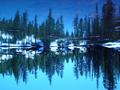
| 05/17/2002 11:32:00 AM |
Eleanor lakeby DominicComment: Nice reflection. While the blues of sky and water are great and really give a good feel of cold to the scene, I think maybe the picture has a bit too much blue (in terms of tint, not the actual amount of blue things in the scene). Both trees and snow seem to have a blue tint to them that I would personally like to see toned down. |
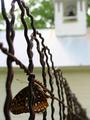
| 05/16/2002 02:39:00 PM |
Butterfly Restingby indigo997Comment: Difficult shot. Always got to get the bugs before they go away. I wish I could see more of the butterfly's head. Like the depth of field. the dark portion of the building up in the UR corner draws my eye a little bit. I think the best comment I can make would be to have shot from the other side of the fence -- obscure the back side of the butterfly, but not the head. Maybe use a piece of white paper to bounce a little light onto the b's wing. |
 Photographer found comment helpful. Photographer found comment helpful. |
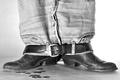
| 05/15/2002 01:28:00 PM |
dang... by iraeComment: The loose change is a perfect touch. A personal preference would be to make this just a touch more contrasty (in particular, the shadows a bit darker). The only real "flaw" I can see is relatively minor. The lighting on the right hand is stronger than on the left. (All I can see is white on the right, but I can see background on the left.) |
| Photographer found comment helpful. |
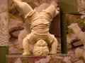
| 05/19/2002 03:49:00 PM |
Upside Down Dudeby tacoComment: The lighting on this seems a little too dark and perhaps a bit yellow. The focus on sculpture also seems a little soft -- I can't tell if that's an out of focus problem, or a lower end camera problem. I think a tighter, vertical crop would have helped focus on the statue and less on all the other things (the toes at the bottom, the other statue to the right, etc). |
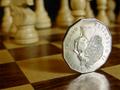
| 05/16/2002 02:36:00 PM |
Queen's Gambitby jmsetzlerComment: OK, this is going to sound hypercritical (like I couldn't think of anything else to say) and in some respects, I guess it is. I can't see anything about the photo I would "fix". Nice focal depth, good lighting and contrast, etc. But the photo as a whole just doesn't do it for me. That's not doing anything to my score (it's very high), but I thought you might like to know.That's just a personal thing and you are certainly welcome to ignore it. |
| 05/13/2002 09:27:00 PM |
nightmare on sesame streetby clayComment: Yup, I'm one of the lame-os who doesn't get the challenge aspect of it. (Elmo looks more like he's on his side than upside down. Or is it the idea that you've turned the world of muppets upside down by introducing a murder?) It is interesting though -- the blur gives it a dream-like (nightmare-like) feel that works for the idea you have. |
| 05/13/2002 09:36:00 PM |
Now just bring the Champagne!by ragde_77Comment: An interesting shot, but I think the lack of any focus ruins it. I like the way the glasses are at different heights. (I'd also turn off the date function -- unless you think you need it for proof that it was taken in the specified time. I don't think you do.) |
| 05/15/2002 01:00:00 PM |
Upside Down Glockby David EyComment: Interesting how you used what I assume is your last entry in this one -- and that it mimics the shape of the gun. I would have tried to do two things: include all the gun in the picture (it looks like even if the goblet were removed it still wouldn't quite have the end of the muzzle on screen) and I would have tried to figure out a different way to prop up the gun rather than the goblet (something behind the handle, maybe?). The lighting on the background is a little uneven. Without knowing your lighting set up, I can't make any really constructive comments there. |
| Photographer found comment helpful. |
| 05/19/2002 04:28:00 PM |
Succulentby ciscocaliComment: Wow, you really managed to bring out those colors well. While you did a good job on the background, I think a tighter crop to get rid of some of the excess black -- particularly on the bottom and right of the picture -- would have been a good idea. |
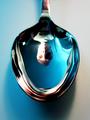
| 05/15/2002 04:54:00 PM |
Blue Moon Spoonby greenem2Comment: All of the following maybe be totally useless comments -- it all depends on your objective with the shot. I think the sides of the face are under- and over- lit respectively. There's not quite enough detail on the one side because there's too much light, and on the other because there's too little. I wondered about making the head a little bigger, getting a little closer, but since I don't know how the spoon would reflect it, I can't say if that's a wise comment or not. Regardless, excelently done. |
| Photographer found comment helpful. |
Home -
Challenges -
Community -
League -
Photos -
Cameras -
Lenses -
Learn -
Help -
Terms of Use -
Privacy -
Top ^
DPChallenge, and website content and design, Copyright © 2001-2025 Challenging Technologies, LLC.
All digital photo copyrights belong to the photographers and may not be used without permission.
Current Server Time: 08/17/2025 02:43:36 PM EDT.