| Author | Thread |
Comments Made During the Challenge  |
|
|
05/18/2002 07:41:00 AM |
|
I didn't take off points for it, but you should turn off the time stamp on your camera. |
|
|
|
05/16/2002 09:52:00 AM |
|
poor lighting, subject out of focus, date in the bottom-right corner. this is a good idea, but the picture could have been much better. |
|
|
|
05/15/2002 11:39:00 PM |
|
|
|
05/15/2002 12:05:00 PM |
|
For a rotated shot this is a bit more interesting than some of the others. |
|
|
|
05/15/2002 09:07:00 AM |
|
the image looks messy and dull !!!!!! can't you turn the date stamp off ? |
|
|
|
05/14/2002 07:04:00 PM |
|
Great idea. Out of focus. What's with the time stamp? |
|
|
|
05/14/2002 05:42:00 PM |
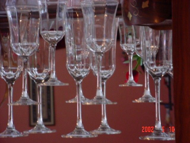
Pretty good, maybe a little "soft" focus. (You are allowed to turn off the date function on your camera, I am certain that data is embedded in the photo)
Photo 7 Creativity 8 Upsidedown 8 total 8
(Try cropping the tops of the glasses, the effect seems more pronounced) |
|
|
|
05/14/2002 02:54:00 PM |
|
can you turn the date function off ? It doesn't help your picture much. Focus could be better on the glasses. |
|
|
|
05/14/2002 11:08:00 AM |
|
i feel this could have been contender but it is very very blurry |
|
|
|
05/13/2002 10:46:00 PM |
|
This is really, really well composed... I love the way the glass stems create those tiers, and the background colour works well with the glasses. It's a real shame it's not focussed better! |
|
|
|
05/13/2002 09:36:00 PM |
|
An interesting shot, but I think the lack of any focus ruins it. I like the way the glasses are at different heights. (I'd also turn off the date function -- unless you think you need it for proof that it was taken in the specified time. I don't think you do.) |
|
|
|
05/13/2002 08:57:00 PM |
Love the concept, and composition.
The blurriness throws me off, as unintentional ?!?!
And i can't make out what's in the top righthand corner.
Nice. |
|
|
|
05/13/2002 08:04:00 PM |
|
Seems a bit out of focus. |
|
|
|
05/13/2002 05:22:00 PM |
|
|
|
05/13/2002 12:34:00 PM |
|
You have a good concept here. It appears that the glasses are quite a bit out of focus. Suggestion: Turn your date function off on your camera :) |
|
|
|
05/13/2002 12:27:00 PM |
|
Cool idea, the date stamp is a little distracting... |
|
|
|
05/13/2002 11:49:00 AM |
|
Clever - gains points, but appears out of focus -loses points |
|
|
|
05/13/2002 11:20:00 AM |
Very neat idea here. Looks like they are floating in air.
Out of focus and distraction in the upper right and the lower right (date).
Your on the subject and score for being so creative. |
|
|
|
05/13/2002 10:16:00 AM |
[I bet I'm not the only one to say this - can you turn the date imprint off?]
OK ignore that last comment! 2 days later and this shot still sticks in my mind which must mean it's pretty good! Thinking about the date, I realise now that it must be deliberate to show that this isn't just one of those where someone has rotated a perfectly ordinary photo. Clever idea - it just reminds me too much of all the snaps that I saw ruined by a date stamp when this was popular on film photos.
I really like the way the heights of the glasses are all different which adds a lot of interest to the scene. However, what lets it down for me is the focusing and (to a lesser extent) the distracting background. If the glasses had been sharp and the background had been cleaner then I probably would have realised straight away that the trick with the date was a clever idea. |
|
|
|
05/13/2002 07:16:00 AM |
|
I am a little disturbed by the date in the lower right corner. Is there some way to turn that off? (I did not subtract any points for that, but something you may want to think about). |
|
|
|
05/13/2002 02:35:00 AM |
|
great picture idea, the picture quality could be better, tho. |
|
|
|
05/13/2002 01:06:00 AM |
Great idea, looks nice...if a little blurry
That date down the bottom-right annoys me greatly |
|
|
|
05/13/2002 12:37:00 AM |
|
Cool pic, but a solid backgroung, some better focus, and cropping of the junk on the right (including the date) would have made it a 10! Was this like a camcorder vidcap sorta deal? |
|
Home -
Challenges -
Community -
League -
Photos -
Cameras -
Lenses -
Learn -
Help -
Terms of Use -
Privacy -
Top ^
DPChallenge, and website content and design, Copyright © 2001-2026 Challenging Technologies, LLC.
All digital photo copyrights belong to the photographers and may not be used without permission.
Current Server Time: 06/27/2026 02:41:12 PM EDT.