|
|
|
Showing 171 - 180 of ~452 |
| Image |
Comment |
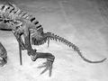
| 06/04/2002 04:57:00 PM | The one that got away...by albright1Comment: I'll be curious to see the reaction this one gets. I like it. I wish that the skeleton was just a little lower in the frame or angled in such a way that the tail was a little closer to the corner. However, I also recognize that this likely wasn't an option given that you were shooting in a museum and had to work in the boundaries they gave you. |
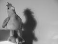
| 06/09/2002 12:14:00 AM | Lone Roosterby ChrommonkyComment: Fun. Really dig the shadow. Since the shadow, and thus the background, are so important, the dirt and creases (not sure what the darker streak near the shadow or the lighter portions on the right really are) detract from the overall effect. |
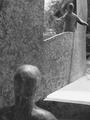
| 06/09/2002 04:25:00 PM | Helloby mattpgaComment: This is a cool reinterpretation of someone else's work. (Don't worry, not gonna cream you for the using someone else's art.) Personally, I would have pushed the forground figure a little further out of focus, but that's me. Mostly, I think there needs to be a simpler background -- both through the "window" and along the far right edge of the "wall". Since I don't know if you have access to this sculpture everyday, it may or may not be good advice to go back and have someone hold a sheet or something up to mask the background, but I'll make the suggestion anyway. |
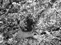
| 06/09/2002 04:57:00 PM | Life Beginsby TiggarrooComment: This is one of two photos I'm making the B&W vs. Color statement about. You are more than welcome to flame me once the votings over (although I'd really appreciate it if you didn't -- but I'd be happy to talk about it). Lots of good contrast -- I think maybe too much. The caterpillars just kind of blend into everything else. I wonder if this shot in color is easier to read because you have the colors of the caterpillars to set them apart from the branches and leaves. Perhaps not, I just don't know without being able to see the original. Otherwise, very clean shot -- nice focus and good tones. |
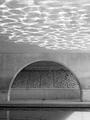
| 06/04/2002 03:23:00 PM | Reflections on Brush Creekby AndyLeeG4Comment: Really cool. I wish there was a little more shadow in it to balance out all the light, but I don't think it's possible to do without spot touches. The only element I'd say detracts is the patch of sunlight in the water in the lower right. But, you can't really do anything about that without losing the reflections on the ceiling. Maybe a smaller crop that cuts it out? All just suggestions -- good shot. |
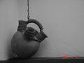
| 06/04/2002 03:16:00 PM | Still waiting to be used...by ragde_77Comment: This would have been a contender, except for two things: first the date stamp -- it's great for memory photos where you want the date on the picture, but not so good for artwork. I'd turn it off if possible. Second, I think that wall needs to be a lot brighter -- adjusting the levels to fix that would also lighten the jug a little. To test what I'm saying, I saved the photo and used PS's auto levels and it looks great. |
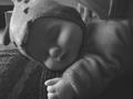
| 06/05/2002 03:46:00 PM | A Precious Giftby byjillComment: So how many people have been suckered into believing it's a real baby? While the picture was loading, I was thinking, "The lighting is a little dark, but wow -- that baby looks perfect." Then I saw the hand, and thought, "Aha -- that's why it looks perfect." Like I said, the picture is a little dark. A simplified background would help, as would a different surface (more simple, perhaps lighter colored) for the "baby" to be resting on. |
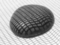
| 06/04/2002 03:02:00 PM | grid rockby lecookComment: Very fun. The only thing that looks a little "off" to me is the way the grid shadow at the bottom of the screen looks wavy while the rest of it is relatively straight. While I like the centered image, did you try any other compositions? I'm curious to see how it would look off center. |
| 06/04/2002 05:03:00 PM | Macro Mic Checkby TmanComment: I don't know how much of a macro this is, but it's clean nonetheless. I might suggest cropping this to the 427 size and see if that helps cut out a little of the extra white space, but I don't know if it would be effective or not. That would also, depending on how you cropped, even a little of the margin between the right of the mic and the top. |
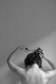
| 06/09/2002 09:36:00 PM | Hair Cutby KimblyComment: I think this is very cool. I like the sharp slant of light/shadow and only wish it were a little bit more distinct (the shadow a little darker). It looks like there is some already cut hair on the left shoulder, but I can't quite tell -- I assume that's what it is, but I wish it were a tiny bit more obvious. Still very cool. |
|
Showing 171 - 180 of ~452 |
Home -
Challenges -
Community -
League -
Photos -
Cameras -
Lenses -
Learn -
Help -
Terms of Use -
Privacy -
Top ^
DPChallenge, and website content and design, Copyright © 2001-2025 Challenging Technologies, LLC.
All digital photo copyrights belong to the photographers and may not be used without permission.
Current Server Time: 08/18/2025 09:47:05 AM EDT.
|