| Author | Thread |
Comments Made During the Challenge  |
|
|
06/09/2002 09:43:00 PM |
|
|
|
06/09/2002 07:52:00 PM |
|
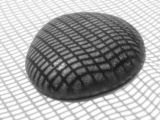
Very good choice for B&W. You did a great job emphasizing the patterns in here. No complaints here. |
|
|
|
06/08/2002 09:43:00 PM |
|
|
|
06/08/2002 12:36:00 PM |
|
i really like the simplicity of this image .... good job! |
|
|
|
06/06/2002 10:29:00 PM |
|
I like this. What a unique idea. |
|
|
|
06/06/2002 09:29:00 PM |
|
This is a very creative idea. |
|
|
|
06/06/2002 01:41:00 PM |
|
I like the combination of opposites - light background vs. dark stone and rectangular grid vs. round stone and waviness of the grid in the front. |
|
|
|
06/06/2002 08:51:00 AM |
|
shadows are cool. nice graphic design. |
|
|
|
06/06/2002 03:10:00 AM |
|
|
|
06/06/2002 12:46:00 AM |
|
Good choice. Textures, play of light and shadow, geometry... my only suggestion is to give the darks just a bit more density. |
|
|
|
06/06/2002 12:14:00 AM |
|
If that's a real rock, shouldn't it be distorting the gravity well more....really, cool idea, done well, funny name... |
|
|
|
06/05/2002 04:18:00 PM |
|
I really like the simplicity here, as well as the pattern that hte shadow makes. |
|
|
|
06/05/2002 03:43:00 PM |
|
I like the originality and creativity of this shot. It's odd, a little unusual, but really good. |
|
|
|
06/05/2002 01:48:00 PM |
|
You've captured a somewhat surreal quality in this picture. Zones are there. It reminds me of the things I drew earlier in life. |
|
|
|
06/05/2002 01:09:00 PM |
|
|
|
06/05/2002 11:19:00 AM |
|
This is just really cool. I like the ripple/folding effect on the right |
|
|
|
06/05/2002 12:07:00 AM |
|
I love the lines in this shot... excellent!!!!! |
|
|
|
06/04/2002 11:02:00 PM |
|
I really like this. The depth is exellent. |
|
|
|
06/04/2002 07:45:00 PM |
|
|
|
06/04/2002 07:36:00 PM |
|
Great shadows. Great use of b&w. Could almost be a loaf of bread |
|
|
|
06/04/2002 03:42:00 PM |
|
Simple but to the point... I like it. |
|
|
|
06/04/2002 03:02:00 PM |
|
Very fun. The only thing that looks a little "off" to me is the way the grid shadow at the bottom of the screen looks wavy while the rest of it is relatively straight. While I like the centered image, did you try any other compositions? I'm curious to see how it would look off center. |
|
|
|
06/04/2002 11:57:00 AM |
|
very nice use of shadows. |
|
|
|
06/04/2002 10:16:00 AM |
|
|
|
06/04/2002 09:59:00 AM |
|
|
|
06/04/2002 09:46:00 AM |
|
Nice, simple, effective - a very good shot for b&w. I've been trying to play around with the crop to move the stone off center, but I don't like any of those variations, yours is better. |
|
|
|
06/04/2002 05:13:00 AM |
|
A very interesting concept. It's odd that the grid lines are contoured on the white background in the lower right hand corner, which detracts a bit from the effect, to me. |
|
|
|
06/04/2002 12:05:00 AM |
|
great pattern. i really like this photo |
|
|
|
06/03/2002 07:39:00 PM |
|
Very original. Amusing play on words, subject. |
|
|
|
06/03/2002 05:06:00 PM |
|
|
|
06/03/2002 03:39:00 PM |
|
Fun abstract b&w. Good work. |
|
|
|
06/03/2002 03:36:00 PM |
|
Simple, intense, vivid, great contrast! I like it! |
|
|
|
06/03/2002 12:55:00 PM |
|
Very interesting shot, so simple, yet effective. The waves in the grid work great. |
|
|
|
06/03/2002 10:57:00 AM |
|
Well done. I like the tonal range. The whte seems to be just a few % below the highlight on the rock. I the composition would feel better for me with a bit more space on the left and the top, right a bottom equal. (bottom is a bit too much.) Another alternative would be more space at the top with right and bottom equal. One criterian I use for B&W is if I would rather see the image with color. This image passes that test easilly, color would be a distraction. |
|
|
|
06/03/2002 07:53:00 AM |
|
very interesting textures |
|
|
|
06/03/2002 05:34:00 AM |
|
Home -
Challenges -
Community -
League -
Photos -
Cameras -
Lenses -
Learn -
Help -
Terms of Use -
Privacy -
Top ^
DPChallenge, and website content and design, Copyright © 2001-2026 Challenging Technologies, LLC.
All digital photo copyrights belong to the photographers and may not be used without permission.
Current Server Time: 06/28/2026 12:57:47 AM EDT.