| Author | Thread |
Comments Made During the Challenge  |
|
|
06/09/2002 12:14:00 AM |
|
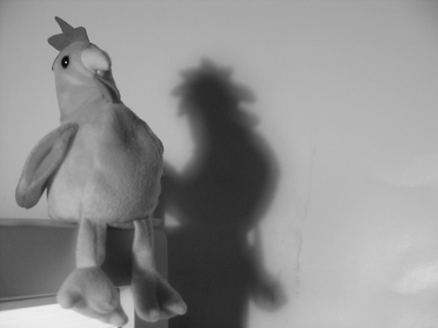
Fun. Really dig the shadow. Since the shadow, and thus the background, are so important, the dirt and creases (not sure what the darker streak near the shadow or the lighter portions on the right really are) detract from the overall effect. |
|
|
|
06/08/2002 03:15:00 PM |
|
Shadow is distracting, too much dead space,. |
|
|
|
06/07/2002 08:05:00 AM |
|
Seems kind of oof and grainy to me. I do like the shadow. |
|
|
|
06/06/2002 02:20:00 AM |
|
Nothing striking in this image. |
|
|
|
06/05/2002 09:20:00 PM |
|
Where's his sidekick, the duckling? |
|
|
|
06/05/2002 04:07:00 PM |
|
This shot would have been much better with either the rooster or the shadow in sharper focus. I like his profile as it looks in the shadow. |
|
|
|
06/05/2002 01:04:00 PM |
|
Shadows usually work well in b&w, however, IMO, this shot needs more contrast, it's more gray&gray right now. Good use of ROT. |
|
|
|
06/04/2002 10:27:00 PM |
|
I think it would have made a better black and white picture if you just used the shadow on the wall. :) |
|
|
|
06/04/2002 03:32:00 AM |
|
Looks to me like he's got an evil twin. I think you could have spread the contrast around a little better here. The black eye and white highlight in it show that you do have a full range here, but the rest of the subject is kind of clumped in the middle gray range. I'd increase the gamma, then punch up the blacks a lot and the whites a little. |
|
|
|
06/03/2002 10:13:00 PM |
|
to blurry and not enough contrast |
|
|
|
06/03/2002 05:18:00 PM |
|
|
|
06/03/2002 04:09:00 PM |
|
focus looks out here, intentional? I would guess not. |
|
|
|
06/03/2002 03:55:00 PM |
|
He'll be Humpty Dumpty if he's not careful. Neat shot. Fun. |
|
|
|
06/03/2002 02:54:00 PM |
|
Just too flat, tonaly, no black blacks or white whites. |
|
|
|
06/03/2002 07:44:00 AM |
haha scary!
would have looked interesting with alot alot of contrast... |
|
|
|
06/03/2002 06:03:00 AM |
|
|
|
06/03/2002 06:01:00 AM |
|
|
|
06/03/2002 02:59:00 AM |
|
The focus on the rooster is a tad soft for my preferences... the shadow does look good though! Nice shot! |
|
|
|
06/03/2002 12:20:00 AM |
|
very cockey of you to enter such a photo |
|
Home -
Challenges -
Community -
League -
Photos -
Cameras -
Lenses -
Learn -
Help -
Terms of Use -
Privacy -
Top ^
DPChallenge, and website content and design, Copyright © 2001-2026 Challenging Technologies, LLC.
All digital photo copyrights belong to the photographers and may not be used without permission.
Current Server Time: 06/28/2026 04:44:21 AM EDT.