| Image |
Comment |
| 12/23/2005 09:28:10 PM |
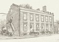
Wilson Warehouseby SJCarterComment by Canadian_eh: Very Nice! I think this is my favourite of the three! I love the brickwork detail captured, and the shading looks excelent. Really, all three apply to this. I like the prespective, and how it shows the depth of the building especialy. The stairway i find looks a bit busy (not sure whats at the top), but It's extreamly nice! |
 Photographer found comment helpful. Photographer found comment helpful. |
| 12/23/2005 08:41:41 PM |
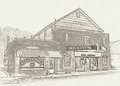
Buchanan Theatreby SJCarterComment by phatphoto: I think this is one of my favorites, although right of the bat, I'd like to say that I like the lithograph-like effect. They remind me of an old postcard. The lettering seems really vivid, and maybe a little too drastic compared with the rest of the picture, but I do like it. For some reason, I get this urge to go to one of those old pharmacies that serve ice cream and sodas and sit on a tall stool. :) Nicely done. Message edited by author 2005-12-23 23:32:00. |
| Photographer found comment helpful. |
| 12/23/2005 08:30:03 PM |
Wilson Warehouseby SJCarterComment by modgethanc: I think this is my favorite out of the series...it's very clean and clear, and the angle of the perspective is very effective. Great editting :) |
| Photographer found comment helpful. |
| 12/23/2005 08:24:27 PM |
Buchanan Theatreby SJCarterComment by CEJ: Ah...I get a transition of time from this shot. Very nostalgic and very well done. The lettering and sign have an almost 'neon' feel to them which I think is where I get this transitional feel from it. Still in the 50's, but want to be in the 60's look. Very nice overall composition - again your approach and angle of perspective really set it up well. Well done Jimmy! |
| Photographer found comment helpful. |
| 12/23/2005 08:21:17 PM |
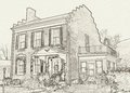
Trinity Episcopal Churchby SJCarterComment by CEJ: I think you have blended the hard natural lines with the processing technique to perfection in this one! Very well done and perfectly represents your subject. I also like the balance with the negative space in the sky - really adds a lot to the overall impression of the building. Very well done! |
| Photographer found comment helpful. |
| 12/23/2005 08:19:06 PM |
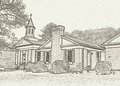
Harry's Houseby SJCarterComment by CEJ: One of the things I like about your photography is how you manage to get just the right perspective in your images. Another excellent image Mr. Carter! Your ability to grasp and master new styles and produce excellent images amazes me!
With the original I am surmising I would say the foreground is a little busy. However, on this rendition, it adds so much to the overall feel of the shot. This new processing technique really goes well with your approach! Looking forward to more! Very well done! |
| Photographer found comment helpful. |
| 12/23/2005 08:13:58 PM |
Wilson Warehouseby SJCarterComment by CEJ: Wow! You have done it again Mr. Carter! This is totally excellent in every way! Very expressive and very realistic in representation! Very well done!
Your approach to the subject is very reminiscent of period photos and paintings. I would love to see the 'pre' image. |
| Photographer found comment helpful. |
| 12/23/2005 07:24:38 PM |
Wilson Warehouseby SJCarterComment by loriprophoto: Jimmy I really like all four of these pictures. Would look great framed, matted and sold as a set. I like them all as they are, wouldnt change a thing. Very nice.
|
| Photographer found comment helpful. |
| 12/23/2005 07:03:20 PM |
Buchanan Theatreby SJCarterComment by Beetle: Some of the darker lines are just a bit TOO dark IMHO, plus I keep wondering what this would look like if the coloring had a touch of sepia to it.
All up, the whole series is terrific, and would look great framed as a set. |
| Photographer found comment helpful. |
| 12/23/2005 03:36:59 PM |
Harry's Houseby SJCarterComment by Mr_Pants: Although the subjects and composition are very good in each, I think that this is my favourite out of the four posted here. The other three seem to have parts of the images almost dominated by some thick lines, which, I feel, detract from the subtle feel. Perhaps these lines could be toned down a little. Nice work. |
| Photographer found comment helpful. |
Home -
Challenges -
Community -
League -
Photos -
Cameras -
Lenses -
Learn -
Help -
Terms of Use -
Privacy -
Top ^
DPChallenge, and website content and design, Copyright © 2001-2026 Challenging Technologies, LLC.
All digital photo copyrights belong to the photographers and may not be used without permission.
Current Server Time: 07/25/2026 11:32:02 PM EDT.