| Image |
Comment |
| 07/06/2004 06:54:02 PM |
Bond, Jane Bondby trying2bstillComment: Excellent concept. I love the composition, the lime is a very nice touch. The only thing that, in my opion, could be just a bit better is the hand either being competely shadowed (ie black) or with a bit more detail. It just feels to me that it is inbetween somewhere, and not entirely as it should be. Still a very nice image. |
 Photographer found comment helpful. Photographer found comment helpful. |
| 07/06/2004 06:45:32 PM |
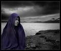
Girls night outby MiinervaComment: Fascinating image. So many engaging elements to appreciate. The purple toning works very well and reminds me of some the colour washes we saw in glossy magazines in the 59's and 60's.. nicely done. |
| Photographer found comment helpful. |
| 07/06/2004 06:44:30 PM |
Heather by grigrigirlComment: Stunning portrait.. The light is excellent, the shadows add another dimension and just a bit of mystery. nicely done. 9 |
| Photographer found comment helpful. |
| 07/06/2004 06:43:40 PM |
Spinning On That Dizzy Edgeby mocabelaComment: Stunning floral, ala O'Keefe. Love the rich deep tones, composition and dof. It is almost abstract, while retaining just enough information to let the viewer appreciate the actuallity of the components. nicely done 10 |
| Photographer found comment helpful. |
| 07/06/2004 06:42:13 PM |
Silence by heidaComment: This is an absolutely stunning image. There is drama, tesnsion and multiple levels of interest. Your choice of placement for the model is perfect. I really see no where to make a comment for improvement. BRAVO 10 |
| Photographer found comment helpful. |
| 07/06/2004 06:26:50 PM |
Sensualityby wwwavengerComment: hmm, red and blue do make purple, so the suggestion is there. I like the "wet" feel of it all. My personal taste is entering in here, I find the crop not as dynamic as it could be, (and this is just my opinion). I moved the window over to do an alternate "crop" and find that if more of the arm was not there the had would really stand out and the cuve of the body would become more of an element in the image. I have a feeling you may not be doing well in this challenge. Since you have really captured the literal sense of "suggestion".. 8 |
| Photographer found comment helpful. |
| 07/06/2004 01:40:07 PM |
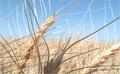
Feeding The Worldby Prime_TimeComment: Wheat, or is this oats?, are a fascinating subject. This image had a lot of potential. I'm afraid it is to bright, over exposed to be really effective. THe foreground element is not detailed enough, maybe it's just too under lit, to pull off being the star, which is what it's placement suggets it to be. The dof could work here with a little more light in the foreground, using different settings to not have the rest too bright, or possible some post processing work to alter the light - epxosure. Good effort. |
| Photographer found comment helpful. |
| 07/06/2004 01:35:53 PM |
Graveyardby emorgan49Comment: Interesting treatment. The soft watercolour effect is pleasing, I like the grouping of the stones. My personal feeling is that the front marker being so black sets it apart from the others, rather than it being an integral part of the composition. The oversaturated flag is so out of context with the rest of the treatment it is more of a distraction, to me, than a positive element. Just my opinio, of course. Still, very nicely don. |
| Photographer found comment helpful. |
| 07/06/2004 01:23:10 PM |
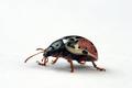
Meerly Restingby ImagineerComment: These little guys are natural hams. And may be rapidly becoming one of the most photographed creatures in the world. You 've nicely captured the classic "smile" there are excellent details in the fur. It is just lacking that WOW factor that makes an image pop off the screen. That said, I've been looking at him/her for quite some time now, so obviously ther is merit to the image. The crop is just a bit tight on top, I feel, other than that, nicely done. 8 |
| Photographer found comment helpful. |
| 07/06/2004 01:20:38 PM |
On the Runby JackoComment: Fascinating creature. I've never seen marking like that before. I love the high key treatment, just enough shadow to give definition to your subject. The wee bit of motion blur mirrors your title well. The only negative I see to comment on is, the slight lack of definition on the lower head and neck (do they have necks?) Otherwise an excellent image. 8 |
| Photographer found comment helpful. |
Home -
Challenges -
Community -
League -
Photos -
Cameras -
Lenses -
Learn -
Help -
Terms of Use -
Privacy -
Top ^
DPChallenge, and website content and design, Copyright © 2001-2026 Challenging Technologies, LLC.
All digital photo copyrights belong to the photographers and may not be used without permission.
Current Server Time: 07/23/2026 05:03:21 AM EDT.