| Image |
Comment |
| 12/20/2002 10:59:32 AM |
|
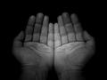
| 12/20/2002 10:56:19 AM |
diseases of the hair, nails and skinby snsComment: Theres something wrong compositionaly. I think its cos the subject is up in the top right, and its moved an area of dead space in at the bottom left. |
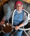
| 12/20/2002 10:44:58 AM |
Happily Retired Grannyby camelotnorthComment: Good use of humour, or good use of drugs, or both. Id replace the frying pan with something smaller of lighter coloured, its making that part of the pic a bit dark. |
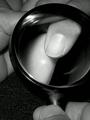
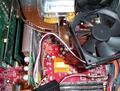
| 12/20/2002 10:40:01 AM |
Crunching Numbersby ltvinoComment: Nice used feel, most PC shots have that scrubbed look. Dark think in top right needs getting rid of. |
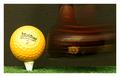
| 12/20/2002 10:37:31 AM |
Retired But Still Swingin'by autoolComment: Ye olde pull it backwards movement trick is becoming a bit overused, white border is a bit pointless and makes the active picture area smaller. |
 Photographer found comment helpful. Photographer found comment helpful. |
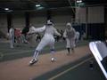
| 12/20/2002 10:29:30 AM |
Hitby Antart101Comment: Can you see your next photo? All those highllights on footwear would make a great movement photograph. |
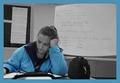
| 12/20/2002 10:28:19 AM |
I Teach; Therefore I Amby karmatComment: Lose the bag, also try and get the subject to be looking into frame (put the file where the gag is). The position of subject against background stuff is good. Be aware that you have student names on the walll, there may be 'issues' with that sort of thing. |
| Photographer found comment helpful. |
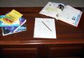
| 12/20/2002 10:19:20 AM |
Homework is soooo over-rated!!by evmariedogsComment: The three points of interest (books, penci on peperl, open book) are all in the top helf of the frame and have equal weight. Close in on the subject till the boopks are half out of frame, and the paper is on a line of third. Use the pencil to point at a compositional element, or use it to underline some notes on the page (write a big A+ on the paper and use the pencil to draw the eye to that place). There is a big band of grey along the top of the image and a big band of dark along the bottom, both of these are de-emphasising the surface of the desk that the compositional elements are sitting on. Try not to have upside down writing, the viewerwill read it anyway, so make it easy (unless you want it upside down for a very specific purpose). Lighting is horrible, try not to use the flash if you can help it. |
| 12/20/2002 10:08:01 AM |
Tranquil Berthby gminishComment: Go right, and drop down and the jetty will be framed by the trees a bit better. |
| 12/20/2002 10:05:46 AM |
Upgradeby cdhukComment: Its just cluttered, with things creeping shamefully into frame. The lighting is a bit glarey too. |
Home -
Challenges -
Community -
League -
Photos -
Cameras -
Lenses -
Learn -
Help -
Terms of Use -
Privacy -
Top ^
DPChallenge, and website content and design, Copyright © 2001-2026 Challenging Technologies, LLC.
All digital photo copyrights belong to the photographers and may not be used without permission.
Current Server Time: 07/17/2026 03:50:00 AM EDT.