|
|
|
Showing 2791 - 2800 of ~4876 |
| Image |
Comment |
| 12/23/2008 09:10:40 PM | Growing Lifeby peterComment: Greetings from the Critique Club...
I was not able to vote on this challenge, but if I had, I probably would have given you a 6.
My first reaction is that this photograph is well done. The exposure is great, the framing is perfect, and the contrast between the black background and the colours in the image work well. The image also has the "cuteness factor". There is another image in this challenge that is similar; it is of a woman's chest and a very young child. I think that image faired better because the co-relation between the womb and a baby was a little closer in time. This is an awesome photograph to have and be able to look back on. Great work.
If you need any clarification on any of my comments, please feel free to pm me. It might take some time for me to get back to you. |  Photographer found comment helpful. Photographer found comment helpful. |
| 12/23/2008 09:05:50 PM | Atlanta Sky Line through My Eyes by photobyjewellComment: Greetings from the Critique Club...
I was not able to vote on this challenge, but if I had, I probably would have given you a 4.
One of the most difficult aspects of this website is submitting a photograph that clearly conveys the theme of the challenge. The reason your photograph did not score well was because the viewers were not able to figure out the "before & after". While you may know what the message is, you have to understand that it is your job as a photographer to get the message across to the viewers. If you browse through the entries that faired a little better, you will see that most of them have 2 distinct aspects to them. This is the main difference between your photo, and the rest.
Good luck with your future challenge entries.
If you need any clarification on any of my comments, please feel free to pm me. It might take some time for me to get back to you. |
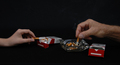
| 12/23/2008 09:01:01 PM | Before And Afterby vaarComment: Greetings from the Critique Club...
I was not able to vote on this challenge, but if I had, I probably would have given you a 5.
My first thought is that the image is a little busy overall. A closer crop, perhaps even a square crop might bring to attention the important elements in this photograph. An alternative photo that would be really simple would be one without the hands. You chose to include hands however, and this adds another element to the photo, and speaks of age as well as habits. I find the empty box of cigarettes a little distracting, and think the image would be less complicated without it. I don't think you would lose the message in doing so. Last but not least, I think the image could be a little brighter overall.
I hope to see your photographs in future challenges.
If you need any clarification on any of my comments, please feel free to pm me. It might take some time for me to get back to you. | | Photographer found comment helpful. |
| 12/23/2008 08:55:01 PM | The ROM - Before and After; Together in Harmonyby Shutter-For-HireComment: Greetings from the Critique Club...
I was not able to vote on this challenge, but if I had, I probably would have given you a 6 or 7.
I have only taken photos of the ROM during the day, but after seeing your photo, I will definitely have to make a point to go at night. This solves the problem of getting people in the shot as well. You've done well to divide the frame in half for the before and after. It works well. I'd love to offer some constructive criticism, but the only complaints I have are things beyond your control (firehydrant, construction signs, and lamp posts). Congrats on your top 10 finish.
Keep up the good work.
If you need any clarification on any of my comments, please feel free to pm me. It might take some time for me to get back to you. | | Photographer found comment helpful. |
| 12/23/2008 08:50:26 PM | Catching Airby Physics_GuruComment: Greetings from the Critique Club...
I was not able to vote on this challenge, but if I had, I probably would have given you a 5 or 6.
My first reaction, before reading your comments, was that there is too much space at the bottom of the photograph. I would like to see a version with 2/3 of the ramp cropped off. I think this would allow the viewer to focus more on the fact that the biker is in the air, and would also help keep the viewers eye looking up into the sky. As it stands, I find myself looking up and down trying to find the focal point. The exposure is very good, and the moon in the sky is an excellent addition. Great shot.
If you need any clarification on any of my comments, please feel free to pm me. It might take some time for me to get back to you. |
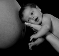
| 12/23/2008 08:45:56 PM | Different Worldby Ragga2000Comment: Greetings from the Critique Club...
I was not able to vote on this challenge, but if I had, I probably would have given you a 6.
My first thought is that it is a beautiful image, and also cute. I really like that you chose to show this in black & white. It allows the viewer to better connect with the scene. The black background was a great choice as it is a nice contrast to the light skin tones. I love the thin line of rim light as well. My only criticism would be that the image could use a little more brightness overall. This might be a personal taste however. Great image.
If you need any clarification on any of my comments, please feel free to pm me. It might take some time for me to get back to you. |
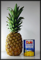
| 12/23/2008 08:41:41 PM | Fresh Or Convenientby boss351Comment: Greetings from the Critique Club...
I was not able to vote on this challenge, but if I had, I probably would have given you a 6.
In regards to this challenge, you created a photograph that is very easy to understand. Well done. I love that the image is balanced, and the white background was a good choice. I like that you chose side lighting to give the photo a dramatic effect, but it is a little bright on the left hand side of the pineapple. The can is also a little dark. I realize you were trying not to get reflections on the can. Perhaps this would be a good time to try bouncing the light back in with a reflector.
If you need any clarification on any of my comments, please feel free to pm me. It might take some time for me to get back to you. | | Photographer found comment helpful. |
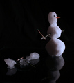
| 12/23/2008 08:37:10 PM | Frosty the Widowby bfurnerComment: Greetings from the Critique Club...
I was not able to vote on this challenge, but if I had, I probably would have given you a 6.
I think you did a great job considering it wasn't packing snow. You must have magic hands. My first constructive criticism would be that since this photo was taken for a "before & after" challenge, it might make a little more sense to have the full snowman on the left, and the melted snowman on the right, as we generally read from left to right. I love the contrast of the white snow people against the black background. This image might benefit from a little more brightness overall, as the details for the melted snowman are a little difficult to see. My last comment would be that the reflection of the full snow man is a little distracting because it is almost a whole reflection, but not quite. I would either crop the image so that only a small portion of the reflection shows, or crop it so that the entire reflection shows. I think that would strengthen the photo a little bit more. Overall, very comical shot.
If you need any clarification on any of my comments, please feel free to pm me. It might take some time for me to get back to you. | | Photographer found comment helpful. |
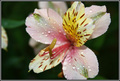
| 12/22/2008 10:43:22 PM | After the Rainby garrethtComment: Greetings from the critique club...
My first impression is that this is a gorgeous image and technically sound. In any other challenge, I would easily give this photo a 7. In this challenge however, I would have given it a 5 or 6 because it is difficult to figure out the "before and after". That doesn't mean it doesn't fit the challenge, but you have to remember that your image will be viewed by a variety of people with different backgrounds. If the before and after of your image relates to botany, and/or the transformation of the flower, not everyone will understand the message you are trying to explain because it is a specialiazed knowledge.
If you need any clarification on any of my comments, please feel free to pm me. It might take some time for me to get back to you. |
| 12/22/2008 10:39:17 PM | Siby tomorrowindComment: Greetings from the critique club...
I was not able to vote for this challenge, but if I had, I would probably have given this image a 4.
Overall, the subject is not very clear. I am able to decifer what it is, but most people would probably have a hard time figuring it out. It appears to be a thermometer on a glass table/tray. The first thing I would do to improve this photograph, is to include the thermoter in the crop, as opposed to having it's reflection. Right now, you are showing 1/4 object and 3/4 object's reflection. If you reversed this ratio, the composition would be easier to understand.
You have also chosen a subject that many people do not understand. This will also affect your score as your image is being judged by a broad base of people, from different race, religion and countries.
Good luck with your future entries.
If you need any clarification on any of my comments, please feel free to pm me. It might take some time for me to get back to you. |
|
Showing 2791 - 2800 of ~4876 |
Home -
Challenges -
Community -
League -
Photos -
Cameras -
Lenses -
Learn -
Help -
Terms of Use -
Privacy -
Top ^
DPChallenge, and website content and design, Copyright © 2001-2026 Challenging Technologies, LLC.
All digital photo copyrights belong to the photographers and may not be used without permission.
Current Server Time: 07/25/2026 02:01:49 PM EDT.
|