Blacksheepby
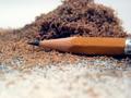
whobeeComment: (1) COMPOSITION -CONTENT - The composition of this is very good and compelling to the viewer; it is probably the strongest aspect of the picture. First, the red contrasts with the blues, and that is almost always a pleasing color combination. Secondly, the red pencil lead draws attention, then the pencil helps to pull the eyes back and up, giving a sense of movement to the picture. A couple of ideas -- did you try having the blue pencils lying in a "pattern" so that it looked more consistent, rather than just random. This may have helped pull the eyes even more. Also, if the leads were "touching" (obviously they couldn't because of the glass), it may have given an even stronger "illusion" feeling. Finally, I think a tighter crop would help eliminate soem of the bright foreground. Maybe even let the pencils overflow out of the frame some.
(2) BACKGROUND - The "background" of this picture is actually "the underground!" Having the red pencil "floating" is a very nice effect. Also, the blue pencils being blurry actually causes the eyes to focus on the red pencil, so in this instance, it adds to the overall effect of the pencil.
(3) CAMERA WORK -TECHNICAL - I am glad to read this process, and I am going to try it in the future! I am assuming you were using a shutter priority mode since the aperture says auto. If this is the case, you may have had as much depth of field as possible. I think if more of the red pencil could have been in focus, it would have been more effective. Maybe backing away and using the zoom, instead of a macro type setting. Also, the front of the pencil is a overexposed, as is the front of the frame, detracting some from the overall effect. Using a softer light, (shining through a light cloth, but be careful, don't sit it on fire) or bouncing it off of a white wall (or cover a piece of cardboard with aluminum foil to use as a reflector) will sometiems help to take the edge off. Since you were using an 8 second exposure, less light may have worked okay.
(4) DIGITAL PROCESSING - TECHNICAL - The color is very good in this, and having had two sonys, you receive an extra thumbs up for keeping the red "normal," since Sony reds seem to be whacky sometimes. It is not oversharpened, and the white balance is good.
(5) YOUR OPINION ON THE PHOTO - Overall, I really like this picture. The first time I judged it, I only gave it a four. However, at second and closer glances, I probably should have given it a 6. The exposure and focus issues mentioned earlier prevent me from scoring it higher than that. Overall, it is a very neat effect, adn one I look forward to trying.
Karma