|
|
|
Showing 1121 - 1130 of ~9205 |
| Image |
Comment |
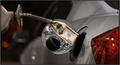
| 06/25/2008 03:31:38 PM | Daily Crime Scene...by F-StopBluesComment: CRITIQUE CLUB CRITIQUE
by karmat
Excellent shot, and one of my highest scores while voting.
Compositionally, this is a strong,stable shot. The nozzle's hose and nozzle lead the eyes to the tank. It may have been a bit more dynamic or edgy if it were set on a diagonal, but I am a bit "odd" about stuff like that, so this was probably the safer composition.
Technically, I like the rich hues and colors. Also, the exposure and focus work well. The only distracting thing to me is the gas tank "flap/door." I know there was no way to avoid it really, but it almost obscures the bill and makes it less effective. Perhaps if you could have found an older vehicle that did not have one of those, it could have been avoided.
Overall, a very well done shot, and one that was a bit of a refreshment after looking at a lot of "dead bodies." As far as dnmc, the way I see it, this was a bit of a theme in the challenge, so it obvious did meet the challenge, even if not in the most expected way.
Karma |  Photographer found comment helpful. Photographer found comment helpful. |
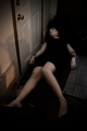
| 06/25/2008 03:12:57 PM | One Night Standby UbersteinyComment: CRITIQUE CLUB CRITIQUE
by karmat
Compositionally, I think you have done well to include enough context to help develop the story, but simiplified the shot enough that the "victim" isn't lost in the details.
Technically, the focus is good, and the lighting gives it that "almost morning, been here all night" feeling. I couldn't help but chuckle over the pose is very stiff comment. Woudln't that indicated that you succeeded in making her look really dead? I do agree that not being able to discern the edge of the model from the floor is a bit disconcerting. She looks dismembered. Maybe is she was wearing a different color, or if there was just a bit more light on her. If you were going for the dismembered look, you did well.
Overall, a good shot, and it definitely meets the challenge.
Karma | | Photographer found comment helpful. |
| 06/25/2008 03:01:58 PM | Highway Robberyby 777STANComment: CRITIQUE CLUB CRITIQUE
by karmat
Compositionally, it is good that the sign with the prices "anchors" the shot on the right. I assume that is your focal point. The eaves of the "shelter" over the pumps also serve as a kind of leading line pointing you to the sign. The price sign is straight, but the perspective of the the rest of the shot leads it feeling a bit tilted to the right. I'm wondering if a different angle would take advantage of the "patterns" created by the tanks, and minimize the actual price. That way, you would still get your idea across, but in a more generic way (those with higher prices wouldn't be distracted by your lower ones, etc). Or you could have tried to simplify the shot and not include quite so many elements of the station.
Technically, I like the high contrast and the fact that you resisted the urge to super-saturate the greens, as some are in the manner of doing. The deeper hues gives it a more serious, heavy feeling. The focus seems pretty good, and clear, especially on the sign and falling off some on the rest of the shot. On the one hand, this further directs attention to the sign, but on the other, it can give the impression that focus isn't as clear as it could be. Also, the lighting is extremely harsh on this. I think it would work, generally, to further the mood of your shot, but that shadow down the middle of the sign on the right is really distracting.
Overall, a decent shot that meets the challenge in a political statement kind of way.
Karma | | Photographer found comment helpful. |
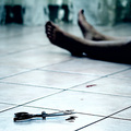
| 06/25/2008 02:48:19 PM | Noirby Rino63Comment: CRITIQUE CLUB CRITIQUE
by karmat
One of my favorites in the challenge!
Compositionally, I really like how the scissors occupy a spot in the lower left and just the feet are showing beyond that. I think that sets it up as being very well balanced.
Technically, I really liked the high contrast in this. It detracts some from a "sharp focus" but in this shot, sharp focus would have taken the edge off of the mood of the shot. It looks, and feels violent, which is what I imagine blood stained scissors would be the result of. The bluish hue gives it that horror movie, dead feeling.
Overall, again, I really like this shot and felt it nailed the challenge. For whatever reason, the story that formed in my mind was that someone was in the hospital and met the end of their life, violently. What it is about this shot that says "hospital" to me, I cannot define. Maybe a secret phobia, or something?
Great work.
Karma | | Photographer found comment helpful. |
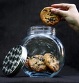
| 06/25/2008 02:43:56 PM | Shh, Don't Tellby enajjComment: CRITIQUE CLUB CRITIQUE
by karmat
Compositionally, the diagonal you establish betwee the lid and the hand is good. It gives a definitive "line" to the shot, and adds a bit of interest or action to it. That said, the straight on perspective makes the shot seem a bit static. The lower perspective is better, I think, than one that is even, but perhaps if it were "turned" some, more dof could be defined, and it would have more depth to it. Also, it feel a bit tilted to the right to me.
Technically, you have done well with exposing the glass correctly. That can be difficult. the hand and the lid, though, appear to be just a touch off. That makes the shot have the impression that it is out of focus, because the two "anchor" points are not crisp. Overall, it feels like a touch more contrast would also help it to be a bit more dynamic.
Overall, I think you did meet the challenge, though arguably, stealing a cookie isn't a crime (unless you are shoplifting it), but the idea was good, and it was kinda nice to not see all blood, gore and violence.
Good work and best to you in future challenges.
Karma | | Photographer found comment helpful. |
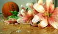
| 06/25/2008 01:54:23 PM | "Sorry Mum...It Was An Accident..."by SundayMorningsComment: CRITIQUE CLUB CRITIQUE
by karmat
Compositionally, I think this shot works very well. The flowers are the primary focus, with the glass adding some interest and finally, an oof basketball telling the rest of the story. Without anyone of those elements, the shot would seem incomplete. Also, it is well balanced between the flowers on the right and the ball in the upper left. I think a little less foreground might make it a bit stronger.
Technically, the focus, lighting, and dof work great here. It seems to have a touch of a yellowish cast to it, but it could be my monitor -- I don't remember it being like that when I voted. OR it could be because the table top is an orangish/yellow color, and it makes it feel that way.
Overall, a well executed (no pun intended) shot. On the one hand, some may have felt it wasn't a true "crime" (my initial thought), but if you've ever had kids around, it definitely fits the definition of "crime" at home. :) Not that my kids have ever broken anything, hahahaha.
Good work and I look forward to seeing more of your stuff.
Karma |
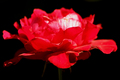
| 06/24/2008 04:29:55 PM | Roseby 777STANComment: CRITIQUE CLUB CRITIQUE
by karmat
Compositionally, I think this could be made stronger if it weren't quite so centered. You have a good idea with the red flower on a black background, and I do like how it largely fills the frame. Because it is almost centered, though, it makes it feel very static. Perhaps you could experiment with various crops and rotations and see if it made a difference. Even extreme crops where part of the flower out of the frame could help to add interest.
Technically, the color is great. The "hot spot" on the flower, though, really grabs the viewer's attention. Since that particular spot is out of focus,the rest of the shot "feels" out of focus, even though you do have clearly defined focus areas on the flower. Again, playing with the composition may enable you to minimize the distraction of the bright spot, and emphasize the areas that are have clarity and detail.
Overall, I think it is a good idea, and it does meet the challenge, at least in my opinion.
karma | | Photographer found comment helpful. |
| 06/24/2008 12:13:41 AM | Flying the Flagby xianartComment: CRITIQUE CLUB CRITIQUE
by karmat
Great composition on this -- very balanced and strong feeling.
Technically, I love the high contrast in this and the bold colors. Even without the rainbow, it would be a strong image I think. The rainbow adds a nice splash of color, and an extra dimension of color to it. As far as being "lucky," well yea, maybe, but I've found that you have to be prepared and "able" to be lucky. :)
I feel it definitely meets the challenge, and I suppose dpc voters were looking for a bit more "context" or something. ??? I dunno. To me, I think this would make an awesome album cover, especially for some of the more alternative types of music out there. Or an album from the 70s.
I like this entry, and honestly think it should have scored higher.
Karma | | Photographer found comment helpful. |
| 06/18/2008 04:39:35 PM | | | Photographer found comment helpful. |
| 06/16/2008 12:23:01 AM | | | Photographer found comment helpful. |
|
Showing 1121 - 1130 of ~9205 |
Home -
Challenges -
Community -
League -
Photos -
Cameras -
Lenses -
Learn -
Help -
Terms of Use -
Privacy -
Top ^
DPChallenge, and website content and design, Copyright © 2001-2026 Challenging Technologies, LLC.
All digital photo copyrights belong to the photographers and may not be used without permission.
Current Server Time: 06/21/2026 10:06:45 PM EDT.
|