|
|
|
Showing 111 - 120 of ~1021 |
| Image |
Comment |
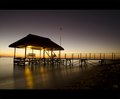
| 06/24/2011 07:43:16 AM | June - Getting into winterby youpeeComment: Hi Irshad, welcome to the Critique Zone!
This is a very pleasant shot which did quite well with the voters and obviously tuned in well to the challenge. I don't think that there is much you could really change on this to improve it, which makes critiquing tricky.
I think that you nailed the technicals of taking this, but you could have tweaked it a tiny bit in post processing to get the most: levelling that horizon would be quite important I think, and perhaps boosting the blues and reds (but not the yellow!)just a very little bit. Other than that, it's pretty much on the money.
Happy hunting,
Frank. |  Photographer found comment helpful. Photographer found comment helpful. |
| 06/24/2011 06:35:20 AM | Miss Februaryby albc28Comment: Hi Anthony, welcome to the Critique Zone!
This is certainly an eye catching shot, but beyond that it doesn't really have the aesthetic appeal to keep my attention and there is nothing to say 'hey - February!' apart from the title. Hmmm. What to say?
Technical: There's nothing really wrong here. I'm assuming that you wanted the station to be identifiable or you would have opened up that aperture, but it isn't really an appealing background, if I'm honest - neither cutesey or gritty, just there.
Artistic: I think, on reflection, that it is the background where this shot falls down. The settings, perspective etc are all bang on for your model, but the way the background is displayed doesn't really add. You don't show much of it, the perspective of it doesn't show it to best advantage and the 'bits' (platform, sign, doors) don't tie together because of the very central, very large, positioning of the model in the frame.
I hope at least some of that makes sense, noting that it is always easier to critique than to shoot!
Happy hunting,
Frank. | | Photographer found comment helpful. |
| 06/24/2011 06:25:06 AM | April (Summer Rain)by lobrinComment: Hi Louie, we meet again!
There are a few things about this shot which don't really appeal to me but I think that the voters will have also hammered this because of the lack of tie in to the challenge - the rain isn't really a feature of this shot and (if your model would have been prepared to get a bit damp!) it could have been.
Technical: It's nice and sharp, but unfortunately so is the background - I would have been tempted to drop the aperture to no more than f2.8 to try and blur things a little. The lighting is also really harsh and keeps dragging my eye to the white area, which shouldn't really be the focus.
PP: I'm not sure what, if anything, you did but my only real comment here would be that her skin looks almost unnaturally smooth, which detracts from the natural feel I think you should be shooting for with this title.
Artistic: Again, completely subjective. The background is a killer here - it's harsh, boring and the perspective is unbalanced - by which I mean that the street level yellow lines are up round her waist. It just doesn't work for me. The other issue is her expression - she looks so angry! April/ spring / showers really calls for a natural, happy look I would have thought.
If doing this again, I would look to change the perspective (maybe shoot up, to catch the look of the falling rain? and get your model to relax, jump, dance, something less moody.
Happy hunting,
Frank. | | Photographer found comment helpful. |
| 06/24/2011 06:16:22 AM | Juneby danitarComment: Hi Danitar, welcome to the Critique Zone!
The only thing that I disagree with on this photo is the score. 6+ is certainly a decent score but I think that in a Free Study, this could have gone up to a full point higher. It just doesn't really connect to the challenge except in the name. (You're not alone in this!)
I might have changed one thing - I don't normally comment on borders but I think that with a photo taken to give a paint effect, some sort of framing would probably be beneficial. Other than that, the composition, structure and lighting of this is simply masterly. I personally disagree with the comment asking for something to be perfectly in focus, I don't think that it would work with this effect, it's great just as it is.
I'm sure that we will be seeing more of you, and I look forward to it!
Happy hunting,
Frank. | | Photographer found comment helpful. |
| 06/24/2011 06:03:14 AM | Juneby Ja-9Comment: Hi Janine, welcome to the Critique Zone!
I doubt that there is much I could say about this that would be news to you, so I'll forgo my usual structure and just throw out some random thoughts.
I like the natural complimentary colours, that really works for me, and I love the watercolour wash effect of the green background. I guess that's what you are really paying for with this lens!
Sadly, that's all that really grabs me. The proportions for this just don't really work, the balance is out because (IMHO) the flower is represented too small. It's also a little teeny tiny bit blown out, and again that doesn't balance with the rich, gloomy background.
There doesn't seem much point in saying any more - the whole of DPC knows that you know how to take a masterpiece, so I'll leave it there.
Happy hunting,
Frank. | | Photographer found comment helpful. |
| 06/22/2011 09:27:34 AM | CIty Lightsby stantheman1313Comment: Hi Stanley, welcome to the Critique Zone!
It's a great shot, no doubt about it. Really nice structural framing from the bridge silhouette and a well posed relaxed model (it matters!).
Technically: Nothing to say - 30 seconds seems like a slightly unnecessarily long expsoure (and would have hit the noise levels hard), but the final result really works.
PP: There are a couple of comments on noise (including yours) but it's not really a problem for me. If it really bothers you then as I said, a shorter exposure at maybe f8 would maybe help.
Artistically: I really can't add anything about the shot - I would not have done this so well, it's a great vision. THe border bothers me though. The big letterbox is ok, but the bright white strips on the dark picture really grab the eye away from what I want to be looking at - your photo.
Overall, great take and congrats on the top ten finish.
Happy hunting,
Frank. | | Photographer found comment helpful. |
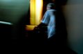
| 06/22/2011 09:19:21 AM | My friendly neighborby lobrinComment: Hi Louie, welcome to the Critique Zone!
What a curious shot! I suspect that with 20/20 hindsight, you can see the major problems here: the voters don't spend long enough looking at each shot to appreciate the less obvious entries and secondly, he's not a silhouette - and the voters here are very strict on sticking to the challenge... sorry about that.
Technical: A tough one to call, you were clearly going for the blur, and you nailed that. Nothing crazy about the settings so nothing to comment on there. The lighting is your biggie - he needed to be completely backlit.
Artistic: This is a fairly arty kind of shot, which rarely do that well here at DPC - but as long as you liked it, then it is a winner. My only comment would be that the most eye-catching thing is that big tungsten strip down the middle - if that were slightly off to one side or the other I think that it might be more pleasing.
Overall, you got hammered because the voters don't like to be challenged in their thinking. It is clear from your portfolio that you are quite capable of knocking out a voter pleasing shot if you want, so perhaps it is time to explore this arty side a little more?! I do wonder if this would have done better in a 'dream' related challenge?
Happy hunting,
Frank. | | Photographer found comment helpful. |
| 06/20/2011 10:04:47 AM | Summer in the Cityby bing3102Comment: Hi Ryan, welcome to the Critique Zone!
This is an interesting idea but I'm not sure that it tells the story that you are aiming for. I have no doubt that the voters couldn't figure it and that hurt your score. Perhaps a wilting flower and a dead bee against the cityscape would have sent the message? Twin that with a long exposure (using a tripod) against the city at night, to capture light trails and you might have taken a ribbon!
Technical: This is a very capable camera / lens combo - but almost no lens is at its best at f20 - refraction creeps in from f16 onwards and sharpness goes. f8 would probably have been enough here which would have boosted your shutter speed - again good for sharpness. I know that the reciprocal law says you only need 1/focal length but Ansel Adams reckoned anything below 1/250 wasn't fast enough. We can't always get there but more speed = good a lot of the time, unless you have a tripod and remote release!
PP: The shot is a little 'flat' - try adding a little contrast with curves or levels to make it more three dimensional. It also could do with some sharpening.
Artistically: While this looks like you were going for the 'rule of thirds', to me the flower is a little cramped and almost off the edge of the shot. I would pull it a little more to the centre, using the stem as a leading line perhaps, to make it really the subject, with the city as a background.
All of this is just my opinion, but I hope that there is something of use in here. You clearly have an eye for the unusual, and a lateral perspective on life which I'm sure will result in some interesting shots - I look forward to seeing more!
Happy hunting,
Frank. |
| 06/20/2011 09:45:12 AM | A Competitorby DiscoVaderComment: Hi Disco! Welcome to the Critique Zone...
First take, this is a great shot. I'd change a couple of minor things with 20/20 hindsight, but not much.
Technical: Nothing to say here - this is fantastically sharp and the DoF control is superb.
PP: I'd bump the contrast a little more to bring out the structure of the head, and emphasis that shadow a little more - it provides an outstanding leading line. You mention having done some colour correction, but it still looks to have a slightly blue/green cast. This might reflect reality but I think it would be more aesthetically appealing if it were a little warmer.
Artistic: Again, very little to say apart from perhaps just a smidgen more space on the right hand side to balance it up? It's quite close to the edge. Other than that, the composition and structure are excellent.
If this wasn't just asking for the DNMC comments and really fitted the challenge, this shot would be a shoe in for a 6-6.5 score, maybe more. I have 6+ shots which aren't nearly this good. I hope you aren't put off and come back for more!
Happy hunting,
Frank. | | Photographer found comment helpful. |
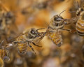
| 06/20/2011 08:54:13 AM | Holding On by wehehComment: Hi Richard, of all the critique zones, in all the websites on the interweb, and you had to walk into mine? How can I critique this??!
I'd be interested to hear about the lighting that you used for this - the shot itself is beautifully structured and technically unimpeachable, but it is the lighting which adds a fair amount of the magic.
I'm also interested because this shot has inspired me to go and shoot my father's bees (he has three hives, but doesn't think he has seen this behaviour there before - I shall find out!) and I am not sure how to light it without distressing the bees.
Sorry it is a slightly shorter and weaker critique than I would normally give, but there just isn't anything to say, apart from "well done!"
Happy hunting,
Frank |
|
Showing 111 - 120 of ~1021 |
Home -
Challenges -
Community -
League -
Photos -
Cameras -
Lenses -
Learn -
Help -
Terms of Use -
Privacy -
Top ^
DPChallenge, and website content and design, Copyright © 2001-2026 Challenging Technologies, LLC.
All digital photo copyrights belong to the photographers and may not be used without permission.
Current Server Time: 05/25/2026 10:20:49 AM EDT.
|