| Image |
Comment |
| 01/17/2006 01:34:16 PM |
Bass Harbor Light by NeilComment: I remember seeing this earlier in the year, but I don't remember when or who owns it. I just remember it being an image that I wish was part of my own portfolio. It's beautiful... 10 |
 Photographer found comment helpful. Photographer found comment helpful. |
| 01/14/2006 06:48:19 PM |
|
| Photographer found comment helpful. |
| 01/14/2006 06:41:43 PM |
pizzazz by ursulaComment: lovely color... the background colors are somewhat strong for the subject though. |
| Photographer found comment helpful. |
| 01/14/2006 06:39:28 PM |
urban huesby tateComment: Excellent interpretation of the challenge. Your subject does stand out nicely here... great shot :) |
| Photographer found comment helpful. |
| 01/14/2006 06:37:17 PM |
|
| 01/14/2006 02:51:43 PM |
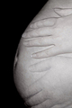
Tattoed Purityby bangwinComment: Greetings from the Critique Club...
I think the comments you received do a fair job of summing up the results of this image. I'm in agreement with those who think it should be tack sharp. Soft focus could be good, but this one isn't sharp enough to get away with that. The idea and composition are both excellent. I like the curves and abstract nature of the image. I think this theme also calls for some more dramatic light and some more contrast in the image. In my opinion, this type of image does very well as either a high key study or a high contrast study. Both may be worth exploring on your part :)
John Setzler
|
| Photographer found comment helpful. |
| 01/14/2006 12:23:02 AM |
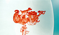
Out of the Ordinaryby Sunshine86Comment: Greetings from the Critique Club :)
This image has an interesting abstract feel to it. It's a nice technique-drive image with a twist of surrealism at the same time :) The color play also works ok here. I'm not as keen on the blue fade from the center of the image to the right side. I believe you could probably work this image into something a little stronger in the realm of colors. Blue is not as complementary of red as green would be. In a nutshell, I really like the idea and have actually been thinking about something along these lines for my own portfolio.
As for the challenge, I notice that the score on this image is OK but not outstanding. The theme of 'shapes' is not really the dominant theme of this image. When one thinks of shapes, the general view would be shapes with definition, like a triangle, rectangle, circle, or diamond. The shapes that dominate this image are random curves, which none-the-less, are shapes. The feeling I get from this image is more along the lines of texture than shape probably.
I think this subject/technique is well worth some further experimentation... keep up the good work :)
John Setzler
|
| Photographer found comment helpful. |
| 01/13/2006 03:08:13 PM |
Shape of my Heartby unicumComment: Greetings from the Critique Club...
This photo meets the challenge with the heart shape, but I believe it would have scored a lot better if that shape was a larger part of the composition/theme of the photo. This is a technique that I particularly enjoy and you have done it well here. I can't really offer you much suggestion for improvement other than making the theme/subject of the photo more dominant in the frame...
Excellent work :)
John Setzler
|
| 01/13/2006 12:34:57 AM |
Only my mother are left to take care of meby DufusComment: Greetings from the Critique Club...
Future requests for in-depth critique will require that you have filled out your photographer's comments when you submit the photo. This will be beneficial to you if the person giving the critique has some additional insight into your photograph...
I don't believe the hand motion effect shown here is adding impact to the image. It does demonstrate an interesting technique, but I believe the photo would be stronger without that. A sweeping motion of the hand could have possibly produced something a bit more interesting to me, but the double hand image just makes me ask 'why?' I don't understand the intent or purpose of it. The duration of the exposure to make this effect has possibly made the image display motion blur in places where you don't want it also.
The subject is very strong, but I think some additional execution would be nice :)
John Setzler |
| Photographer found comment helpful. |
| 01/12/2006 02:58:49 PM |
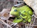
Motherly Frogby tolovemoonComment: Greetings from the Critique Club...
I believe this photo meets the challenge, but the subject itself is rather weak overall. The lighting and composition don't offer much inspiration. There isn't any particular technique applied here that separate the subject from the environment, which is quite busy. I understand you were probably trying to create the natural environment of the frogs, but it just doesn't work out well in this photo. Your depth of field is also a bit shallow or your focus point is off a bit. The use of figurines in challenges has proven to be a huge undertaking when it comes to getting a good score on the photo. In general, they seem to be shunned.
John Setzler
|
| Photographer found comment helpful. |
Home -
Challenges -
Community -
League -
Photos -
Cameras -
Lenses -
Learn -
Help -
Terms of Use -
Privacy -
Top ^
DPChallenge, and website content and design, Copyright © 2001-2026 Challenging Technologies, LLC.
All digital photo copyrights belong to the photographers and may not be used without permission.
Current Server Time: 06/10/2026 11:01:04 PM EDT.