| Image |
Comment |
| 05/06/2004 01:58:41 PM |
Playful lightby sfaliceComment: because your light and shapes are defined, I think this does a good job of meeting the challenge and having some interest to it besides. |
 Photographer found comment helpful. Photographer found comment helpful. |
| 05/04/2004 07:40:14 PM |
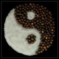
Salt and Pepperby labudsComment: I love this! i did a similar shot for a challenge last year and never entered it..but yours is much nicer. :) I'm glad I wasn't the only one who thought this would look cool. |
| 05/03/2004 09:45:46 AM |
handscapes.jpgby theodor38Comment: oh this is very clever! I like the consistent lighting and the colouring you've chosen. Very skillfully done! |
| Photographer found comment helpful. |
| 04/26/2004 05:12:46 PM |
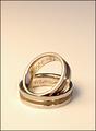
Forever Love was the last thing I was looking for...by KaveyComment: i can see the link to the challenge topic quite easily..its not "pictured" but represented. I would have chosen a different coloured background. Something equally as simple and unobtrusive, but that gave more contrast to the subject. I like the placement of one ring in the other..suggests a connection between their owners.
There is a lack of sharpness overall (not major) that catches my attention, too. I like that we can read the inscription dates but the edges of the rings are not as sharp and clear as they could be--
overall: a challenge well met, and an elegant composition. |
| Photographer found comment helpful. |
| 04/22/2004 03:06:23 PM |
Lightnessby ccjpComment: the framing on this is excellent and the near mimicking of movements in the two individuals really makes for a lovely and interesting composition. I might have take a bit off the bottom black, but i think that's just personal preference or speculation!
I agree that I'd like to see it a big bigger. :) |
| Photographer found comment helpful. |
| 04/21/2004 12:24:50 PM |
|
| 03/15/2004 12:26:26 PM |
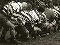
Captainby timj351Comment: because you chose a landscape orientation, I'd almost like a little more space on the right side to give the captain more to look into. Its a great shot, however. Wonderful tones! Only thing missing is that bit of hair at the top. ;) |
| Photographer found comment helpful. |
| 03/15/2004 12:23:06 PM |
Natural Beautyby labudsComment: the guy in the background makes it look quite candid. I think a closer crop would have helped make this look more purposeful. |
| 03/15/2004 12:21:27 PM |
Model in daffodilsby KevinRiggsComment: your model is lovely, and the composition is good, but there is something about the colours that makes me pause..maybe its that the yellows of the daffodils are not vibrant. It almost seems slightly underexposed? I'm not sure what it is, but that's the only reservation I have on this shot. :) |
| Photographer found comment helpful. |
| 03/10/2004 12:28:21 PM |
Pinnacle of Silenceby ChaszmyrComment: I saw this and thought "that looks like home, I wonder if its in BC?" And it is! Lovely shot, and you're right, its extremely dramatic when not forced to be 640 by 480. :) |
Home -
Challenges -
Community -
League -
Photos -
Cameras -
Lenses -
Learn -
Help -
Terms of Use -
Privacy -
Top ^
DPChallenge, and website content and design, Copyright © 2001-2026 Challenging Technologies, LLC.
All digital photo copyrights belong to the photographers and may not be used without permission.
Current Server Time: 04/27/2026 01:20:29 PM EDT.