| Image |
Comment |
| 11/15/2004 05:46:32 PM |
Buzzby spydrComment: Interesting angle - more original approach than straight-on, but I'm not sure it show off Buzz's heroic qualities very well. If I didn't know what the character looks like I'd be a bit confused by the proportions. Also the strange rock-like thing is a bit distracting. |
 Photographer found comment helpful. Photographer found comment helpful. |
| 11/15/2004 05:44:09 PM |
Chief Leatherlipsby xtabintunComment: Bright and dramatic. I like the proportion of land. sky and sculpture. Seems to find the right balance. Must have looked fabulous a week or two ago when the line of the horizen was red/orange/yellow with fall foliage. The bareness seems to create a more heroic mood. I really enjoy this. 8 |
| Photographer found comment helpful. |
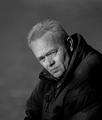
| 11/15/2004 05:36:18 PM |
More Than Wordsby ellamayComment: Have I seen this extraordinary-looking man somewhere before? His expression does speak more than words. The lighting and the composition serve to enhance that. Crisp, beautiful, somehow both dramatic and understated. Although he does not fill the frame - he does! He projects a force of personality around him - and your narrow DOF helps the viewer to visualize that. My favorite so far. 10 |
| Photographer found comment helpful. |
| 11/15/2004 05:32:06 PM |
Mr. Incredibleby JasonComment: nice lighting. Well done getting Mr. I to stand out so well against a red background. The tiny bit of reflection at the bottom feels odd - perhaps more would be more natural? While well done, not extremely original. |
| Photographer found comment helpful. |
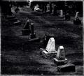
| 11/15/2004 05:28:00 PM |
Heroes Of Our Past: In Loving Memories Of...by artvetComment: Having the bright stone on the thirds line is a good choice for composition. I like the diagonal line of the stones. It needs more interest somehow - would be nice if the leaves at the top came more into the frame. It feels very rough, grainy, which works with the subject. But at the same time the scattered stones and the scattered texture make it feel to loose for me. Perhaps getting in a bit closer to the white stone, and using a smaller depth of focus so the one stone is sharp while the other blur into the distance. This would anchor the composition more. |
| Photographer found comment helpful. |
| 11/15/2004 05:22:44 PM |
Buddha - The Awakened Oneby trnqltyComment: I like the angle looking up, and how the Buddha fills the frame. NIce range of tones. Wish it were more in focus - Could a greater depth of focus gotten it all sharp? |
| 11/15/2004 05:20:20 PM |
Airborn Rescueby frumoazniculComment: Good job being in the right place at the right time, I like the way the bright red of the helecopter frames the people - and having them off to the right side of the frame implies their need to move quickly. Positioning the composition this way you've minimalized the distraction of the onlookers,the building, and trees - our eyed go right to the helecopter and down the the streatcher. I wish I could see the epressions on the faces of the "heros" better - but that is just the limitation of the subject. |
| Photographer found comment helpful. |
| 11/15/2004 05:15:31 PM |
Lest We Forgetby kevrobertsonComment: Great use of depth of focus, and perfect subject matter. The repetition of last and first names if a bit puzzling - perhaps it would have been better to have 4 completely different names, |
| Photographer found comment helpful. |
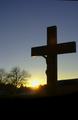
| 11/15/2004 05:13:11 PM |
Ultimate Heroby Prof_FateComment: The burst of sun is very appropriate here. I wish it came from behind the cross, and you could have cropped out the ditracting white building. I like the cross in silouette, but I wish I could see more of Jesus - perhaps from a vantage point more to the right you could have captured more of him and had the sun coming from behind the cross? |
| Photographer found comment helpful. |
| 11/15/2004 05:10:52 PM |
Olympians, True Heros (Seoul Olympic Stadium)by docpjvComment: I like the reflections in the water. Photographing the structure at night gives it a more mythic quality - good for the challenge. I do not feel the large amount of sky does anything for the picture, I would have prefered more water relfections if possible. Perhaps focusing your attention on the end of the building with the olympic sign would have created a composition that filled the frame more and foucused the subject. |
| Photographer found comment helpful. |
Home -
Challenges -
Community -
League -
Photos -
Cameras -
Lenses -
Learn -
Help -
Terms of Use -
Privacy -
Top ^
DPChallenge, and website content and design, Copyright © 2001-2026 Challenging Technologies, LLC.
All digital photo copyrights belong to the photographers and may not be used without permission.
Current Server Time: 07/17/2026 03:22:01 AM EDT.