| Image |
Comment |
| 12/18/2008 06:37:48 PM |
bortukan by shay455Comment: Your lighting in this is really pretty. The bokeh does not lend itself to this photo. It is so dark that it almost disappears completely. Your model is not looking at the camera and because this is such a tight shot, it loses interest as we have no idea why you chose to capture her at this particular moment. If you had shot a little wider, perhaps we would see whatever she may be looking at as well. |
 Photographer found comment helpful. Photographer found comment helpful. |
| 12/18/2008 06:37:45 PM |
Organic fireworksby glenncComment: While there are a lot of OOF areas in this image, I just find them to be a little bit too busy. I find myself hunting for other shapes and trying to make out what could be back there rather than enjoying the viewing pleasure of your subject. You might have considered taking out that purple flowery thing in front too... a good subject is usually alone in it's splendor. Your colour scheme is very very eye pleasing though. This idea has a lot of potential. My suggestion is to re-shoot it with some of the above suggestions in mind so you can see what kind of difference it makes. Good luck! :) |
| Photographer found comment helpful. |
| 12/18/2008 10:24:06 AM |
Of Course, its Gorse!by didlessComment: Your light is really very nice. Your focus is either a bit soft or the lens you used is not very good because it has made your focus seem a bit soft. Placement of the main subject, the flower, could be improved, IMO. Perhaps a tad more left. Your colours here are a nice blend... yellow and blue make green... very complimentary. |
| Photographer found comment helpful. |
| 12/18/2008 10:12:49 AM |
Santa is coming soonby MiepComment: While this is a very creative idea for this challenge, your main subject is just too dark. We can't really get a feeling for the child's emotion here because of the underexposure. Here is a tutorial that may help. |
| Photographer found comment helpful. |
| 12/17/2008 11:20:54 AM |
|
| Photographer found comment helpful. |
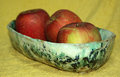
| 12/17/2008 11:20:17 AM |
14dec3859by Pug-HComment: That is a very pretty bowl and made a lovely puzzle macro :) |
| Photographer found comment helpful. |
| 12/17/2008 11:19:09 AM |
14.12.08 Meet Socratesby suemackComment: Socrates should meet Dorothy (my sons rat)... then we could have little Socrateses and little Dorothys :) hehe |
| Photographer found comment helpful. |
| 12/17/2008 11:18:08 AM |
|
| Photographer found comment helpful. |
| 12/17/2008 11:16:50 AM |
|
| Photographer found comment helpful. |
| 12/17/2008 11:16:27 AM |
|
| Photographer found comment helpful. |
Home -
Challenges -
Community -
League -
Photos -
Cameras -
Lenses -
Learn -
Help -
Terms of Use -
Privacy -
Top ^
DPChallenge, and website content and design, Copyright © 2001-2026 Challenging Technologies, LLC.
All digital photo copyrights belong to the photographers and may not be used without permission.
Current Server Time: 07/17/2026 07:08:18 AM EDT.