| Image |
Comment |
| 05/01/2007 08:10:52 PM |
Another new kitty!by bergiekatComment: darn - i am at a computer at the moment where i think the screen is not calibrated right. This picture is a little dark and I cannot see the details as well as I would like. I will say the eyes look spectacular. And this does look like a very regal pose. |
 Photographer found comment helpful. Photographer found comment helpful. |
| 05/01/2007 03:31:14 PM |
Day 1 - Scratchby JutildaComment: oooh love beags - I have two. Thanks for an idea now lol. Love the tilting pose - the composition filling the frame is awesome. The only thing I would like to see different is the background. Since a beagle already has such a variety of colors, it would be nice to see maybe a flatter, duller, or muted background. lol I know tho - with puppies - you catch them where you can. |
| 05/01/2007 03:28:29 PM |
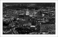
Day-1by SandyPComment: oooh love the black and white contrasts. and you can still tell the difference between the end of the city scape and the horizon - awesome. Plus I am a sucker for lights giving off that starburst look. |
| Photographer found comment helpful. |
| 05/01/2007 01:06:48 AM |
Day 1by eamurdockComment: DNMC - this is gold tone not B/W! ha just kidding - just never typed it before.
I love the shadows of light on the bricks to the right and the reflections on the left.
Seriously tho, how does it look in black and white? |
| Photographer found comment helpful. |
| 05/01/2007 01:04:53 AM |
Office.jpgby weegi70Comment: I like the angles. This is like one of those pics where the lines start moving if you stare at it too long lol. Of course it is 1AM for me right now... I guess to really make those lines jump out even more, try some more contrast? |
| Photographer found comment helpful. |
| 05/01/2007 01:03:03 AM |
one.by xantangummiComment: Fun - look at those big glasses. For my taste, I like the one on the left. I like the contrast and the pose. But people are right, this is a fun diptych. |
| Photographer found comment helpful. |
| 05/01/2007 01:00:05 AM |
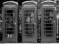
Day 1 - Phone Callby meneleComment: I love the balance of three. Is it my eyes or is the door handle on the booth on the right not level with the other two? I would like to see a little more contrast to make those doors pop out and appear as tho they were ready to open up to the viewer. Great composition! |
| Photographer found comment helpful. |
| 05/01/2007 12:26:31 AM |
crisisby boysetsfireComment: Wow so much being said here. The patterns, the reflections, the diagonal, the man with an umbrella. The contrast of rain vs. what the mural represents. I love that he is a silhouette. Awesome! |
| Photographer found comment helpful. |
| 04/30/2007 10:49:28 PM |
1by sevilduvarciComment: Interesting composition - the people look like they were placed in all their spots. Great candid! |
| Photographer found comment helpful. |
| 04/30/2007 10:48:09 PM |
Fire Doorby jackal9Comment: Interesting subject. I think I'd like to see some more crop off the bottom to get rid of the slanting angle in the left. |
| Photographer found comment helpful. |
Home -
Challenges -
Community -
League -
Photos -
Cameras -
Lenses -
Learn -
Help -
Terms of Use -
Privacy -
Top ^
DPChallenge, and website content and design, Copyright © 2001-2026 Challenging Technologies, LLC.
All digital photo copyrights belong to the photographers and may not be used without permission.
Current Server Time: 07/23/2026 06:58:44 AM EDT.