| Image |
Comment |
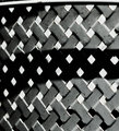
| 05/02/2007 04:59:51 PM |
Latticeby doc_gonzoComment: the shapes and textures are really good in b/w but the DOF seems a bit too shallow - as if almost nothing is exactly in focus except for the very center diamonds. |
| 05/02/2007 01:11:40 PM |
The Alpha Ram by hahn23Comment: Richard - Excellent image. I continue to be jealous your 'backyard'! Message edited by author 2007-05-02 13:12:08. |
 Photographer found comment helpful. Photographer found comment helpful. |
| 05/02/2007 10:27:54 AM |
|
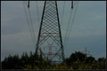
| 05/02/2007 10:27:36 AM |
the steel giantsby chimaeraComment: pretty good perspective - I think portrait orientation would have displayed the symmetry a little better. In addition, the image is quite dark on my monitor |
| Photographer found comment helpful. |
| 05/02/2007 10:26:24 AM |
Arizona Skylineby psartComment: i really don't see the planes of symmetry in this image - it is pretty - love the yellows set off against the blue sky |
| Photographer found comment helpful. |
| 05/02/2007 09:50:48 AM |
Symmetry in Architectureby ZeusComment: Beautiful house and nice image - but the perspective here really doesn't shout out symmetry. There are many symmetric elements in the building but the off centered placement far from away the house does not show us really clearly. A close up of the arches and windows dead on would likely work a lot better. |
| Photographer found comment helpful. |
| 05/02/2007 09:48:30 AM |
|
| Photographer found comment helpful. |
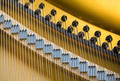
| 05/02/2007 09:47:42 AM |
Stringsby JeffDayComment: I like the crispness and colors on this image and the repeating patters is really nice - but I don't really see symmetry - there is no reflection plane that I can see to superimpose the image on. still it gets a 7 |
| Photographer found comment helpful. |
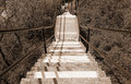
| 05/02/2007 09:45:57 AM |
Downstairsby bvyComment: There is something very strange about this photo that I can't quite put my finger on - the cropping is on the money and the image appears to be even across and up and down, but it still appears not centered for some reason - it must be the shadow of the railing or possibly your placement when taking the photo - it almost seems that you weren't quite dead center when this photo was taken... I wish I could figure it out.
I really like the perspective and contrast in this photo a lot..7 |
| Photographer found comment helpful. |
| 05/02/2007 09:42:39 AM |
Shadows of Moonlightby jeroweComment: nice perspective to add the symmetry - the colors are nice but the shadows across the pier seem to destroy the symmetry actually present. Still a 7 for a good photo |
| Photographer found comment helpful. |
Home -
Challenges -
Community -
League -
Photos -
Cameras -
Lenses -
Learn -
Help -
Terms of Use -
Privacy -
Top ^
DPChallenge, and website content and design, Copyright © 2001-2025 Challenging Technologies, LLC.
All digital photo copyrights belong to the photographers and may not be used without permission.
Current Server Time: 09/10/2025 09:55:10 PM EDT.