| Image |
Comment |
| 05/13/2007 03:50:57 PM |
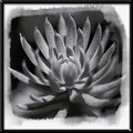
Day Nine: Succulent Grayby Art RoflmaoComment: Really cool processing with the textured watercolor look. I also like the grain and tonals a lot. The outer frame doesn't really work for me though - the 3D seems too busy for the subject, perhaps. |
 Photographer found comment helpful. Photographer found comment helpful. |
| 05/13/2007 03:49:40 PM |
__by undieyatchComment: An interesting concept with the grain - great you are trying new things! Not sure it works for me, as the pattered look in the center of the flower detracts from the depth (flower looks a bit flat). |
| 05/11/2007 02:09:50 PM |
Night Time Strollby jaysonmcComment: Jayson, I gave you a "6" on this shot. I thought the perspective and DOF were interesting, and I liked the tones, but there is something missing to give it that extra "punch" for me. I think that technically it is quite good, and it is very pleasing to the eye, but there isn't an emotive? Please keep in mind this is just my .02 and I love many of your photos - I think you have an awesome eye! |
| Photographer found comment helpful. |
| 05/10/2007 08:56:16 PM |
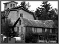
Day-10-BW-IMG_2498-hotel.jpgby JerseyGenieComment: What a fascinating property this is - almost looks like three or four houses collapsing on each other...I think the composition is very strong here. Maybe consider a little dodging on the side of the bottom house? Anyway, I really like this. Very interesting photo. |
| Photographer found comment helpful. |
| 05/10/2007 08:55:09 PM |
Day 10by darnokComment: Wow - weird and spooky - I like it a lot. Great example of low-key. |
| Photographer found comment helpful. |
| 05/10/2007 08:54:20 PM |
nine/thirtyby UNCLEBROComment: I think this is an (unusual?) instance where the shadows actually enhance a very simple object. It might look to flat/stagnant otherwise. |
| Photographer found comment helpful. |
| 05/10/2007 08:53:18 PM |
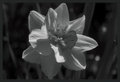
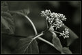
Plantby MelethiaComment: Wow - this does have a definite greenish tint, but I like it. I think the tint definitely enhances it. I do agree with Roz that the berries might benefit from a touch of sharpening, and I'm not sure about the leaf on the far left side. I'm really glad you shared this, though, as it is interesting to see what minor toning adjustments will do to/for a photo! |
| Photographer found comment helpful. |
| 05/10/2007 08:48:02 PM |
|
| Photographer found comment helpful. |
| 05/10/2007 08:47:22 PM |
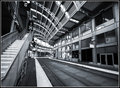
Day 11.jpgby edmengComment: This is really, really cool. I am impressed with how many details are in this photo, yet it doesn't seem too busy. It has an aura of mystery and industrial abandon. Adding to faves. |
| Photographer found comment helpful. |
| 05/10/2007 08:46:11 PM |
child IMG_2284.jpgby dsternerComment: What a cutie! Just a lovely child. I like the shadows on her face a lot - adds interest - focus seems just a touch soft. |
| Photographer found comment helpful. |
Home -
Challenges -
Community -
League -
Photos -
Cameras -
Lenses -
Learn -
Help -
Terms of Use -
Privacy -
Top ^
DPChallenge, and website content and design, Copyright © 2001-2026 Challenging Technologies, LLC.
All digital photo copyrights belong to the photographers and may not be used without permission.
Current Server Time: 07/27/2026 05:29:36 PM EDT.