DPChallenge: A Digital Photography Contest You are not logged in. (log in or register
 
Browse Settings
Currently viewing:
Memberkiwiness

Show comments:

Per page:

Order:

Comments:


Comments Made by kiwiness
Pages:   ... [316] [317] [318] [319] [320] [321] [322] ... [616]
Showing 3181 - 3190 of ~6157
Image Comment
Waiting and Watching
08/26/2003 10:17:51 AM
Waiting and Watching
by OneSweetSin

Comment:
Hi Anna, prepare to be critiqued :-)

I don't really get much time to do CC stuff these days, actually I am surprised they haven't kicked me out of the club yet! By the looks of it you probably contribute the most to the Critique Club yourself, good on ya.

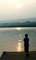
The negative space challenge seemed to have stirred up a hornet's nest as to what negative space really is or isn't. My description is that it is the area surrounding the main subject which is just there and adds interest but doesn't distract away at all. This doesn't necessarily mean that it has to be completely black or white or whatever.

To your negative space photo: Your photo has definitely met the negative space challenge. When I opened your pic my eyes fell immediately upon your main subject, your son, standing on the deck. Your negative space of water, landscape and sky adds interest to the whole image.

By placing your boy in the lower right hand corner you've followed the rule of thirds to create extra impact.

The whole image appears a little on the soft side to me especially the background. Although this isn't really a negative factor, I think a sharper background, especially the water, would have given your photo that extra boost.

I have a couple of minor recommendations for improvement. First of all I would have preferred to see the boy as a complete silohuette, completely black. I can see some color in his shirt and hair. Had you metered off the sun or a brighter part of the sky, you could have created that silohuette effect, it would have also silohuetted the deck.

What also might have been interesting is if you had gotten higher, on a chair or something and photographed more downward. This would have gotten more water into your image and only used the water as the negative space. This would have probably looked quite amazing as well, especially with the sun shining across it leading up to the deck.

Overall an interesting and original photo which I scored a 6.

Good luck in the upcoming challenges.

Gary

Message edited by author 2003-08-26 10:22:17.
Photographer found comment helpful.
Jed
08/26/2003 09:40:50 AM
Jed
by myqyl

Comment:
Go Jed! Everything is fully in focus, good stuff.
Photographer found comment helpful.
Walt Disney Concert Hall
08/26/2003 09:39:29 AM
Walt Disney Concert Hall
by MrAkamai

Comment:
Nice architecture shot, love the curves in it. A little too much glare from the sun on the middle part, but otherwise a very good photo.
Photographer found comment helpful.
14th-16th Century Church (national monument)
08/26/2003 09:35:54 AM
14th-16th Century Church (national monument)
by Azrifel

Comment:
I like it, the lighting is amazing. The texture of the clouds in the sky also add a lot to this photo as they are the same color as the church.
Photographer found comment helpful.
In Harm's Way
08/26/2003 09:34:37 AM
In Harm's Way
by ttreit

Comment:
That's an interesting statue. I would have moved a little to the left to take this photo (if possible) because that beam on the left kind of distracts. Also you would have hidden that guy sitting on the bench out there in the background. Maybe a wide open aperture might have blurred the background out a little as well. But otherwise it is good. What does he represent?
Photographer found comment helpful.
A Nightlight for the Sea
08/26/2003 09:31:34 AM
A Nightlight for the Sea
by byetko

Comment:
The lighthouse is tilting to the left a little, or is it like that in real life? Like the leaning tower of Pisa :-)
Photographer found comment helpful.
Lincoln Memorial
08/26/2003 09:28:34 AM
Lincoln Memorial
by StevePax

Comment:
You get my vote for humor :-) Good idea, certainly different and well composed.
Photographer found comment helpful.
Served and Fallen
08/26/2003 09:27:17 AM
Served and Fallen
by OneSweetSin

Comment:
Everything is full in focus here. I see what you have done here, you wanted to get the statue and the flags into the shot.

For me there is a little too much in the photo with the building, statue, flags and plants. It appears a little on the busy side, too much to look at, you know what I mean? The statue itself looks very interesting but I can't see enough of it. I would have gotten right into it and taken just the two figures close up.
Photographer found comment helpful.
Warwarsing NY
08/26/2003 09:21:12 AM
Warwarsing NY
by joannadiva

Comment:
I would have prefered it if you had moved more to the left so as to get the tree out of the way, it is a little distracting. Or else use a wide open aperture to blur it out a little.
Photographer found comment helpful.
The Chattri
08/26/2003 09:17:14 AM
The Chattri
by robsmith

Comment:
This has an old fashioned feel to it. Interesting sepia toning you chose.
Photographer found comment helpful.
Pages:   ... [316] [317] [318] [319] [320] [321] [322] ... [616]
Showing 3181 - 3190 of ~6157


Home - Challenges - Community - League - Photos - Cameras - Lenses - Learn - Help - Terms of Use - Privacy - Top ^
DPChallenge, and website content and design, Copyright © 2001-2025 Challenging Technologies, LLC.
All digital photo copyrights belong to the photographers and may not be used without permission.
Current Server Time: 11/22/2025 01:32:06 AM EST.